Utagawa Hiroshige, Autumn Moon on the Tama River, Japanese, ca. 1838, via The Met
Diving deeper into the art, Alexandra Kosloski uses design principles to unpack the language within visual compositions in the "How to Look at Art" series.
Continued from Part 1
Moving past the basics of visual analysis, we can look into the work for the formal elements and the principles of design. The formal elements of art are basic terms we use to communicate visually; line, light, color, shape, pattern, space, and time.
Line
Linear marks made by artistic mediums like paint or pencil are actual lines. Implied lines are not made physically but still can make up the composition– dotted lines that don't connect, the horizon in a landscape, the pointed hand on the outstretched arm of a figure.
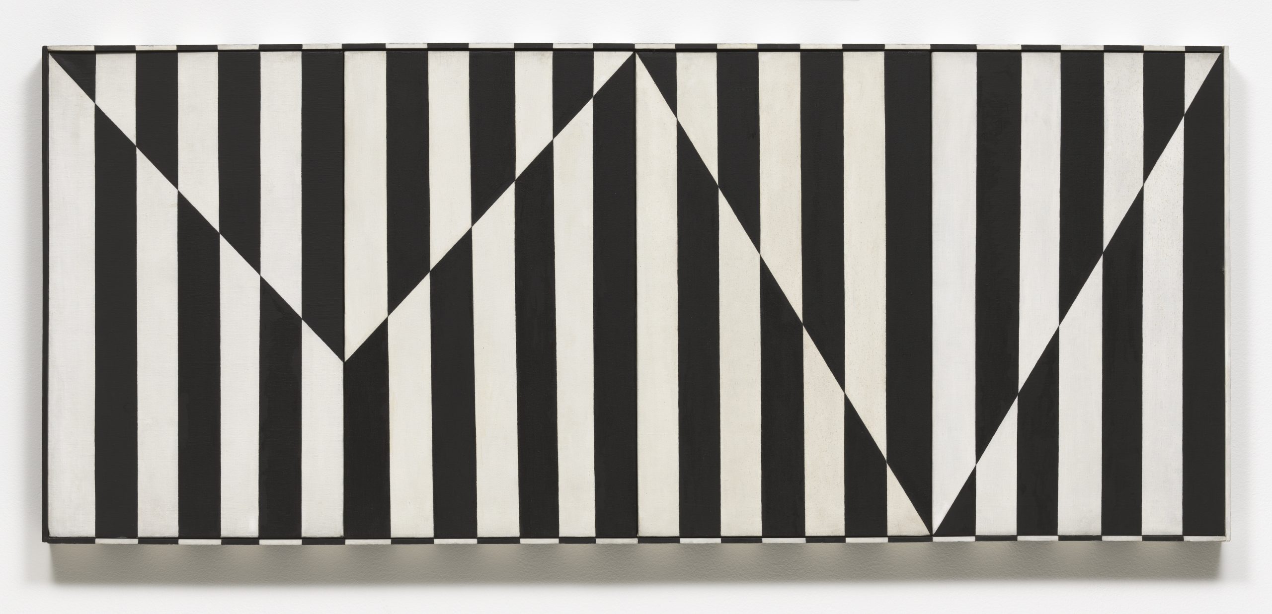
Carmen Herrera, Untitled Estructura (Black), 1966/2016 © Carmen Herrera; Courtesy Lisson Gallery
Notice the vertical actual lines and jagged, horizontal implied line in Herrera's work.
The direction of lines can indicate meaning. Viewers can draw from their own real world experience. Horizontal lines, like a sleeping body, could indicate rest, peace, or inactivity. Vertical lines may suggest aspirational reaching or standing at attention. Diagonal lines would suggest action, like all the diagonal lines of a runner. Curving lines may suggest movement, or the organic lines of nature. Line quality– if a line is thick or thin, or sketchy or bold– can also convey meaning.
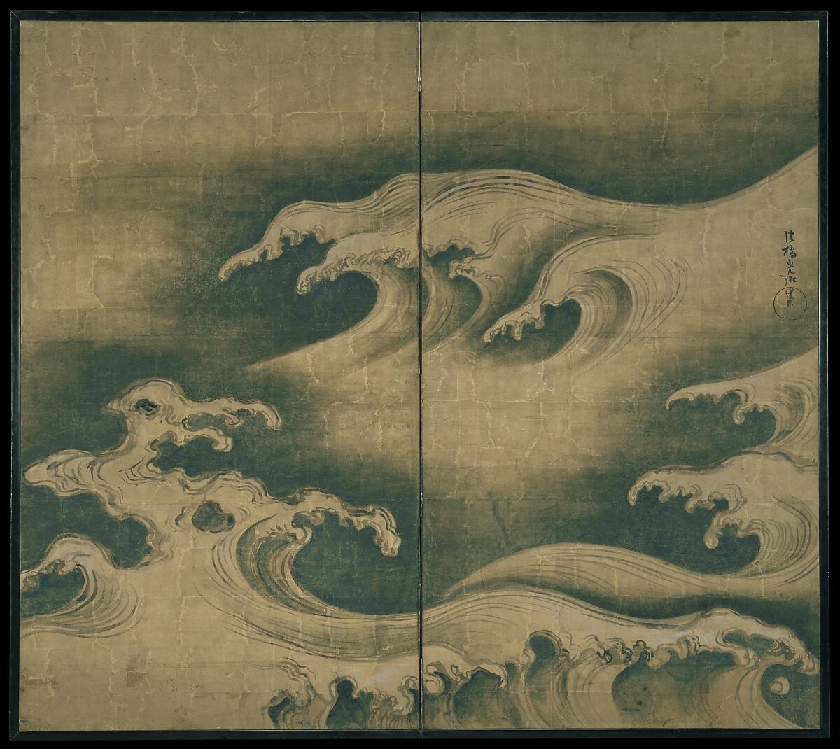
Ogata Korin, Rough Waves, ca. 1704-9, Courtesy Met Museum
"Rough Waves" strives to capture the amorphous tide in ink.
Light and Value
Art may utilize natural and artificial light, like in sculpture or architecture. In 2D art, artists use value to represent shades of light and dark. Artists manipulate light to create form by mimicking shadows and plasticity in 3D objects. Value can also portray emotion. For example, high contrast visuals look dramatic.
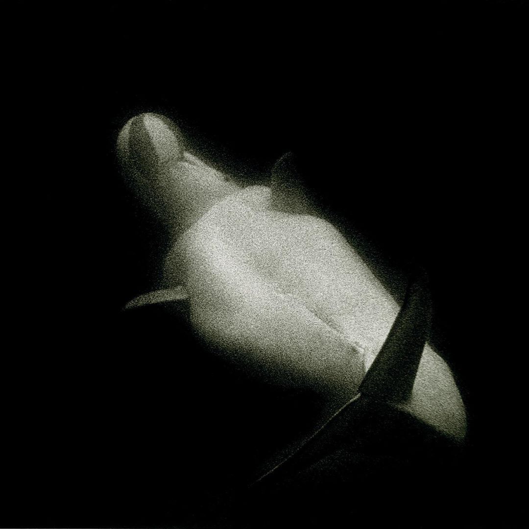
Sante D'Orazio, White Beluga Whale at Coney Island Aquarium, 1975
The harsh contrast between light and dark brings intensity to the mood of the photo.
Color
Color consists of three properties. Hue– the state of a color, like red or blue; value– lightness or darkness within a hue; and intensity– the dullness or saturation of a hue. Color can be warm or cool, which affects the viewer's experience. There is a lot to learn about color theory because color is so subjective. It interacts with its environment and the colors around it, and can be very complex. Color is also largely symbolic, like the colors of a nation’s flag, or red being the color of passion.
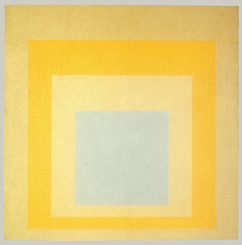
Josef Albers, Homage to the Square: With Rays, 1959, © 2016 Artists Rights Society (ARS), New York
The interaction between the colors causes our eye to see them differently.
Texture and Pattern
Texture can be tactile or visual. A marble sculpture of a figure would be physically smooth to the touch, but visually, the artist might represent soft flesh or sinuous muscle. Texture and pattern are related, as pattern may be perceived as texture and vice versa. Pattern is an arrangement of repeated form, and they can be natural, like in leaves and flowers, or geometric, with mathematical shapes and lines.

Egyptian, Leaf Pendant, ca. 1390–1352 B.C., Courtesy Met Museum
The pattern is meant to mimic the appearance of a natural leaf and add texture.
Shapes
Regular shapes are often geometric and identifiable like triangles and squares. Irregular shapes are organic and spontaneous, like a patch of light or a mark made by a paintbrush.
James Turrell, Meeting, 1980-86/2016, at MoMA PS1, Copyright Hugh Pearman
The shapes create the space of the architecture around the viewer.
Space
Artists can portray space in 2D art by employing one of many illusory techniques, like by manipulating vale or scale. A complex technique is by taking advantage of perspective. There are a few methods of perspective, but generally, the artist considers the natural experience of a viewpoint and tries to mimic it– or, as popularized by the cubist movement– defy it.
Paul Cezanne, Mont Sainte-Victoire, 1902-6, Courtesy Met Museum
The blue mountain seems far away, past the houses.
Time and Motion
Time and motion functions differently across mediums. As we view sculpture, we observe several viewpoints as we move through or around it. Painting and drawing can have an illusion of motion through mark making. Film, dance, and other performance depend on time and motion.
Gian Lorenzo Bernini, Apollo and Daphne, 1622-1625, Photo by Daniel Kelly
"Apollo and Daphne" seems to have a sequence of motion as the viewer moves around the sculpture.
Next, we activate the formal elements by understanding how they make up design principles.
Continue to Part 3

