community

Norooz

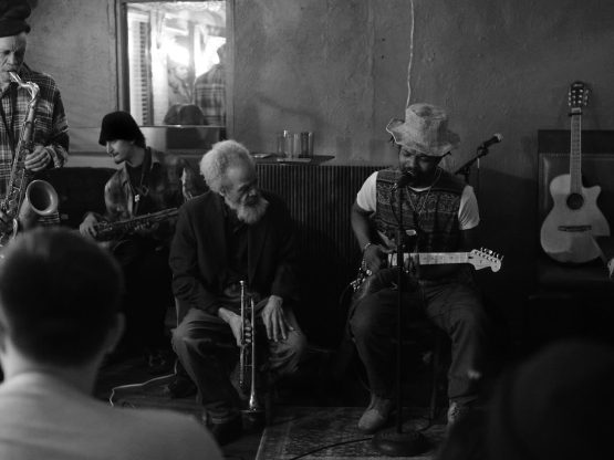
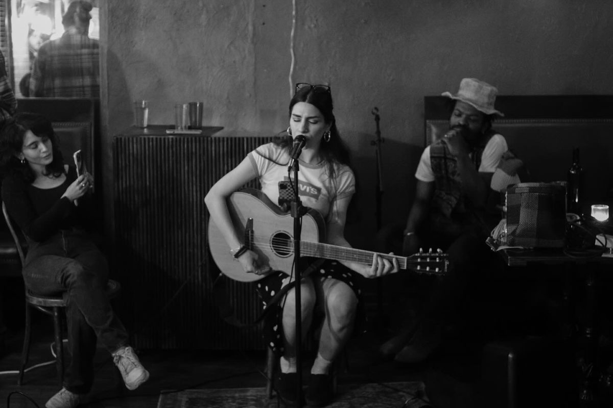
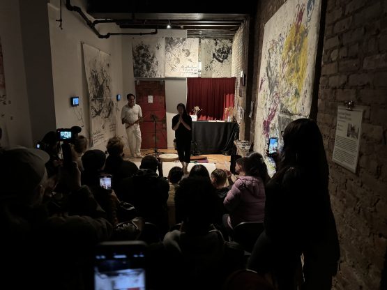
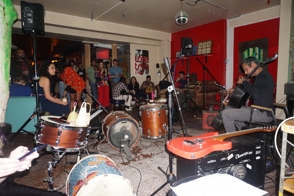
Bako performing at the Trops celebration of Norooz, Photo by Derek Davis

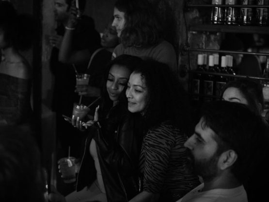
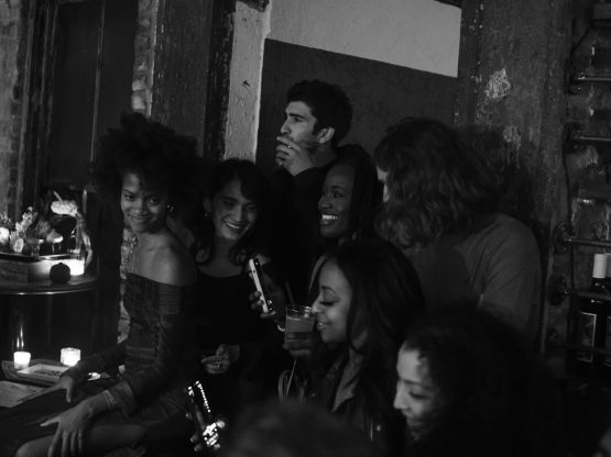
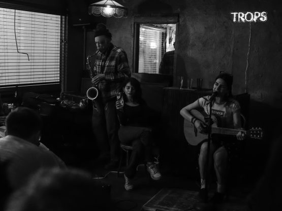
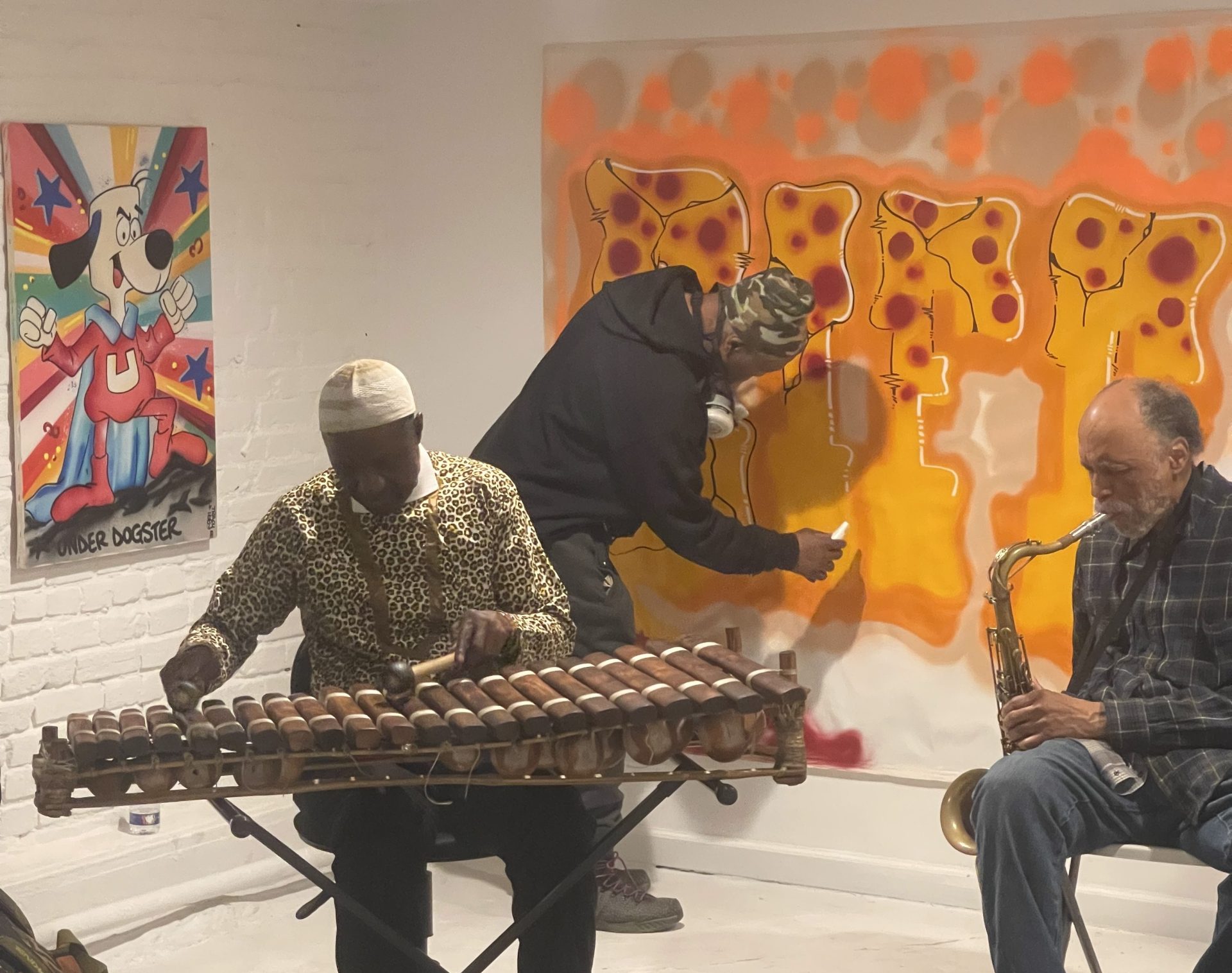
On March 21st, the Trops celebrated a special Bohemian Wednesday full of music, poetry, and dance. The evening was in celebration of the Spring Equinox and the Persian New Year, Norooz, at Manero’s of Mulberry in Little Italy, NYC.

Nowruz / Norooz, Farsi for “new day” – is an ancient festival celebrating the first day of spring in the Northern Hemisphere. The vernal equinox has been observed as the beginning of the new year for more than 3,000 years in different regions, including the Balkans, the Black Sea Basin, the Caucasus, Central Asia, the Middle East and others. As UNESCO puts it, the return of spring has great spiritual significance, representing the triumph of good over evil and joy over sorrow.

The night included special performances by

Daniel Carter, Mehrnam Rastegari, Martin Shamoonpour, Khadim Sene, Ilka Scobie, Isaiah Barr, Jonathan Harris,

Judith Dimitria, Iam Forde, DJ Darius

Trops celebration of Norooz, Photos by Derek Davis

Norooz Read More »

Event

Workshop with Kanami Kusajima

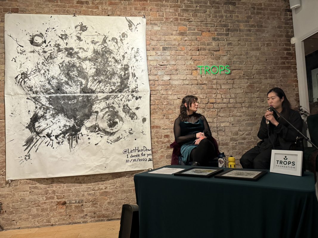
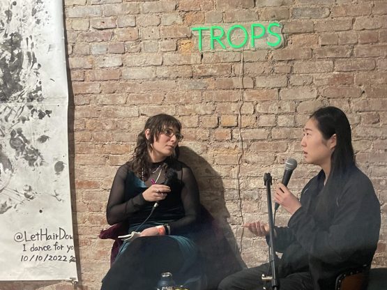
Kanami is interviewed by Amelia A during their artist talk

On March 6th 2024, Trops Foundation presented a Bohemian Wednesday Workshop with Kanami Kusajima in NYC.

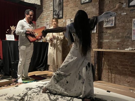
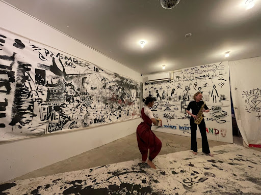
Kanami Kusajima is a dancer, choreographer, and performing artist based in New York City. She is well known for consistently performing at Washington Square Park since November 2020, known as “Let Hair Down,” combining live painting and improvisational dance. Her unique style of dance has captivated the city and awarded the artist recognition and media attention.

Kanami’s performance featured David Kennet and Manami Aoki. The event was a fundraiser for disaster relief on the Noto Peninsula in Japan. After the recent devastiating earthquake, one of the biggest issues is that the Noto Peninsula infrastructure is damaged, and limited, making aid difficult to the area. Since so many roads are closed, many people who survived the earthquake have suffered because of the lack of access to resources and supplies. Funds went to Hokuriku Charity Restaurant, who creates and distributes meals for affected areas.

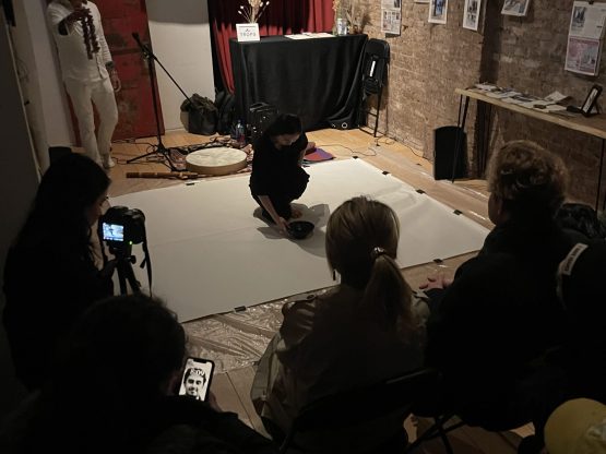
Moments from the Trops Workshop with Kanami

Compilation of Kanami Kusajima’s workshop and artist talk with Amelia A

Workshop with Kanami Kusajima Read More »

Event

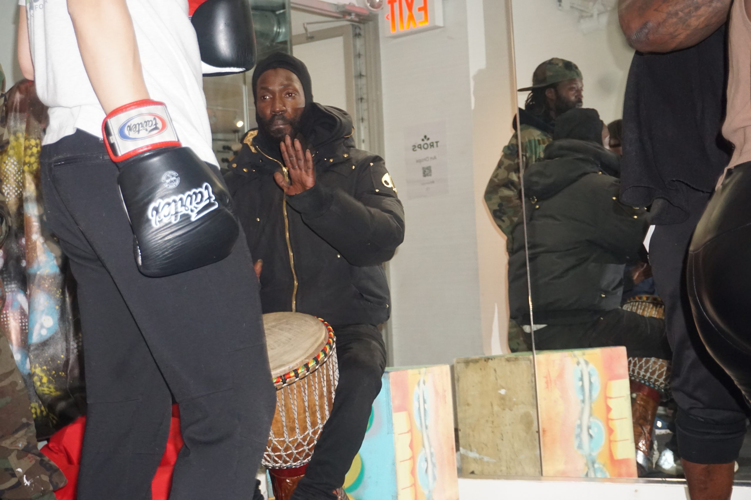
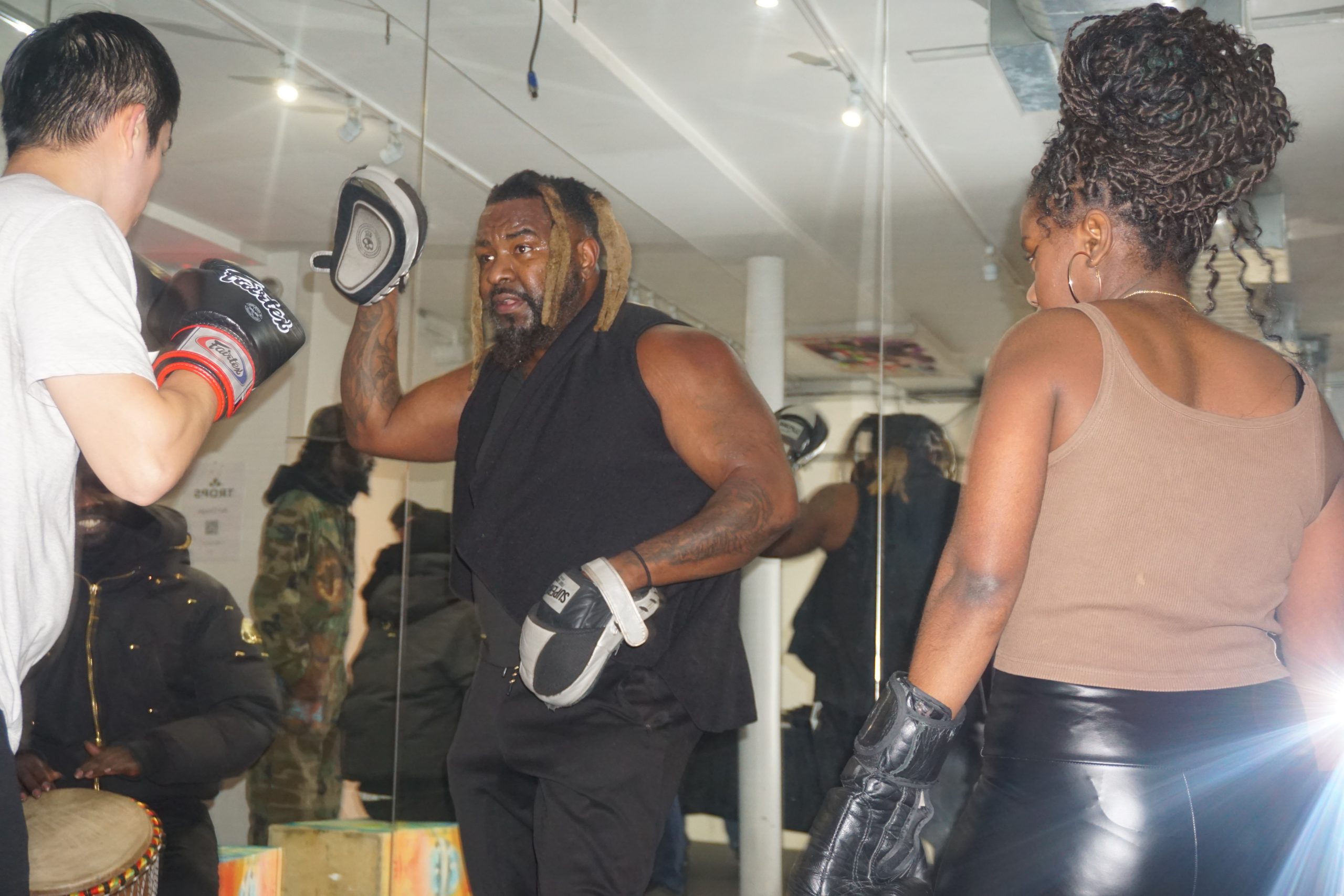
Workshop with Ibrahim Kandji

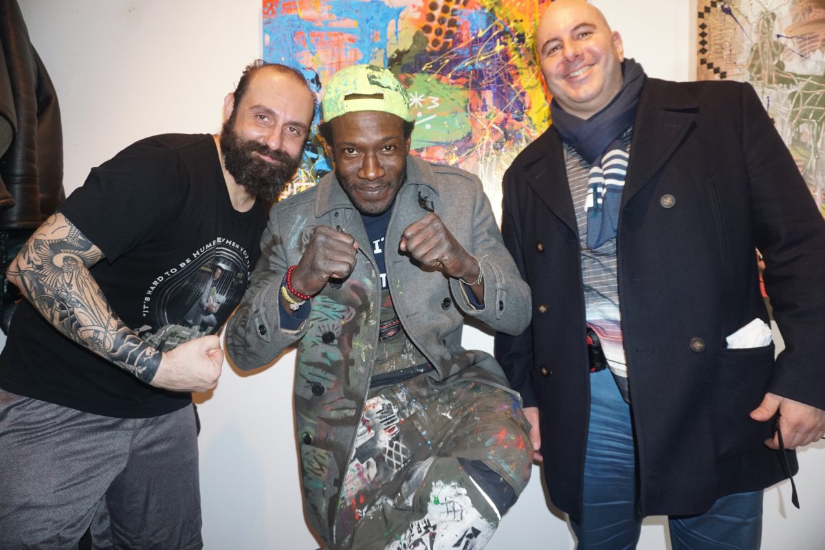
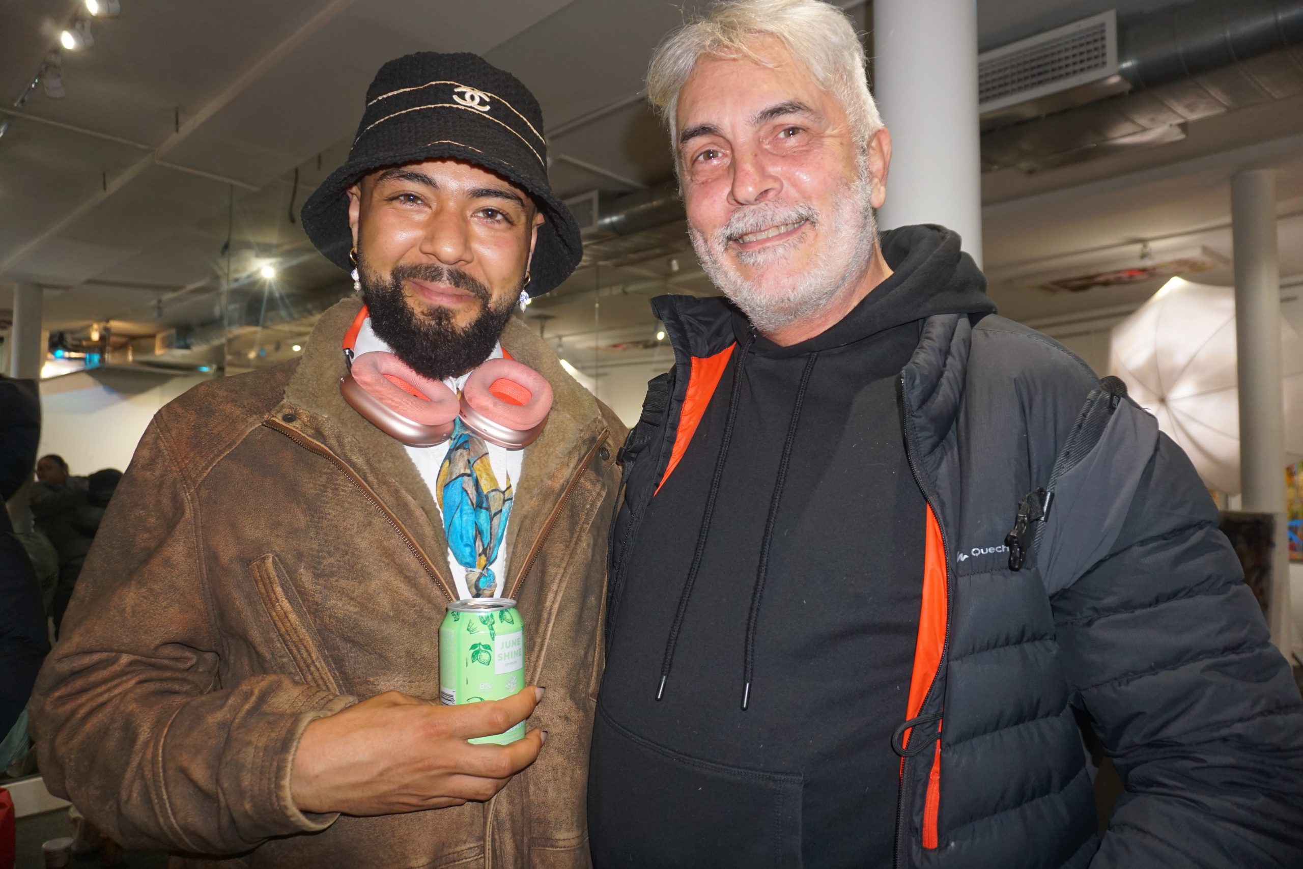
Ibrahim Kandji and friends at the Trops Workshop.

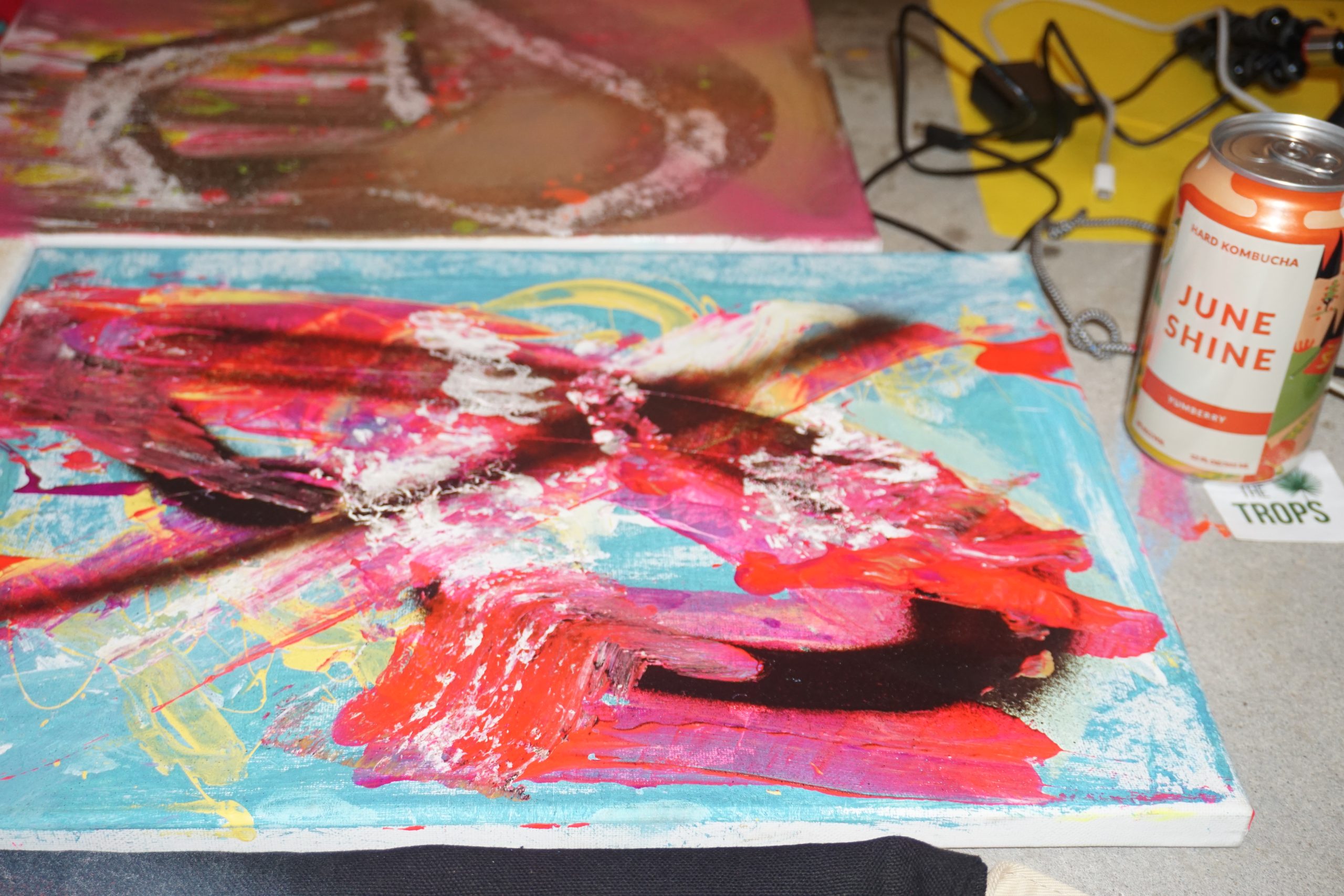
The Trops is proud to present the works of Ibrahim Kandji “Uneek”. This Senegalese artist is based in New York City and creates contemporary street art at his unique studio in TriBeCa.

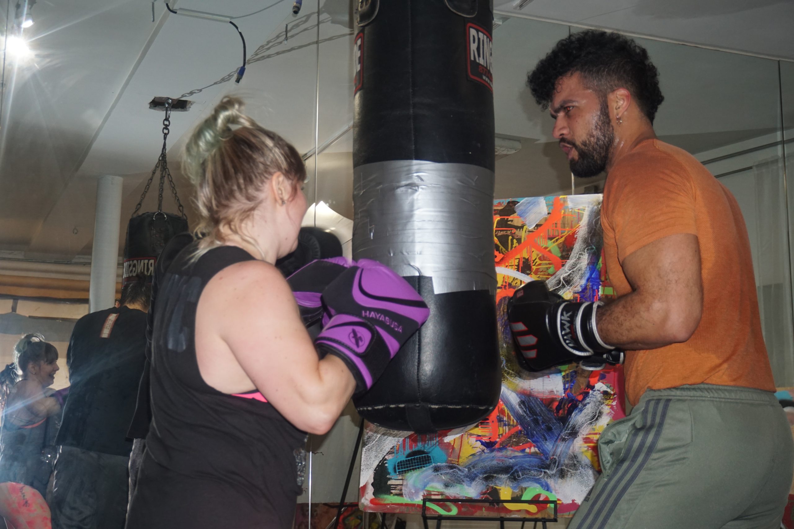
On January 3rd, 2024, the Trops hosted a Workshop at 333 Church St. in NYC. The night featured live music by Adjua Ajamu, boxing by Hudson Boxing, poetry readings and an artist talk with Uneek and Amelia A.

Workshop with Ibrahim Kandji Read More »

Event

How To Look At Art: Design Principles

Bronze statuette of a hound gnawing a bone, Greek, 3rd–2nd century BCE, via The Met

In part 3 of the “How To Look At Art” series, Alexandra Kosloski uses formal elements to bring together the units of visual language.

Continued from Part 2

Design principles are terms to communicate how the formal elements are used, and what kind of effect that has on the work and the viewer: balance, rhythm, proportion and scale, emphasis, unity and variety.

Balance

Balance results from the manipulation of visual weight within a composition. A part of an artwork that is large, more detailed, or more intense in color has more weight. If a piece of art has symmetrical balance, that means weight is distributed evenly, as opposed to uneven elements which are asymmetrical, or when elements radiate out of a central point which is radial balance. Symmetry will often seem harmonious, asymmetry may seem more dynamic, and radial symmetry may even seem mystic.

Sedefkâr Mehmed Ağa, Dome, Blue Mosque (Sultan Ahmed Mosque), completed 1617, Istanbul via iStockPhoto

Rhythm

Patterns can be used to communicate rhythm through repetition, or by leading our eyes through a composition. Visual rhythm can be regular, alternating or eccentric, and a work may have different combinations of the three to express the right pace and movement in the work.

Terracotta fragment of a kylix (drinking cup), Greek, 500-490 BCE, via The Met

Proportion and Scale

Proportion is the relative size of part of a composition. Artists may study proportions so they can create life-like drawings or they may subvert proportion to try to express a new perspective. Scale is when the artist plays with the size of something and our expectations of it, a device that often occurs in sculpture, but can appear anywhere. A large painting with large subject matter will approach the viewer and feel quite intimate, as opposed to a very small painting, which won’t have as much room for detail.

 42-meter inflatable sculpture by KAWS, 2021, Marina Bay in Singapore, Photo by Roslan Rahman/AFP/Getty Images

Emphasis

The part of the work viewers are meant to focus on will be most emphasized. The artist can make the focal point stand out in many ways by employing the elements of art, like adding a bright accent of color to an otherwise dull photograph.

Hierarchy is a useful tool, related to both proportion and emphasis. When looking at religious art, the figure most high or with the most emphasis is the holiest. When looking at advertisements, the most important object or message will have the most emphasis.

Andy Warhol, Detail of The Last Supper, 1986, Andy Warhol Foundation for the Visual Arts, Inc./Licensed by Artists Rights Society (ARS), NY

Unity and Variety

Unity and Variety are counterparts, and the balance of the two is what makes art interesting to look at. Unity is achieved when elements, like color, are all of the same nature. Variety adds contrast and spontaneity.

Keith Haring, Save Dauphine, 1988, via ArtBanx

The purpose of all of this is communication. Artwork can express something very specific, like a well known myth, or something intangible, like ecstasy. By familiarizing ourselves with the ways artists communicate, we can have better visual literacy, which adds depth to the world around us. When we understand art, we can better understand architecture, advertisements, movies, and all of the visual elements of our everyday lives, as well as having true appreciation for the previously unattainable fine art.

How To Look At Art: Design Principles Read More »

Editorial

How To Look At Art: Formal Elements

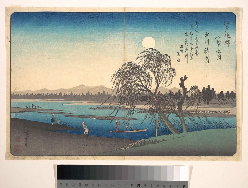
Utagawa Hiroshige, Autumn Moon on the Tama River, Japanese, ca. 1838, via The Met

Diving deeper into the art, Alexandra Kosloski uses design principles to unpack the language within visual compositions in the “How to Look at Art” series.

Continued from Part 1

Moving past the basics of visual analysis, we can look into the work for the formal elements and the principles of design. The formal elements of art are basic terms we use to communicate visually; line, light, color, shape, pattern, space, and time.

Line

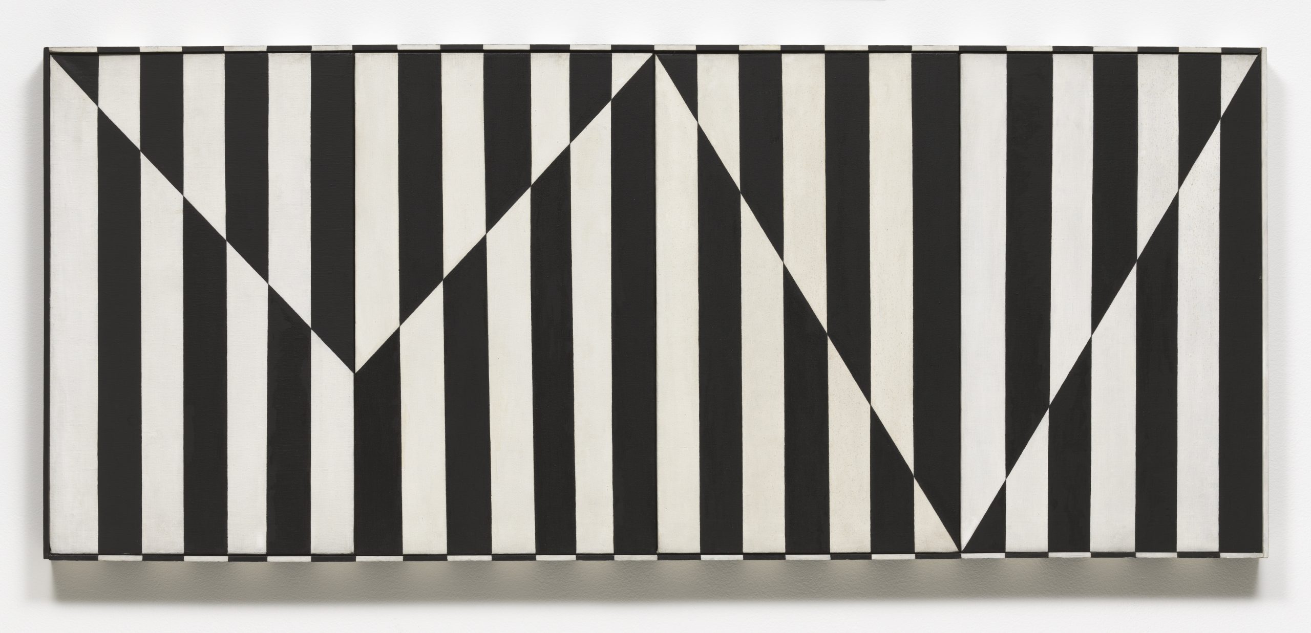
Linear marks made by artistic mediums like paint or pencil are actual lines. Implied lines are not made physically but still can make up the composition– dotted lines that don’t connect, the horizon in a landscape, the pointed hand on the outstretched arm of a figure.

Carmen Herrera, Untitled Estructura (Black), 1966/2016 © Carmen Herrera; Courtesy Lisson Gallery

Notice the vertical actual lines and jagged, horizontal implied line in Herrera’s work.

The direction of lines can indicate meaning. Viewers can draw from their own real world experience. Horizontal lines, like a sleeping body, could indicate rest, peace, or inactivity. Vertical lines may suggest aspirational reaching or standing at attention. Diagonal lines would suggest action, like all the diagonal lines of a runner. Curving lines may suggest movement, or the organic lines of nature. Line quality– if a line is thick or thin, or sketchy or bold– can also convey meaning.

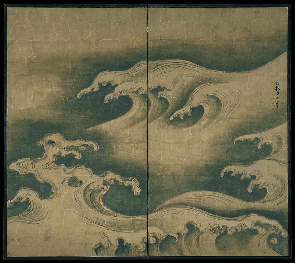
Ogata Korin, Rough Waves, ca. 1704-9, Courtesy Met Museum

“Rough Waves” strives to capture the amorphous tide in ink.

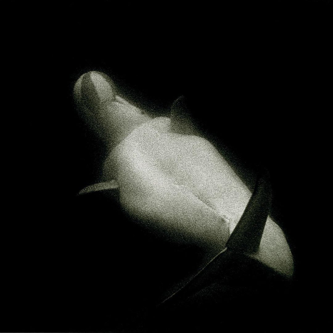
Light and Value

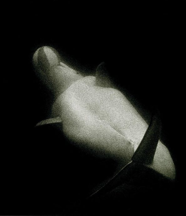
Art may utilize natural and artificial light, like in sculpture or architecture. In 2D art, artists use value to represent shades of light and dark. Artists manipulate light to create form by mimicking shadows and plasticity in 3D objects. Value can also portray emotion. For example, high contrast visuals look dramatic.

Sante D’Orazio, White Beluga Whale at Coney Island Aquarium, 1975

The harsh contrast between light and dark brings intensity to the mood of the photo.

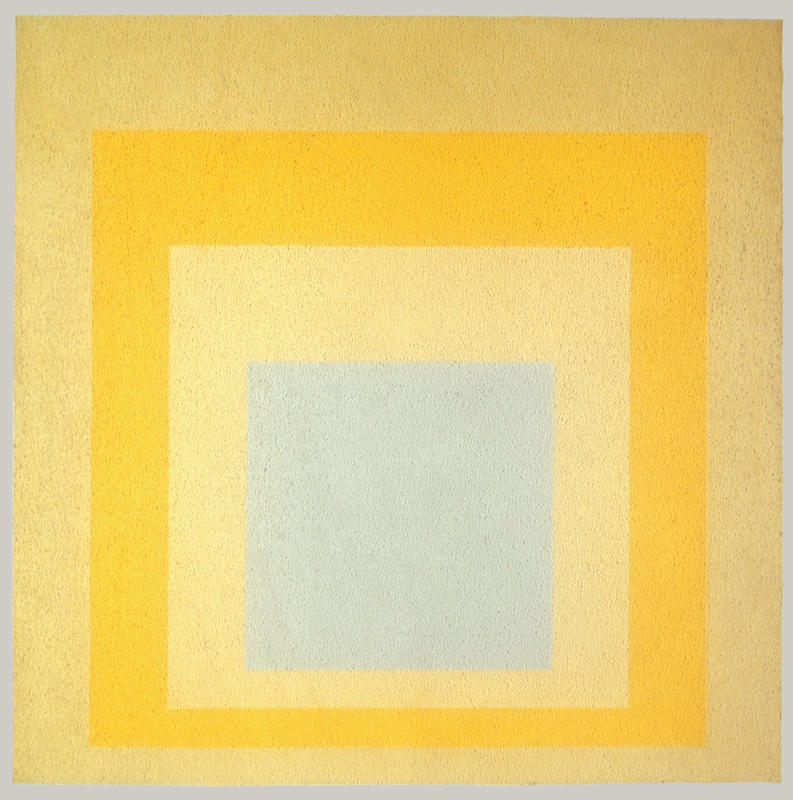
Color

Color consists of three properties. Hue– the state of a color, like red or blue; value– lightness or darkness within a hue; and intensity– the dullness or saturation of a hue. Color can be warm or cool, which affects the viewer’s experience. There is a lot to learn about color theory because color is so subjective. It interacts with its environment and the colors around it, and can be very complex. Color is also largely symbolic, like the colors of a nation’s flag, or red being the color of passion.

Josef Albers, Homage to the Square: With Rays, 1959, © 2016 Artists Rights Society (ARS), New York

The interaction between the colors causes our eye to see them differently.

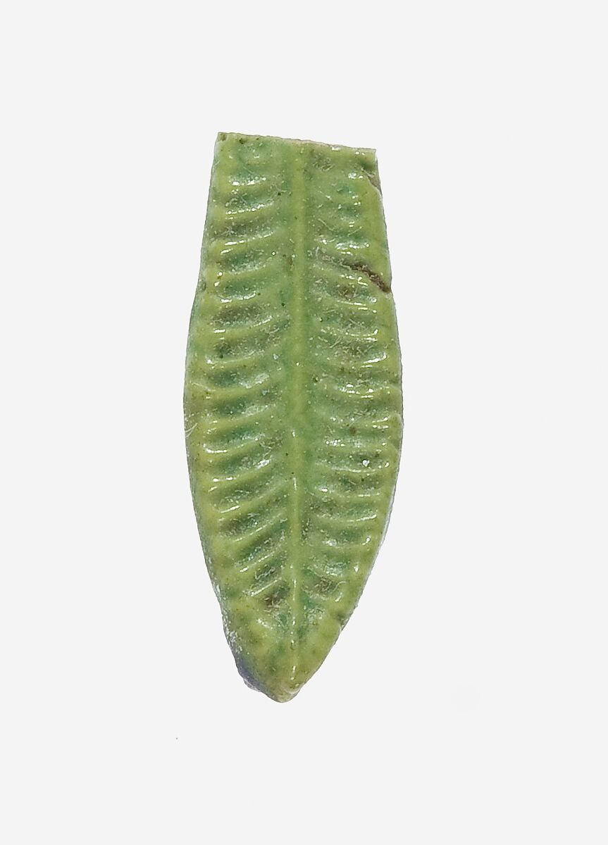
Texture and Pattern

Texture can be tactile or visual. A marble sculpture of a figure would be physically smooth to the touch, but visually, the artist might represent soft flesh or sinuous muscle. Texture and pattern are related, as pattern may be perceived as texture and vice versa. Pattern is an arrangement of repeated form, and they can be natural, like in leaves and flowers, or geometric, with mathematical shapes and lines.

Egyptian, Leaf Pendant, ca. 1390–1352 B.C., Courtesy Met Museum

The pattern is meant to mimic the appearance of a natural leaf and add texture.

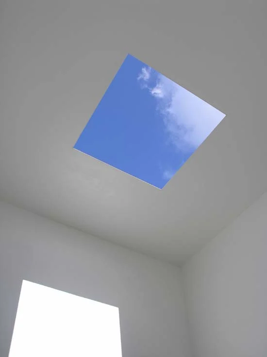
Shapes

Regular shapes are often geometric and identifiable like triangles and squares. Irregular shapes are organic and spontaneous, like a patch of light or a mark made by a paintbrush.

James Turrell, Meeting, 1980-86/2016, at MoMA PS1, Copyright Hugh Pearman

The shapes create the space of the architecture around the viewer.

Space

Artists can portray space in 2D art by employing one of many illusory techniques, like by manipulating vale or scale. A complex technique is by taking advantage of perspective. There are a few methods of perspective, but generally, the artist considers the natural experience of a viewpoint and tries to mimic it– or, as popularized by the cubist movement– defy it. 

Paul Cezanne, Mont Sainte-Victoire, 1902-6, Courtesy Met Museum

The blue mountain seems far away, past the houses.

Time and Motion

Time and motion functions differently across mediums. As we view sculpture, we observe several viewpoints as we move through or around it. Painting and drawing can have an illusion of motion through mark making. Film, dance, and other performance depend on time and motion.

Gian Lorenzo Bernini, Apollo and Daphne, 1622-1625, Photo by Daniel Kelly

“Apollo and Daphne” seems to have a sequence of motion as the viewer moves around the sculpture.

Next, we activate the formal elements by understanding how they make up design principles.

Continue to Part 3

How To Look At Art: Formal Elements Read More »

Editorial

Keeping The Faith, November 2023

Style Writing by Jona Cerwinske at Keeping the Faith

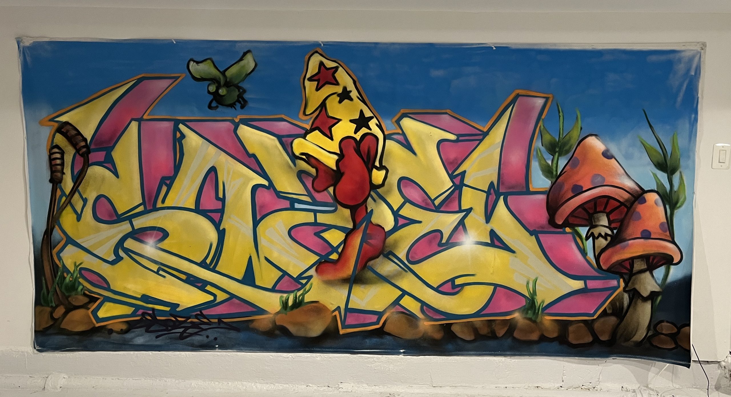
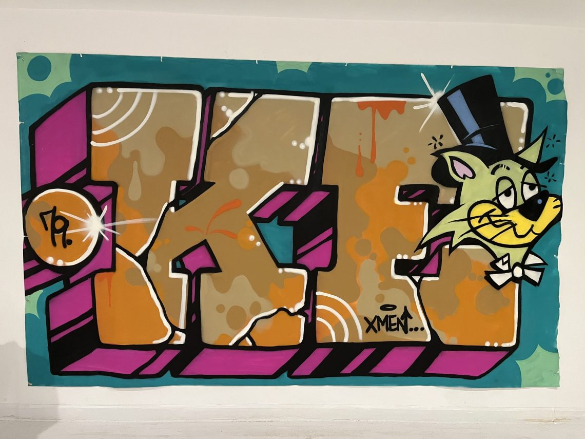
The Trops presents community paintings created live in NYC’s public spaces, representative of the sort of pieces that were done on the walls, streets, and trains that manifested into a global movement. Mark making attached a figurative significance to the individual spirit that guides self-expression in these exhibitive spaces; however, in their original contexts, the art of writing was not necessarily intended as a painting in the western sense of the word. These works, painted by legendary living writers, are contemporary developments of the Style Writing tradition that bring the vitality of the culture into canvas. 
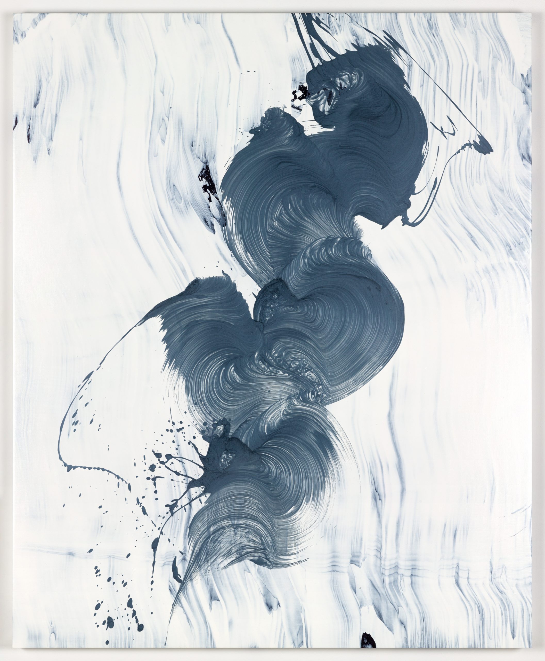
Featuring:

KEO VFR JONA

SOZE RIFF

Keeping The Faith, Video by Avery Walker

The opening reception for Keeping The Faith presented musical performance by Daniel Carter and Ebrima Jassey, as well as a screening by Producer Plug, featuring Big Boo and The 45 King.

Train Writers

Shop our “Train Writers” collection, featuring Style Writers from Keeping The Faith.

Ebrima Jassey (left) and Big Boo (right) at Keeping The Faith, Photos by Adel Saad Abouelalav

Style Writing

Learn more about the Style Writing tradition by visiting our page for the culture.

Style Writing by Soze at Keeping the Faith

Style Writing by KEO at Keeping the Faith

Performance by Daniel Carter and Ebrime Jassey at Keeping the Faith, Style Writing by RIFF

Keeping The Faith, November 2023 Read More »

Exhibition

How To Look At Art: Visual Analysis

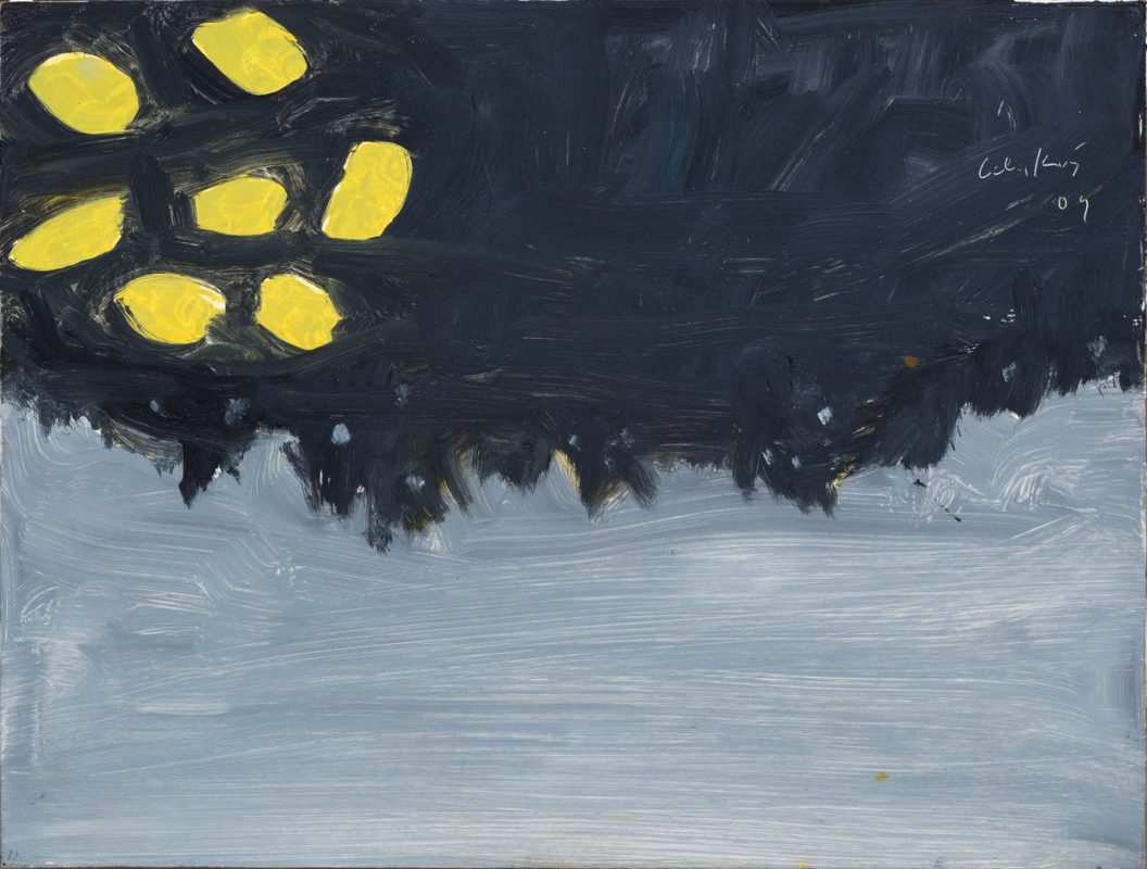
Alex Katz, Homage to Monet, 2009, via Andrea Rossetti, 2016

In the “How To Look At Art” series, Alexandra Kosloski guides readers through the multifaceted journey of art appreciation, fostering a deeper understanding of the emotions and stories woven within the work.

“Fundamentals are the building blocks of fun”

Mikhail Baryshnikov

To begin to understand a work of art, it helps to know any context you can, including the artist’s name, the title of the artwork and the year it was created. This information is often provided, which is useful in considering the historical context, like why the artwork was created, who it was created for, and what movement it was a part of. These details can lay the groundwork for how to look at art. For example, the identity of the artist, or the era they are from may have a large impact on the meaning of their work. Sometimes I look for this information first, and sometimes I look for it last so I can look at the artwork without any preconceived notions. The more artwork you look at, the more you’ll begin to recognize automatically, like the style of a specific movement.
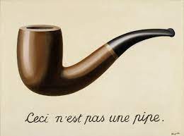
Look at the work and think about what you see. Also, think about what you don’t see. Try to look at art without immediately projecting your feelings or interpretation onto it. It may not be what it first looks like. Meaning can come to you very softly and slowly, you don’t have to rush to that point. First, observe the content–  who or what is on the canvas and how is it presented? Notice all of its parts. Then consider how the artist manipulated the content and what they might be trying to communicate through it.
Keep an open mind. You should always assume that the artist meant to make the work look that way. If the painting looks weird, the artist wanted it to look weird. It’s not every artist’s goal to make a painting look representational or naturalistic.
Rene Magritte, The Treachery of Images, 1929, via MoMA

It’s a matter of style. Style can be dependent on the individual or the culture. Sometimes art is idealized, meaning it looks somehow more perfect than reality. Sometimes, art is expressionist, which usually looks a little chaotic and wild, and is meant to communicate emotion. Sometimes art is entirely abstract and is only expressive marks or random pieces. Don’t assume the artist didn’t have the skill to make art lifelike, beautiful, or the way you think it should look. That’s irrelevant. If you’re focused on what you think it should be, you’ll miss out on what is actually there.

Jamie Nares, Back Then, 2021

Then, try to use your observation to piece together what is being depicted. Consider the figures and what they represent, and if there is a narrative or theme being portrayed. Make connections to what you already know. If the work is abstract, observe the marks made by the artist. What is the overall mood of the artwork? How does it make you feel?

In Part 2, we continue into a more detailed analysis of art.

Continue to Part 2

How To Look At Art: Visual Analysis Read More »

Editorial

On Message Off Grid (March 2022)

Performance at On Message Off Grid

March 2022

On Message Off Grid was a 2022 installation by Jona Cerwinske in collaboration with the Trops in New York City. Presenting works created in situ, On Message Off Grid showcased the gallery format as the ultimate studio visit as the artist created additional works across the streetscapes of NYC. 

Plato’s allegory of the cave was intended to show  “the effect of education and the lack of it on our nature.”

The allegory consists of a family who has lived their whole lives in a cave with no natural light. The only things they see are shadows cast on the wall by a fire. They see these shadows as real figures and learn from them as if they were aspects of real life. One day, someone finds a way out of the cave. They first are overwhelmed by the light, and soon realize that what they were looking at were the actual forms of the shadows they had been seeing their whole life in the cave. 

When the person goes back into the cave and tells the other about his discovery, they become angry and do not want to see his reasoning, plotting to kill him. The purpose of the allegory of the cave is to show that the reality of life often contrasts with the version of it that we interpret.

“I create in a marriage of two art forms that rebel against each other. I come from a generation when galleries did not accept anything from the street. And, vice versa, the street wanted nothing to do with the galleries. I had to experiment with what that looked like, combined.”

Jona Cerwinske

On Message Off Grid (March 2022) Read More »

Exhibition

NYC Parks: Central Park (Part 3)

Lithograph by Julius Bien, Central Park (Summer), 1865, via the Met Museum

Central Park, and all of its features and amenities, demonstrate the intent that designers Olmsted and Vaux had in 1858– to create a social space where New Yorkers could come together to connect with nature and enjoy arts and culture. The vast park contains listless hidden gems and art drops, but below are a few highlights. 

The Literary Walk

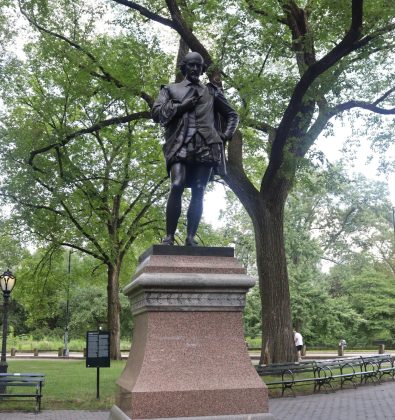
The Mall and Literary Walk is the wide walking path lined with trees and benches, located mid-park at 66th St. The path is renowned– it was part of Olmsted and Vaux’s original design of the park. Today, it is populated with vendors, musicians, and artists, it has been featured in many of the famous movies filmed in Central Park, and the path leads the way to many favorite spaces in the park. It is named the “Literary Walk” because of the sculptures of notable writers that it features, including William Shakespeare, an art drop that can be found using the Trops Mobile app.

William Shakespeare, Photo by Avery Walker

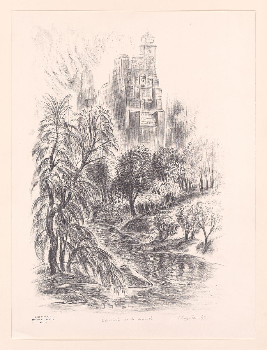
Chuzo Tamotzu, Central Park South, 1935, via the Met Museum

The Metropolitan Museum of Art

Located on the edge of Central Park facing 5th Avenue, The Metropolitan Museum of Art is a significant and beloved institution of art history in New York City. The museum has one of the largest collections in the world, with a diverse and endlessly fascinating breadth of art works. Between the Met and Central Park’s Great Lawn sits the obelisk known as “Cleopatra’s Needle”.

“The Indian Hunter”

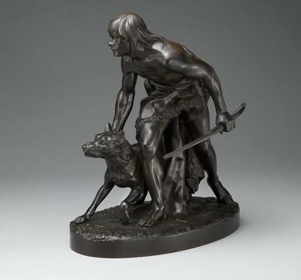
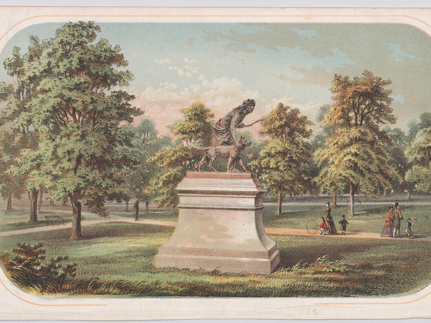
“The Indian Hunter” by John Quincy Adams Ward, was first built on a smaller scale before it became the life size bronze monument that we see in Central Park today. The Met Museum describes some of the history surrounding the statue:

With his statuette of a Native American youth and his dog, Ward answered the call for sculpture modeled by home-based, rather than expatriate, artists in a realist style. He imagined an Arcadian hunting scene, a stark contrast to the reservation system by then established to confine Indigenous peoples to U.S. government-specified tracts of land.”

John Quincy Adams Ward, The Indian Hunter, 1860, via the Met Museum

Anonymous, Central Park, Statue of The Indian Hunter, 1860, via the Met Museum

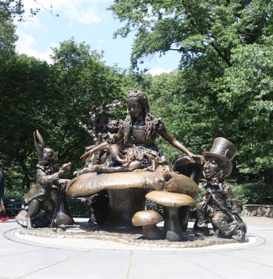
José de Creeft, Alice in Wonderland, 1959, Photo by Avery Walker

Conservatory Water 

Many water features can be found in Central Park, and the Model Boat Pond at Conservatory Water is a popular favorite. Visitors can watch the races of miniature boats and yachts on the pond, and it is an ideal place for relaxing. The scenery also draws guests towards one of the most adored statues in Central Park, Alice in Wonderland. 

The sculpture was donated by philanthopist and publisher George Delacorte, as a gift to the children of the city and in honor of his late wife, who loved literature and would read “Alice’s Adventures in Wonderland” to their children.

Find “Cleopatra’s Needle”, “The Indian Hunter”, “Alice in Wonderland” and many more art drops and hidden gems on the Trops mobile app, available in the app and google play store.

Video by Avery Walker

NYC Parks: Central Park (Part 3) Read More »

Public Art

NYC Parks: Prospect Park (Part 2)

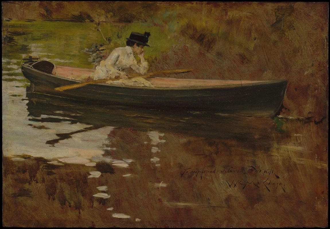
William Merritt Chase, Alice Gerson in Prospect Park, 1886, via the Met Museum

Prospect Park, the crown jewel of Brooklyn, NY, is admired by tourists and adored by locals. The green space, spanning 585 acres, is nestled in the middle of several charming Brooklyn neighborhoods. Since its opening in 1867, the park has been a place of leisure for New Yorkers in the busy city. Below is a guide to some of Prospect Park’s art drops. 

Grand Army Plaza

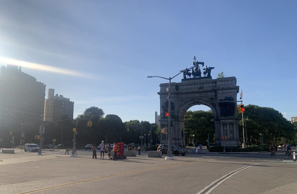
Reminiscent of Paris’s Arc de Triomphe, Grand Army Plaza features an arch in honor of Union Civil War soldiers. The space holds the Grand Army Plaza Greenmarket, open on Saturdays year round. Grand Army Plaza serves as a striking transition from the city to the verdant park.

Grand Army Plaza, Photo by Avery Walker

Lookout Hill

Lookout Hill is the highest point in the park, and offers a beautiful panorama view of Manhattan and Brooklyn. A great time to visit is in the late fall, after most leaves have fallen, and the hill has the best visibility. There, you can also find the Maryland Monument. This art drop is a tall Corinthian column that commemorates the Maryland 400, the group of Maryland soldiers who fought at Lookout Hill almost a hundred years before the park opened.

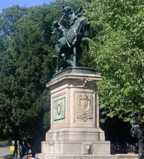
The Horse Tamers, Machate Circle, Photo by Avery Walker

Machate Circle

Machate Circle is the grand south entrance of Prospect Park. Like Grand Army Plaza, designers Olmsted and Vaux envisioned the space to be a palatial transition from busy city to peaceful park. Here, you can find “the Horse Tamers”, using the Trops mobile app. This entrance leads right to the Prospect Park Lake, a popular place for fishing and leisure.

Hiking Trails

Prospect Park features several hiking trails. As the weather cools, fall is the perfect season for hiking and spending long hours out in the beauty of nature. See the leaves change in Brooklyn’s oldest forest.

Find “The Horse Tamers”, “The Maryland Memorial”, Grand Army Plaza and more art drops and hidden gems on the Trops mobile app, available in the app and google play store.

NYC Parks: Prospect Park (Part 2) Read More »

Public Art

NYC Parks: Olmsted Parks (Part 1)

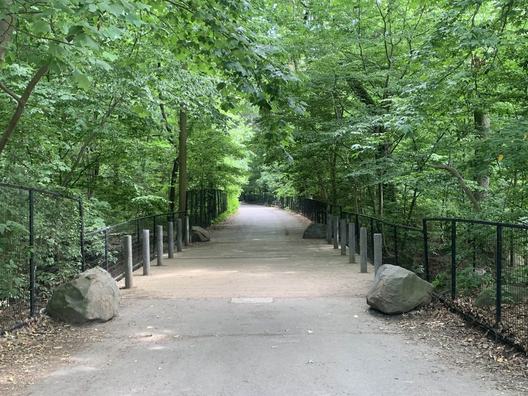
Prospect Park, Photo by Avery Walker, 2023

Frederick Law Olmsted is widely recognized as one of the most influential landscape architects in history. Together with his partner Calvert Vaux, Olmsted created iconic designs for New York City’s Central Park and Prospect Park, leaving an indelible mark on urban landscapes.

In 1858, Olmsted and Vaux’s design for Central Park was selected through a competition, chosen over 32 other entries. Their vision was a departure from the prevailing Victorian-era park designs characterized by geometric patterns and ornate features. Instead, Olmsted aimed to create a practical park that embraced the natural landscape, incorporating native plants and offering an escape from the bustling city. The design prioritized harmony with nature rather than asserting human dominance over it. The result was a revolutionary concept that introduced an idealized version of nature within an urban setting. Central Park’s winding paths, tranquil ponds, and wide green spaces provide respite for residents and visitors alike.

Olmsted’s influence extended beyond Central Park. Prospect Park in Brooklyn, also designed by Olmsted, was similarly intended to serve as a sanctuary for city-dwellers seeking solace in nature. Constructed in one of the most densely populated areas of the country, Prospect Park provided a much-needed escape and a source of inspiration for the local community. 

Beyond the immediate impact on New York City’s landscape, Olmsted’s work elevated the profession of landscape architecture itself. He brought a visionary and artistic approach to his designs, recognizing the importance of creating spaces that not only served practical purposes but also resonated with people on a deeper level. 

Frederick Law Olmsted’s legacy lives on in the enduring beauty of Central Park and Prospect Park, as well as in the countless parks and landscapes that have been inspired by his innovative designs. His commitment to blending nature with urban environments continues to shape the way we perceive and interact with public spaces, reminding us of the profound impact that thoughtful design can have on our quality of life.

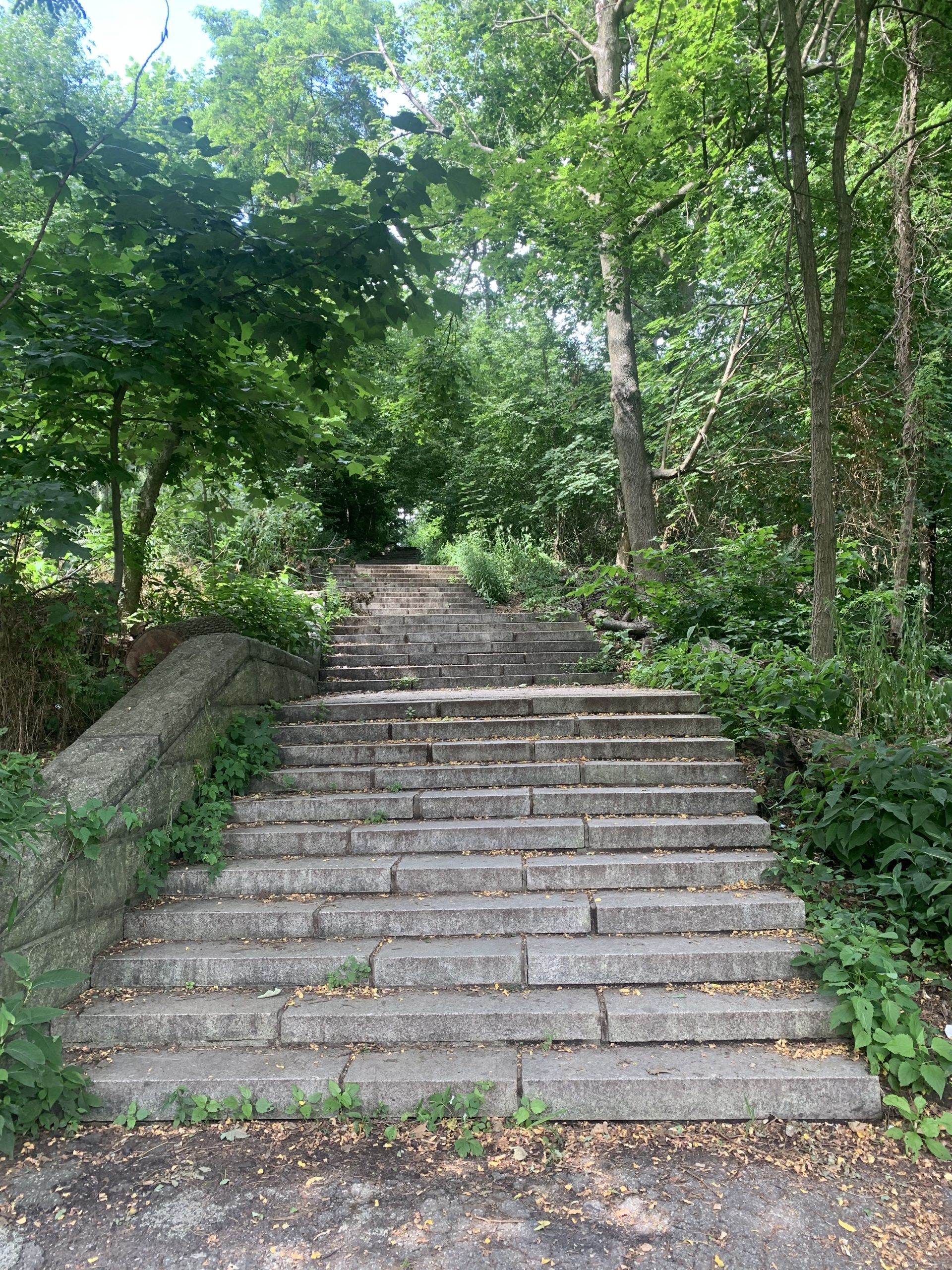
Prospect Park, Photo by Avery Walker, 2023

Embrace the spirit of adventure with the Trops mobile app and unlock the hidden gems of your community, like the enchanting parks of New York City. The Trops mobile app is a guide to new art drops experiences. This fall, step outside, breathe in the fresh air, and let Trops be your ultimate companion. Download the app now and let the adventures begin.

NYC Parks: Olmsted Parks (Part 1) Read More »

Public Art

An Interview with Sante D’Orazio (Part 2)

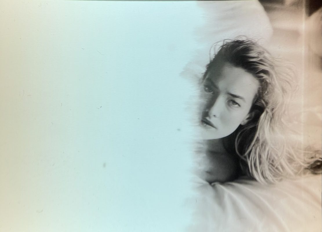
Tatjana Patitz, Photo by Sante D’Orazio

D’Orazio’s world is populated by supermodels, actors, rock stars, and icons. His +30 year career has seen concurrent themes of eternal youth, stunning beauty, and rock and roll. D’Orazio’s portfolio is a mixture of informal and posed – an uncensored and provocative trademark. Since he first shot for Italian Vogue in 1981, D’Orazio’s work has been published in the likes of Andy Warhol’s Interview, Italian, French and British Vogue, Vanity Fair, and GQ among others.

In part 2 of their 3 part interview, Sante D’Orazio tells Alexandra Kosloski how he broke into the fashion industry, and shares the best advice he ever received.

Continued from Part 1

AK: What was your thought process behind pivoting from commercial work to a more personal art practice?

Sante D’Orazio: Well, commercial work is usually directed. They made the choices, it had nothing to do with me afterwards. I was usually directed by someone who didn’t have the talent to direct. I always said just because the word “art” is in their title, doesn’t mean they know anything about art. 

AK: And so how would you handle that?

Sante D’Orazio: The thing is, they always wanted something that they recognized and was easy to replicate. I always tried to give them what they wanted, and then I’ll give them something else that might be really good and different. But they already set their mind to what they’re familiar with. Nine out of ten times they go with that. That’s commercial. They go with what’s familiar. There might be something better, but it doesn’t matter.

AK: Even though you can offer something that might exist beyond their taste.

Sante D’Orazio: Yeah, but that’s the nature of commercial work. I was so stupid, I was always trying to make it better, and I allowed myself to get frustrated, and there was just no need to put myself through all that. In retrospect, it’s like, come on, just do it and go home. Make life easier for yourself. There’s a time and place for certain things. You’re doing a commercial job. I would sometimes have to call up my agent and say “how much am I getting today?” Just so I could put up with it.

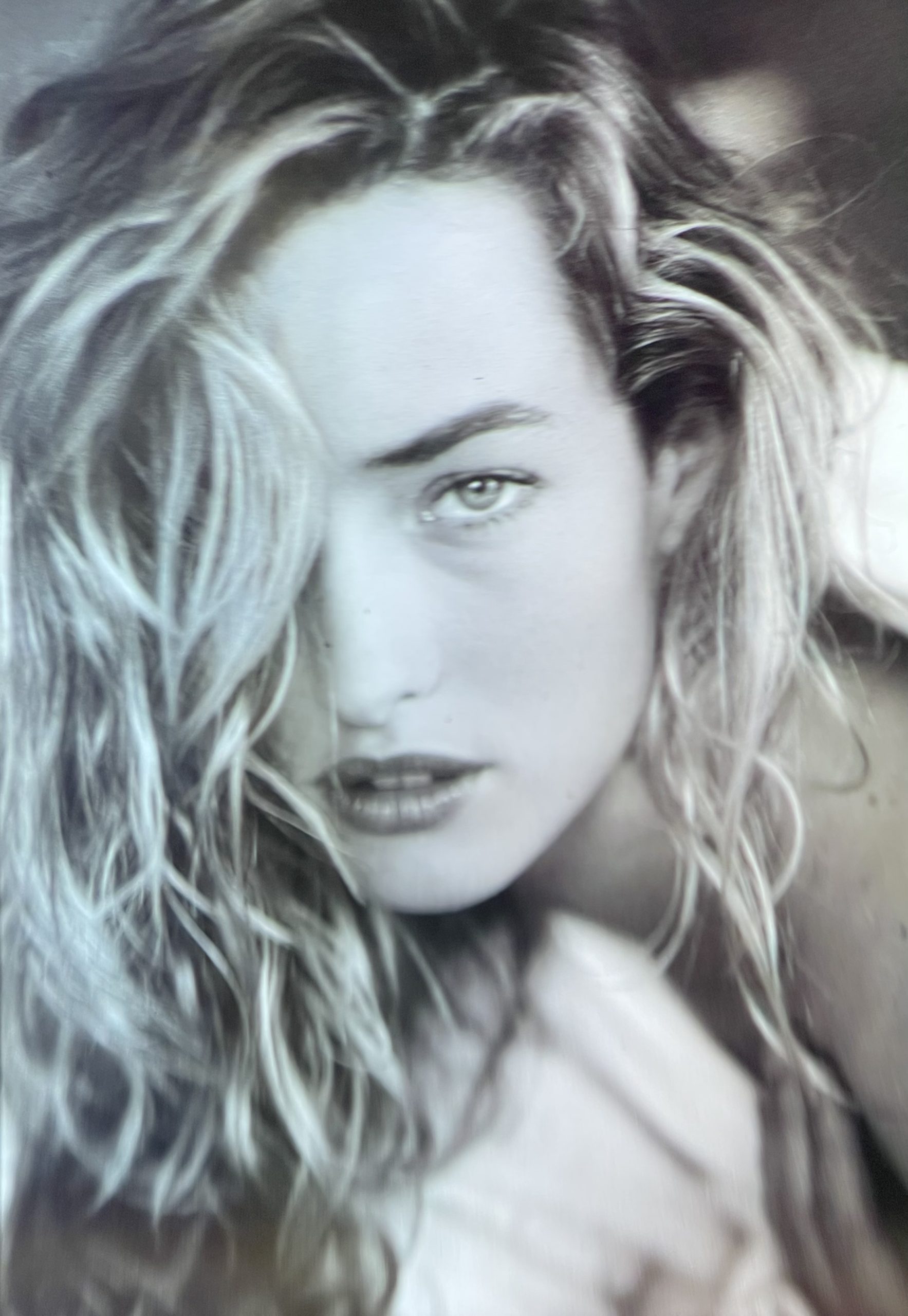
Tatjana Patitz, Photo by Sante D’Orazio

AK: Who do you create art for?

Sante D’Orazio: I still have to do it for me. I’m looking for something within myself. I’m still that foolish kid, dealing with the commercial world and fighting it. I’ve learned not to listen to all the naysayers. You make something that’s unique to you, and the naysayers are the ones that you like and respect, who tell you “Nah, that’s not really that cool.” And you believe that? That’s the worst thing you could do. You have to believe in what you did, and you have to develop it.

That’s the definition of contempt; to make less of another, to make more of yourself. I had a mentor in photography, and he made me write certain things and stick them to my wall, and that was one of the things. “Contempt is making less of others to make more of yourself.” You never do it. And then the other thing that I’ll always remember is that he said, “Let the obstacles be your guide. It leads you to places you would never have gone on your own.”

AK: And that was some of the best advice you’ve ever got?

Sante D’Orazio: Yes.

Geometric painting by Sante D’Orazio, 2021

AK: Could you talk a little bit more about him?

Sante D’Orazio: Lou Bernstein. He said he was the only Jewish man in Brooklyn with an Italian son. He belonged to the New York Photo League, they were the photographers that did street photography as we know it in New York City. I didn’t know his work at the time. He saw me going to art school, I was going to the Art Students League, and he saw me with one of those big portfolios. I told him what I was doing and he asked me if I wanted to learn photography. Yeah. He had a class up in this attic apartment on East Fifth Street in Brooklyn, and he taught three students on a Friday night. And on the weekend, I would go with him out in the street, wherever there were people gathered. He wanted me to shoot alongside him so I could see what he was looking at. He would point things out, learning how to anticipate a moment. You start putting it all together, and we go from there.

AK: Before you had met him, you had been painting?

Sante D’Orazio: Yeah, I started out painting. I had to figure out in high school what the hell I wanted to do, and the only thing I knew how to do naturally was art. So I went to community college for art direction, and I hated it. Then I transferred over to Brooklyn College for fine art, and those were my best years in college. I met Phil Pearlstein, who was one of the leading artists in figurative painting, and I became his assistant. When I graduated, I had to figure out, what am I going to do now? I had a cousin, who was a well-known hairdresser in the city, who was always telling us stories of all the glamorous people that he was doing hair for. It seemed like a world away, but he encouraged me to go into fashion, so I gave it a try. I put together a portfolio of ten life drawings of nudes, ten pictures that looked like ten different photographers took them, and ten pictures of whales from the aquarium.

AK: You’re laughing, but I saw those pictures and I think they’re great.

White beluga whale at Coney Island Aquarium, Photo by Sante D’Orazio, 1975

Sante D’Orazio: Thank you. Those were my first photographs. And so I put them all in the portfolio. Who do I go to first? Avedon Studio. Didn’t get past the secretary. And then I went to Irving Penn and didn’t even get past the intercom. And then one blizzard of a day, I went to Scavullo, and I got into the door, and the first person I saw was Scavullo, himself. And he’s like, “What do you want?” I was like, “I want to be an assistant”. He’s like, “Get out of here”. I thought to myself, I gotta rethink this.

AK: So how do you come back from that?

Sante D’Orazio: I eventually got a job as a gofer at a commercial studio, with a commercial photographer who borderlined fashion advertising. He worked with famous models on advertising shoots. My job was to mop the floors, clean the dishes, go for whatever was needed, and I was just happy to be in the studio. I was making $75 a week. I didn’t care. I got in the door.

Adrianna Bach, Photo by Sante D’Orazio, 2015

I worked in that studio and I made friends with other assistants, and once in a while they would take me out with them to Studio 54, and the floodgates opened up. I told a friend that I would go to Italy with him, because somebody wanted to work with him there. We planned a trip to Milan, and I gave notice at my job and saved 1500 dollars, which was a shitload of money for me. And the night before, he bailed on me. I didn’t know what to do, so I just said, “Fuck it, I’ll go”, and I went on my own. I didn’t even know where the magazines were. I didn’t know of any hotels. I got a room with a neon sign that flashed and buzzed, like in a film noir. I put my suitcase down and didn’t even open it. I couldn’t even go home. 

I ordered a big pitcher of beer, and I got myself shitfaced, and who walks by is a photographer, who I had assisted. He’s like, “Why are you in that hotel? Stay in my hotel, with all the models and the young photographers.” He goes, “I’m going to Portofino tomorrow with my girlfriend for the weekend. Why don’t you come with us?” I was like, “Oh, God, thank you.”

I took my luggage over there, and went to Portofino. He gave me the name of all the agencies, all the magazines and everything I needed to know. It was a godsend. I checked into the hotel on Sunday night, and Monday was the next day. And the photographer said to me, “Look, there’s no work. I’ve been here for three months. I have to go back, there’s nothing happening.” I said to myself, I’ll take my shitty portfolio and go to Italian Vogue. And when they say no, I’ll get on the train and go visit family. 

I go to Italian Vogue and they let me wait for the art director. He looked at the portfolio– the whales, the drawings, ten pictures that looked like ten different photographers. And then he goes, “Wait here. I’m going to wait for the beauty editor to come”. She came and they talked to each other, this and that, and they gave me two double pages to do nudes for Italian Vogue Beauty. So on my first day there, I got that job. Because they were creative, they saw nude drawings that I did, they saw I could draw a sensual line, they saw the whales that were sensual, and they saw in the ten different photographs that I could light.

AK: They see skill, they see good composition, so they can make the connection.

Sante D’Orazio: They were creative. That’s what you don’t get here in the States. And that was the beginning of my career.

AK: So do you remember that photo shoot?

Sante D’Orazio: Oh, yeah. There were two nudes on how to tan yourself. One was in natural light, and one was in the sun bed. So that was all blue lights. And the other one was in the sunlight. So you turn the page, one was all orange and yellow and one was all blue. I had to wait the entire month to shoot it, but in the meantime, I got to meet all the agencies, all the important people. Then it was the end of July, and nobody works in August, so I went home. I had to wait two and a half months for the magazine to come out in the U.S., and I went back to work as an assistant, saved more money, and went back to Milan again in February. So that was the start of my career.

Irina Shayk by Sante D’Orazio for CR Girls, 2016

Continue to Part 3

An Interview with Sante D’Orazio (Part 2) Read More »

Interview