Editorial

Xingzi Gu’s “Pure Heart Hall”

Installation view of “Pure Heart Hall” by Xingzi Gu at Lubov Gallery

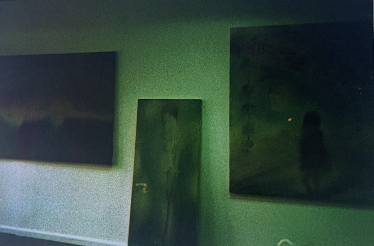
I love when a gallery is in an off-beat, walk-up, possibly residential building. I like when you have to be buzzed in, or make an appointment, or be led by only a small, inconspicuous and un-explaining sign with the name of the gallery on it. It adds a little suspense to your average city gallery day. This was the case for “Pure Heart Hall” by Xingu Gu at Lubov Gallery, running from April 27th- July 13 in Chinatown, NYC. 

I usually find new artists and gallery openings because I keep my eye on art in the city. This time, I found an image of a painting by Xingzi Gu online– “Rouge”. I thought it was so beautiful, I loved the way the artist treated the paint. I loved the way the figure was treated. It all felt very fresh to me.
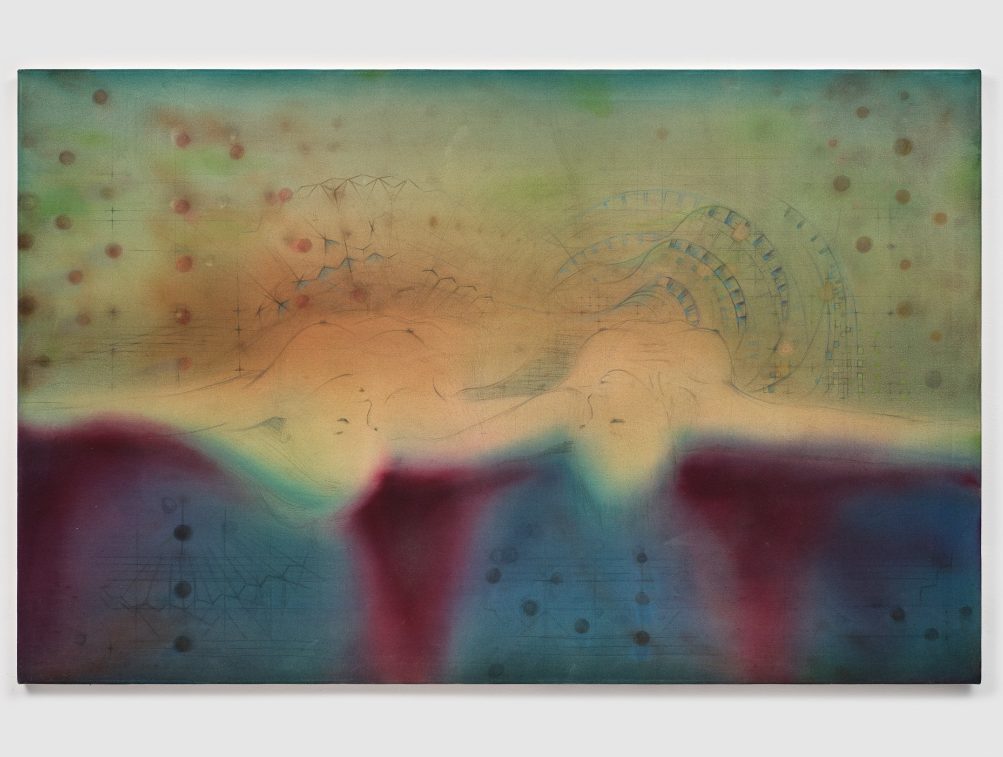
Xingzi Gu, Landline, 2023-24, via Lubov Gallery

The physical quase-inaccessibility of the show lies in discord with the press around it. I was easily able to find more works, and more about the artist, who shared their views on their understanding of the body and its aura, and how that manifests in their paintings. All very interesting. I had such good fortune that there was a recently opened exhibition of the artist’s work near me.

The paintings were in oil and acrylic on canvas, applied thinly, which added luminosity to the paintings and didn’t conceal the delicate pencil and raw canvas underneath. Some paintings were hung and some were on the floor, leaning against the wall. The figures of the paintings were youthful and somewhat ambiguous, surrounded by vaporous auras of color. They had geometric or botanical motifs and the fantastical scenes suggested the spiritual. The narrative feels open ended, which only further draws the viewer into the haze.
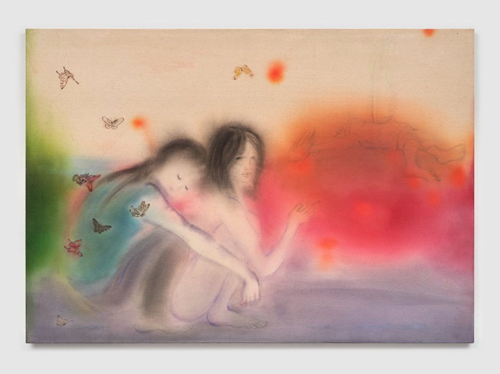
Xingzi Gu, Untitled (Ruddy or Ruddy Ice), 2024, via Lubov Gallery

Xingzi Gu’s “Pure Heart Hall” Read More »

Editorial
How To Look At Art: Design Principles

Bronze statuette of a hound gnawing a bone, Greek, 3rd–2nd century BCE, via The Met

In part 3 of the “How To Look At Art” series, Alexandra Kosloski uses formal elements to bring together the units of visual language.

Continued from Part 2

Design principles are terms to communicate how the formal elements are used, and what kind of effect that has on the work and the viewer: balance, rhythm, proportion and scale, emphasis, unity and variety.

Balance

Balance results from the manipulation of visual weight within a composition. A part of an artwork that is large, more detailed, or more intense in color has more weight. If a piece of art has symmetrical balance, that means weight is distributed evenly, as opposed to uneven elements which are asymmetrical, or when elements radiate out of a central point which is radial balance. Symmetry will often seem harmonious, asymmetry may seem more dynamic, and radial symmetry may even seem mystic.

Sedefkâr Mehmed Ağa, Dome, Blue Mosque (Sultan Ahmed Mosque), completed 1617, Istanbul via iStockPhoto

Rhythm

Patterns can be used to communicate rhythm through repetition, or by leading our eyes through a composition. Visual rhythm can be regular, alternating or eccentric, and a work may have different combinations of the three to express the right pace and movement in the work.

Terracotta fragment of a kylix (drinking cup), Greek, 500-490 BCE, via The Met

Proportion and Scale

Proportion is the relative size of part of a composition. Artists may study proportions so they can create life-like drawings or they may subvert proportion to try to express a new perspective. Scale is when the artist plays with the size of something and our expectations of it, a device that often occurs in sculpture, but can appear anywhere. A large painting with large subject matter will approach the viewer and feel quite intimate, as opposed to a very small painting, which won’t have as much room for detail.

 42-meter inflatable sculpture by KAWS, 2021, Marina Bay in Singapore, Photo by Roslan Rahman/AFP/Getty Images

Emphasis

The part of the work viewers are meant to focus on will be most emphasized. The artist can make the focal point stand out in many ways by employing the elements of art, like adding a bright accent of color to an otherwise dull photograph.

Hierarchy is a useful tool, related to both proportion and emphasis. When looking at religious art, the figure most high or with the most emphasis is the holiest. When looking at advertisements, the most important object or message will have the most emphasis.

Andy Warhol, Detail of The Last Supper, 1986, Andy Warhol Foundation for the Visual Arts, Inc./Licensed by Artists Rights Society (ARS), NY

Unity and Variety

Unity and Variety are counterparts, and the balance of the two is what makes art interesting to look at. Unity is achieved when elements, like color, are all of the same nature. Variety adds contrast and spontaneity.

Keith Haring, Save Dauphine, 1988, via ArtBanx

The purpose of all of this is communication. Artwork can express something very specific, like a well known myth, or something intangible, like ecstasy. By familiarizing ourselves with the ways artists communicate, we can have better visual literacy, which adds depth to the world around us. When we understand art, we can better understand architecture, advertisements, movies, and all of the visual elements of our everyday lives, as well as having true appreciation for the previously unattainable fine art.

How To Look At Art: Design Principles Read More »

Editorial
How To Look At Art: Formal Elements

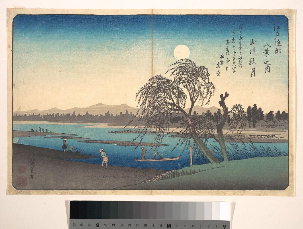
Utagawa Hiroshige, Autumn Moon on the Tama River, Japanese, ca. 1838, via The Met

Diving deeper into the art, Alexandra Kosloski uses design principles to unpack the language within visual compositions in the “How to Look at Art” series.

Continued from Part 1

Moving past the basics of visual analysis, we can look into the work for the formal elements and the principles of design. The formal elements of art are basic terms we use to communicate visually; line, light, color, shape, pattern, space, and time.

Line

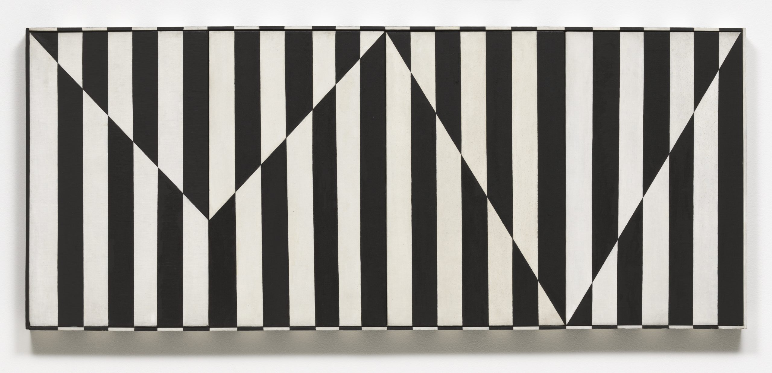
Linear marks made by artistic mediums like paint or pencil are actual lines. Implied lines are not made physically but still can make up the composition– dotted lines that don’t connect, the horizon in a landscape, the pointed hand on the outstretched arm of a figure.

Carmen Herrera, Untitled Estructura (Black), 1966/2016 © Carmen Herrera; Courtesy Lisson Gallery

Notice the vertical actual lines and jagged, horizontal implied line in Herrera’s work.

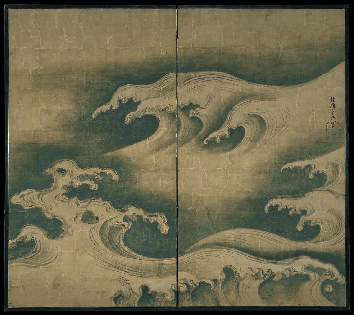
The direction of lines can indicate meaning. Viewers can draw from their own real world experience. Horizontal lines, like a sleeping body, could indicate rest, peace, or inactivity. Vertical lines may suggest aspirational reaching or standing at attention. Diagonal lines would suggest action, like all the diagonal lines of a runner. Curving lines may suggest movement, or the organic lines of nature. Line quality– if a line is thick or thin, or sketchy or bold– can also convey meaning.

Ogata Korin, Rough Waves, ca. 1704-9, Courtesy Met Museum

“Rough Waves” strives to capture the amorphous tide in ink.

Light and Value

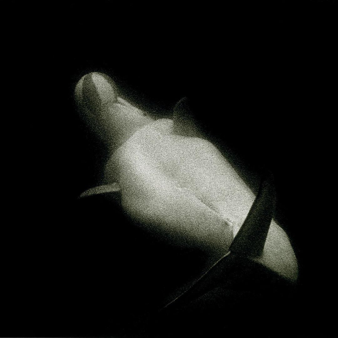
Art may utilize natural and artificial light, like in sculpture or architecture. In 2D art, artists use value to represent shades of light and dark. Artists manipulate light to create form by mimicking shadows and plasticity in 3D objects. Value can also portray emotion. For example, high contrast visuals look dramatic.

Sante D’Orazio, White Beluga Whale at Coney Island Aquarium, 1975

The harsh contrast between light and dark brings intensity to the mood of the photo.

Color

Color consists of three properties. Hue– the state of a color, like red or blue; value– lightness or darkness within a hue; and intensity– the dullness or saturation of a hue. Color can be warm or cool, which affects the viewer’s experience. There is a lot to learn about color theory because color is so subjective. It interacts with its environment and the colors around it, and can be very complex. Color is also largely symbolic, like the colors of a nation’s flag, or red being the color of passion.

Josef Albers, Homage to the Square: With Rays, 1959, © 2016 Artists Rights Society (ARS), New York

The interaction between the colors causes our eye to see them differently.

Texture and Pattern

Texture can be tactile or visual. A marble sculpture of a figure would be physically smooth to the touch, but visually, the artist might represent soft flesh or sinuous muscle. Texture and pattern are related, as pattern may be perceived as texture and vice versa. Pattern is an arrangement of repeated form, and they can be natural, like in leaves and flowers, or geometric, with mathematical shapes and lines.

Egyptian, Leaf Pendant, ca. 1390–1352 B.C., Courtesy Met Museum

The pattern is meant to mimic the appearance of a natural leaf and add texture.

Shapes

Regular shapes are often geometric and identifiable like triangles and squares. Irregular shapes are organic and spontaneous, like a patch of light or a mark made by a paintbrush.

James Turrell, Meeting, 1980-86/2016, at MoMA PS1, Copyright Hugh Pearman

The shapes create the space of the architecture around the viewer.

Space

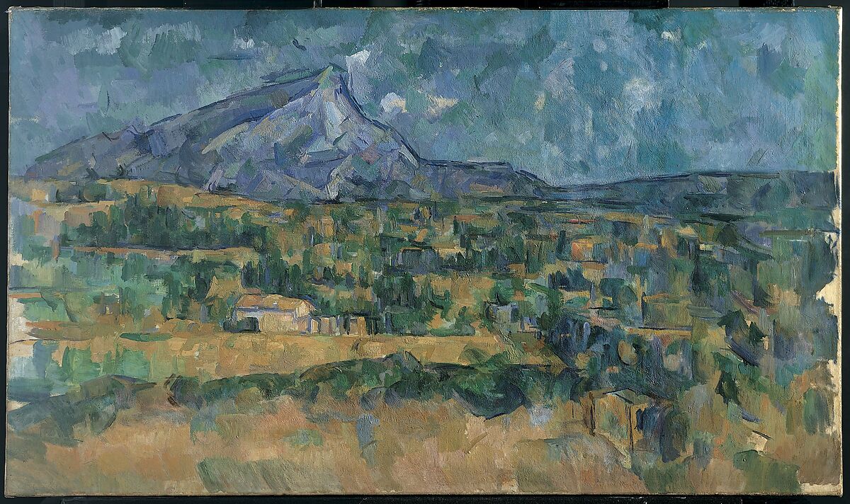
Artists can portray space in 2D art by employing one of many illusory techniques, like by manipulating vale or scale. A complex technique is by taking advantage of perspective. There are a few methods of perspective, but generally, the artist considers the natural experience of a viewpoint and tries to mimic it– or, as popularized by the cubist movement– defy it. 

Paul Cezanne, Mont Sainte-Victoire, 1902-6, Courtesy Met Museum

The blue mountain seems far away, past the houses.

Time and Motion

Time and motion functions differently across mediums. As we view sculpture, we observe several viewpoints as we move through or around it. Painting and drawing can have an illusion of motion through mark making. Film, dance, and other performance depend on time and motion.

Gian Lorenzo Bernini, Apollo and Daphne, 1622-1625, Photo by Daniel Kelly

“Apollo and Daphne” seems to have a sequence of motion as the viewer moves around the sculpture.

Next, we activate the formal elements by understanding how they make up design principles.

Continue to Part 3

How To Look At Art: Formal Elements Read More »

Editorial
How To Look At Art: Visual Analysis

Alex Katz, Homage to Monet, 2009, via Andrea Rossetti, 2016

In the “How To Look At Art” series, Alexandra Kosloski guides readers through the multifaceted journey of art appreciation, fostering a deeper understanding of the emotions and stories woven within the work.

“Fundamentals are the building blocks of fun”

Mikhail Baryshnikov

To begin to understand a work of art, it helps to know any context you can, including the artist’s name, the title of the artwork and the year it was created. This information is often provided, which is useful in considering the historical context, like why the artwork was created, who it was created for, and what movement it was a part of. These details can lay the groundwork for how to look at art. For example, the identity of the artist, or the era they are from may have a large impact on the meaning of their work. Sometimes I look for this information first, and sometimes I look for it last so I can look at the artwork without any preconceived notions. The more artwork you look at, the more you’ll begin to recognize automatically, like the style of a specific movement.

Look at the work and think about what you see. Also, think about what you don’t see. Try to look at art without immediately projecting your feelings or interpretation onto it. It may not be what it first looks like. Meaning can come to you very softly and slowly, you don’t have to rush to that point. First, observe the content–  who or what is on the canvas and how is it presented? Notice all of its parts. Then consider how the artist manipulated the content and what they might be trying to communicate through it.

Keep an open mind. You should always assume that the artist meant to make the work look that way. If the painting looks weird, the artist wanted it to look weird. It’s not every artist’s goal to make a painting look representational or naturalistic.

Rene Magritte, The Treachery of Images, 1929, via MoMA

It’s a matter of style. Style can be dependent on the individual or the culture. Sometimes art is idealized, meaning it looks somehow more perfect than reality. Sometimes, art is expressionist, which usually looks a little chaotic and wild, and is meant to communicate emotion. Sometimes art is entirely abstract and is only expressive marks or random pieces. Don’t assume the artist didn’t have the skill to make art lifelike, beautiful, or the way you think it should look. That’s irrelevant. If you’re focused on what you think it should be, you’ll miss out on what is actually there.

Jamie Nares, Back Then, 2021

Then, try to use your observation to piece together what is being depicted. Consider the figures and what they represent, and if there is a narrative or theme being portrayed. Make connections to what you already know. If the work is abstract, observe the marks made by the artist. What is the overall mood of the artwork? How does it make you feel?

In Part 2, we continue into a more detailed analysis of art.

Continue to Part 2

How To Look At Art: Visual Analysis Read More »

Editorial
How To Buy Art

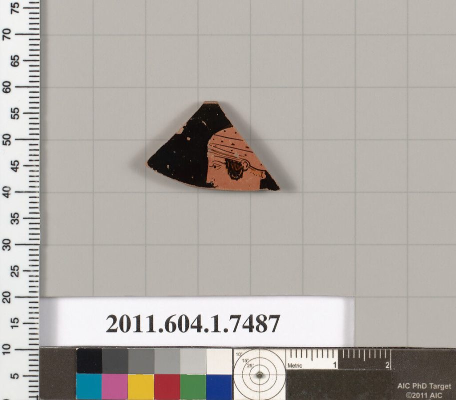
Terracotta rim fragment of a kylix, 460-450 BCECourtesy of the Met Museum

“I seek not good fortune. I myself am good fortune.”

-Walt Whitman

This may be the smartest advice on art investment you will ever read, and yet there will be no proofs, charts or diagrams. It is extracted from a full life’s experience, itself built on my father’s life’s experience, the wisdom of which he shared readily with anyone who would listen, but especially with me. It’s about collecting art from a love of art and not in order to make money. And while I can’t promise you will make money this way, as that is not the stated intention, I also can’t see how you would fail. Yet in the end, perhaps the greatest rewards are entirely impractical, utterly ineffable, and most enriching. If energy of work and bright ideas are represented by money, the energy of inspired genius and all the best of the human spirit is represented by art, so to trade the former for the latter, we are always getting the best deal. 

Maffet Ledger, 1874-81, Courtesy of the Met Museum

I hate to sound like a paradoxical fortune cookie so it’s best to draw from life experience examples. When I was a teenager I thought I was smart. So smart that I knew Picasso sucked, and that anybody who liked Picasso was stupid or brainwashed. Then my father was the middle man on a big Picasso deal and an important Picasso hung in our living room, replacing a particularly joyous Miro I loved seeing daily in passing. Now, this Picasso was so expensive that it was a special kind of ugly. That stripped down Madrid palette: black, white, gray and shitty ochre. Plus all the bells and whistles of distorted facial features. A travesty. I complained when it went up, passed it with a shudder and couldn’t wait for it to be sold, so we could reinstate the Miro, and probably fly to Europe for a celebration of the big sale as was our wont.

After a night of drinking I reclined on the sofa still swaddled in my blanket, eating a bowl of cereal and watching rap videos on MTV. I looked over at the horrible Picasso, back at Public Enemy… and then back at the Picasso. Something happened. A light went on. I can’t explain what occurred psychologically but probably something like a million brain synapses firing at once, and from that point on I could stand toe to toe with John Richardson and debate Picasso. And he was every bit as topical to date as my favorite rappers. I saw.

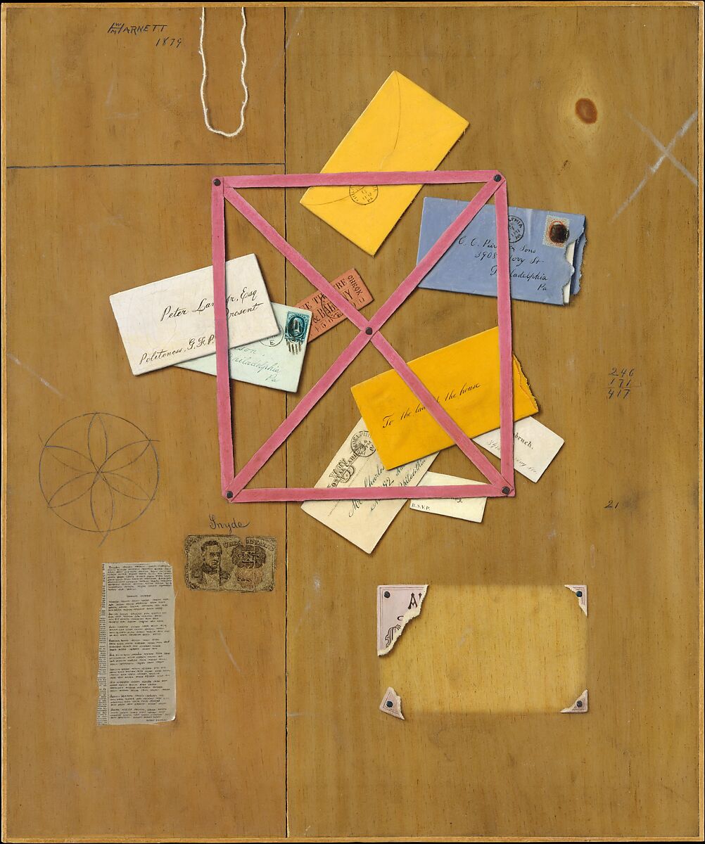
William Michael Harnett, The Artist’s Letter Rack , 1879, Courtesy of the Met Museum

I was a graffiti artist on the subway scene. Whenever the big guys in this underground movement had an exhibit above ground, Futura, Dondi, Rammellzee or Lee Quinones, everybody in the civilized world showed up. So as a card carrying member of this closed society, I thought of all the zillionaires and movie stars as mere hangers on. But then there came a wave of artists in their own right, very interesting ones, who brought a new kind of synergy to this popular avant garde. Luminaries like Keith Haring, Kenny Scharf, Richard Hambleton, Martin Wong, and David Wojnarowicz. This new wave of innovation was not driven by marketing or PR but– to use Robert Faris Thompson’s specialty term– because it was “cool”.

When Fun Gallery showed Basquiat we all went to the opening. Hands down one of the coolest guys downtown. Neck and neck with Rammellzee. The paintings that still smelled of fresh oil stick were $1,200 or maybe just an even grand. And Dad and I were in that group of New Yorker insiders, with money to spend, yet none of us, nobody… bought one. 

Strangely, nowadays collectors only want to buy a Basquiat. It’s seen as safe, as blue chip. A (cringe) status symbol. I even meet people who want to make a million dollars SO they can buy a Basquiat. To buy and live with a Basquiat absolutely has value today, such as if one bought a Picasso or DeKooning, the investment should appreciate, and the art will radiate its riches. But clearly the best time to buy was at that Fun Gallery show. When the work was new, the ideas were raw, the artist was alive, young and hungry, living dangerously and needed the sale. Again, nobody bought one.Basquiat, in the arc of his mayfly short life, enjoyed success. However, we continually fail to recognize and support young artists, specifically, and art as a whole when we are not there to applaud a genius on their debut on the world stage.

Excluding most of the artists present at the Fun Gallery opening, everyone in that room could have afforded a Basquiat or ten, would have helped the world to be a more beautiful place, and oh my– was there a dollar to be made. But even the rich never seem to be rich enough to invest in art where it counts, in that unpredictable liminal phase, where the work is exciting and not yet market proven.

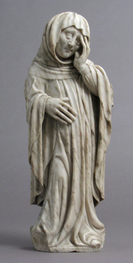
Pere Oller, Mourner, ca. 1417 , Courtesy of the Met Museum

It takes a hero, like that great collector couple. I forget their names, but I watched the documentary- the husband drove a taxi for a living. They loved art and went to all the openings together. They would fall in love with a picture, say a Rauschenberg, and tell the gallery they would pay it off little by little, from paltry wages. In this humble way this enchanted couple cobbled together a world class collection and became fabulously wealthy, but most importantly, lived surrounded by the powerful magnetic field of their passions. 

My father left a stint in the military to hang around the Abstract Expressionists, Beat Poets and Be-Bop musicians, and caught the tail end of all that. He was a teenager working in an art supply store when he met Warhol, who was then still in advertising. Andy asked Pops to take a freshly minted soup can for a walk up Madison Avenue to see what he could get for them. It’s mentioned in the diaries later that “Rick Librizzi [dad] sells my prints too cheap”. And dad was never all about the money, but later I think it did affect him when we sat at Christie’s watching works he sold at 30 or 50K skyrocket to Lotto jackpot figures. Either that or his seat was very uncomfortable.

Nevertheless, he rationalized it, recalling that was the year we rented the suite at the Negresco with the sea view like Matisse. After all, Pops was born dirt poor and believed you could never make every dollar, but had to get some life lived while you had the chance. Maybe I’m wandering off topic a bit, but staying rooted in experience is the best way to show, not tell, the many ways collecting art enhances our human experience. And to invest means not just our money, but our energy, power to believe, and generosity in humble open mindedness, so that even dressed in rags we know an angel when we see one.

When I lived with my dad it was only a matter of time before calls came in from museums requesting the loan of some painting he had paid, literally, fifty dollars for, so when I came of age, I made it a point to collect every notable talent at the moment they emerged from the woodshed. True, some artists materialize on the scene, to be lauded as the toast of the town for a season, only to be damned to obscurity afresh by autumn. And if intrinsic value is anything, qualitatively some of my favorite works come from fringe names that may be lost forever to time, like some anonymous Egyptian or Greek hand. But with every crop of promising talents there is generally one, sometimes two, or in a blessed vintage three who keep at it, and keep striking that sweet spot of relevance until they become household names. This is when your head and heart can agree that your time and energy was well spent. The rise of the one artist who establishes a market pays for the lot of investments, and perhaps your own celebratory tour of European capitals on payday.

Nesting Bowl, 460-450 BCE, Courtesy of the Met Museum

Along with the dilettante who brags about a sound investment in secondary market stock, is the novice Art Historian who can downplay Picasso’s importance, perhaps citing some of his horrible personality traits, chats to be enjoyed while waiting in line for a table at the latest celebrity chef eatery, drawn in by glowing reviews heard on a television program. An entire art-world whose stance is anti-innovation, or even anti-Art. Art as a luxury item. But to venture out as a pioneer on the still-cooling volcanic horizons of a new landscape forged by a visionary avant-garde, that is where real thrills are to be had, together with risks. 

When Dad was collecting East Village artists and supporting the graffiti movement, Richard Hambleton rose from anonymity, painting his menacing shadow man figures on the abandoned streets to an “overnight” art stardom bypassing the entry level investment phase favored by my father. Dad would buy cheap and sell dear as a rule, but from a distance treasured what Hambleton had contributed to the tradition. Pollock had abandoned representation for the sake of the vital gesture, and then turned around abruptly to shock and offend the art public by returning to the figure. Critic and collector felt betrayed by the ex-abstractionist, and he by them. Hambleton, according to my father, came along to push this lost cause to a solution, applying the Ab-Ex dynamic to all-American classic subject matter.

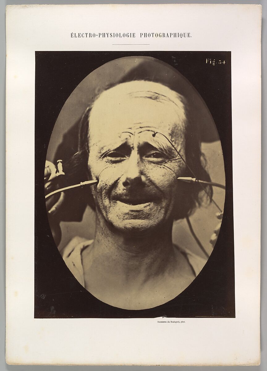
Guillaume-Benjamin-Amand Duchenne de Boulogne, Grimace, 1854, Courtesy of the Met Museum

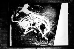
Yet a decade later, Richard would approach my father in the park, humbly asking if he might be interested in buying an ass-kicking rodeo painting tied to the back of his old bicycle. By then Hambleton had tumbled from the ivory tower of bohemian royalty, and thus began a friendship that doubled as a symbiotic business partnership. Dad bought as many paintings as he had room for, and sold off the others to friends and collectors. And at some point my own friendship with Richard blossomed into a business alliance. I bought as many as I could hang on my walls, and visited his studio with fashion models, and pot dealers, and anyone I might encounter with means to acquire something beautiful, and with inherent value well beyond the asking price. Everyone who bought at this stage, and supported a distressed genius, was thrilled by this meaningful exchange, only some were later disgruntled when powerful agencies aligned with our family efforts restoring his market where it belonged– disgruntled that we had not effectively convinced them to invest in time.

Although I am no psychic, it did not surprise me to see Hambleton’s prices spike at the end of his life. And it was not a mere question of engineering, either. But when an artist is that authentic, that tied in with history, that unique and innovative, generally it’s merely a question of time before the trade catches up. In the annals there are of course cases like Picasso’s: a staunch purist who never resorted to charlatanism, who seized the reigns of a thriving career at a young age persevering for the next sixty years with nary a hiccup, persisting to this day as gold standard. Or Van Gogh’s, who suffered the torments of the damned in his lifetime without any respite in worldly success, who nevertheless has in time reached the hearts of zillions. And yes, the works have grown to be treasured as priceless. That a Van Gogh painting never was worthless, however unsaleable they may have been during his lifetime, therein lies the question and answer to absolute value in Art. First and foremost we must appraise an artwork for its potency in conveying human feeling. And when it succeeds at that, Art always generates a profit well beyond any financial return, even when it’s not resold.

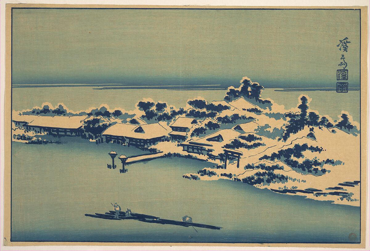
Keisai Eisen,Winter Landscape, 460-450 BCE, Courtesy of the Met Museum

When I was a teenager Jean Michel Basquiat made me a great drawing, employing his key iconography, and I had it framed and lived with it for many years. When I became a father, I never saw bills come crashing in so quickly, so with regret I brought this sacred relic to an auction house. Whereupon they asked me for the paperwork. It had never occurred to me to have the damn thing pedigreed, and now was made to understand that the board was no longer considering certifications. I was met with disappointment, to find this precious item ripped of its price, but met my fiscal challenge in some other manner. And I continue to live with this spark of genius, that might have easily been traded in for a sack of rice, but continues to inspire and bring joy to my household instead… in that intangible way that poetry can always nourish us where bread fails. 

How To Buy Art Read More »

Editorial
Conscious Darkness: Richard Hambleton (Part 3)

CONSCIOUS DARKNESS

“No one can become conscious of the shadow without considerable moral effort. To become conscious of it involves recognizing the dark aspects of the personality as present and real. This act is the essential condition for any kind of self-knowledge.”

-CG Jung

Continued from Part 2

Richard was prepared for the big time the second time around. After a few false starts, bringing major galleries to visit when he nonchalantly had nothing to show, or inviting high profile collectors when Richard did not deign to answer the doorbell. But eventually my father engineered some connections and even I assisted in bringing his painting to the world stage, where it belonged, once again. Andy Valmorbida, Vladamir Roitfeld and Giorgio Armani stepped in, both barrels blazing. In short order the Shadow Man would have international exhibits, TV and magazine appearances, beautiful and famous fans and collectors, and a great documentary based on his life story. Bright blossoms springing up after a harsh winter. My visits with Richard grew more scarce. No more phone calls to invite my model or pot dealer friends to admire his new works. But we remained dear friends. Occasionally I would visit him in his Orchard Street compound, and there, just like the famous lovers from the Triumph Of Death, I’d find Richard lazing on the daybed in front of the TV with his loyal Gigi, Puerto Rican aristocrat and partner in crime, an elegant Surrealist assistant answering the ever-ringing telephone with her mulberry velvet opera gloves, fielding inquiries from abroad in her lilting Eastern bloc accent. I’d move some paint-stained newspapers and debauched take-out containers to sit and chat. Richard opened to a fashion spread from the Sunday Times supplement, and blacked out the bodies with a magic marker. Nebulous resin landscapes from the Beautiful Series dried on the walls, Island of the Dead as viewed through the blood surging into the cloudy liquids of a junkie’s syringe.

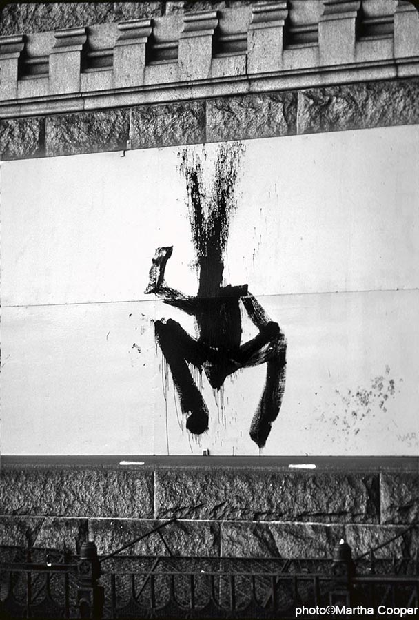
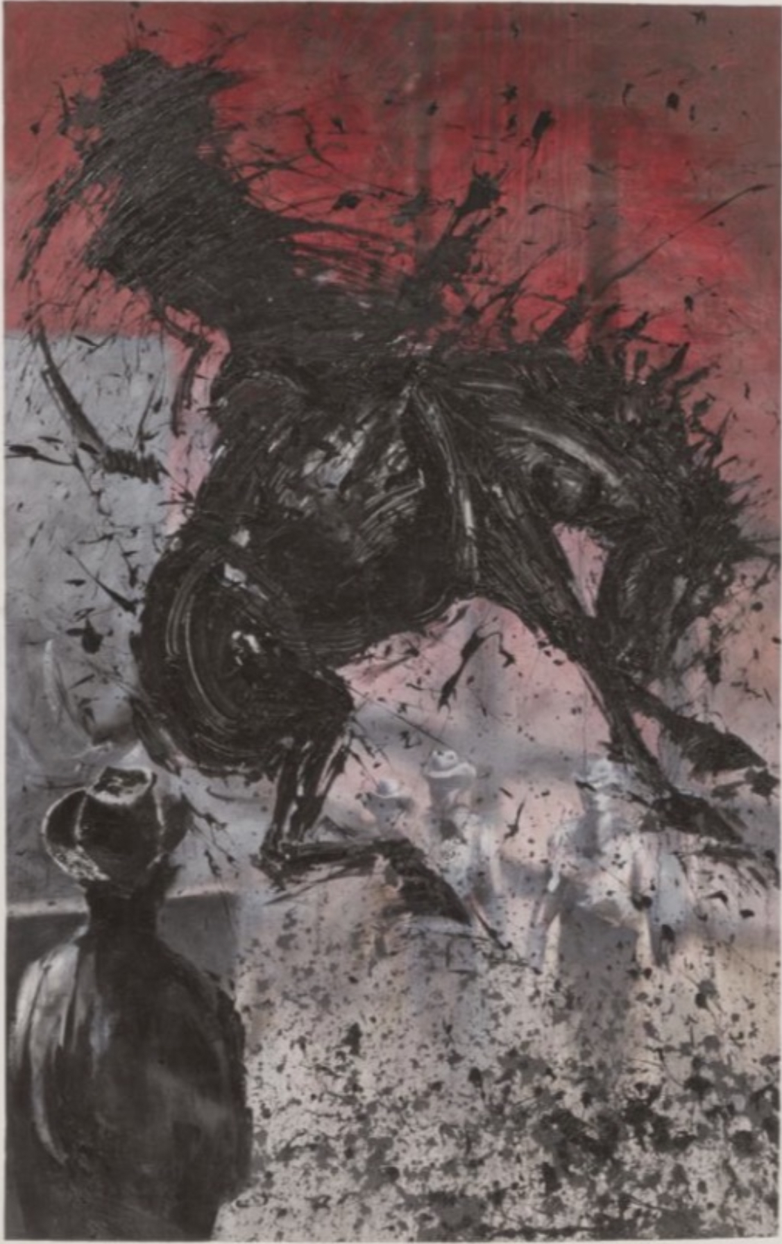
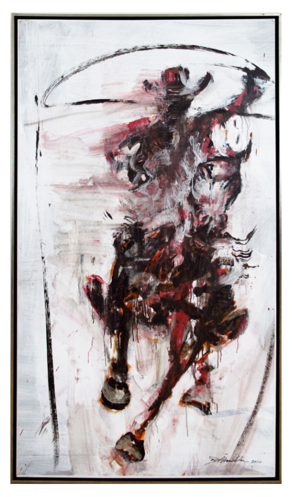
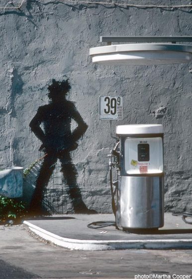
Richard Hambleton

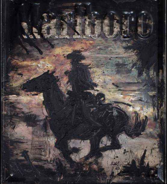
Horse and Rider

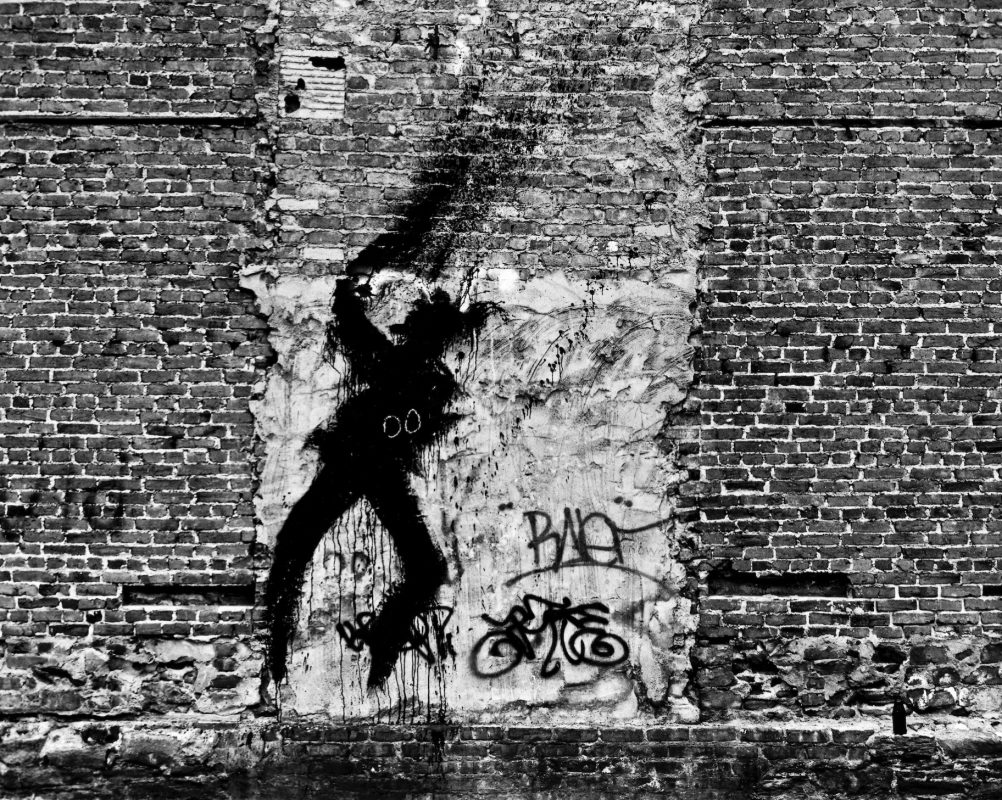
A “Shadow Man” by Richard Hambleton

Photo by Martha Cooper

The ravages of good times were catching up with Richard. He would show up at society functions on his squeaky folding bike, still handsome but bandaged like a fighter pilot shot down, hobbling like a man twice his age. A collector made a joke in bad taste that soon Richard would be gone, and our collections would shoot up in price. I admonished him not to be so sure; Richard had been dangling over this abyss for ages and was liable to bury us all. Alas the small bandage on his nose would be swapped for a face mask as the condition spread, and soon large portions of his face went missing like the Sphinx. It was terrible to see, especially when you cared for him, and yet his courage and joie de vivre never wavered. He took the degeneration of his physical form as a matter of course; he was evolving into the fearsome Shadow of his fantasies. Collectors began to clamor for his Eighties catalogue, but he was still churning out work to his last moments on earth, every bit as vital, in spite of mounting adversity.

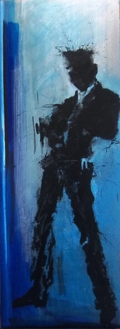
Just when I thought he must be sitting pretty once again, he called to report he was being evicted from his apartment. Surely it was some ploy to hustle another five hundred bucks from me, but this time he was in earnest. All was lost. He and Gigi crashed on my couch for three days, smoking, laughing at cartoons, concocting funky delicacies with cans of tuna, Campbells soup and cartons of vitamin D milk, their every belonging spilling out of suitcases on my living room floor. Thank God pops arranged a long term hotel for the lovers in Soho and it was there he mounted his brave last stand. But before leaving me on that intolerable sojourn, so sweet in retrospect, he left a shadow man on the inside of my front door, a sentinel with the built-in peephole standing in for a single cyclops eye.

Richard Hambleton

Horse and Rider

Richard grew more and more frail, and like Philippe Petit now seemed to be averting a cataclysm with every sure step, while we all watched on helplessly. I think it was my last meeting with him that taught me most about the core character of his being, showing me how to be a man in the truest sense of the word. I was opening a café and wanted him to paint something on the wall. He told me to pick him up at the hotel, and to bring three hundred dollars so he could get “right” first. He made me wait in the stuffy bathroom while his shadowy acquaintance was summoned, and I could hear Richard fixing in the other room. After what felt like hours, he was ready, surgeon’s mask barely covering the facial anatomy lost to decay, we walked the immeasurably long block from the hotel to my café together. His powerful Rodin hand clung to my shoulder to keep him from tumbling over, each step he would stop to wheeze and catch his breath. He was dying. And by asking him this favor, I was killing him. As badly as I wanted him to paint at my café, I told him we should turn back, that I would deposit him back in bed beside his loyal Gigi, and we could paint some other day. In the throes of what must have been unspeakable agony, he refused to surrender. “No, I am going to paint!” And paint he did, as powerfully as he ever had. I enlisted two lovely girls to assist him, a docile Rastafarian sister, and a Jazz drummer’s sage daughter. They refilled his iced coca colas and urged him on as he brought the monumental head and shoulders into existence with turbulent flourishes of liquid black paint, one last Shadow Man.

Richard Hambleton

Shadow Man

Conscious Darkness: Richard Hambleton (Part 3) Read More »

Artist Profile, Editorial
Conscious Darkness: Richard Hambleton (Part 2)

“No one can become conscious of the shadow without considerable moral effort. To become conscious of it involves recognizing the dark aspects of the personality as present and real. This act is the essential condition for any kind of self-knowledge.”

-CG Jung

Continued from Part 1

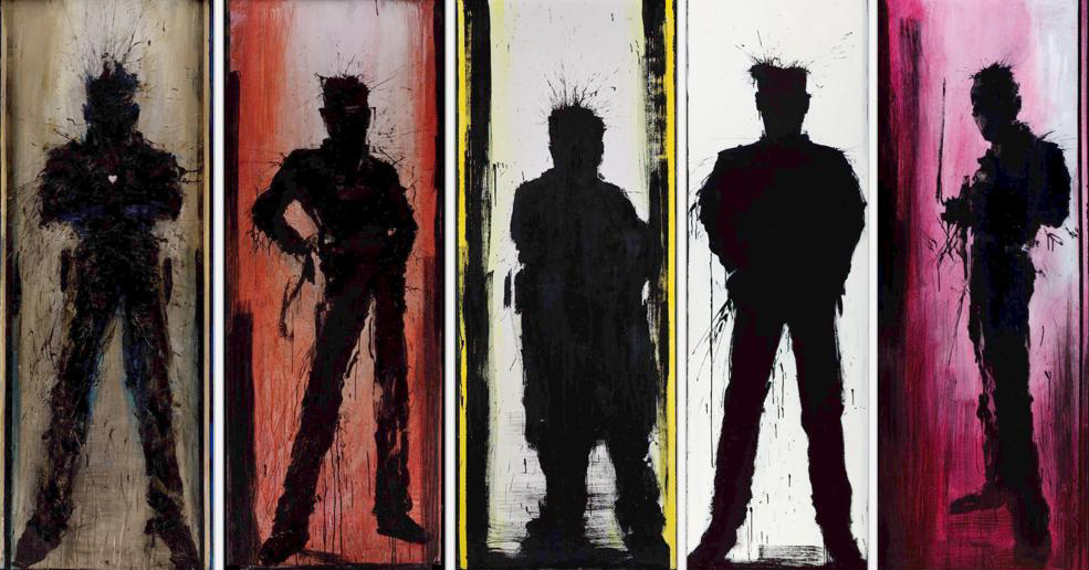
The only thing “street” about Hambleton was that his first works in New York City happened to have been painted on public property, the DOA series conceived directly on the sidewalks and asphalt, then the painterly shadow men that would make his bones as a living legend. Unlike the aforementioned artists who premiered in the trenches alongside the roguish graffiti demi-monde, Hambleton’s shadows painted on the wall did not need to be painted on the wall to be transformed into Art in context, and neither was there any entropy in the eventual transplanting thereof onto canvas, to hang in some white box with the grandeur of crown jewels. Anyone with a modicum of knowledge of Art History could draw a line directly from Monet’s splattered Water Lilies, Picasso’s expressive contortions, Pollock’s liberated unconscious arabesques, straight through Richard Hambleton’s punk rock sprezzatura sensibilities. 

Very quickly Richard enjoyed a caliber of celebrity that elevated him above the fray, positioning him alongside Schnabel and Clemente, with his sold out shows and matinee idol good looks. When at last I identified the Shadow Man in a photograph, it was not from a mug shot. Here he was posing in a glossy magazine spread, the cultural ambassador for the jet set throwing paint like Yves Klein, and finally putting a glamorous face to the name, most incongruous to the terrifying images he left behind on rat-infested squatter tenements. 

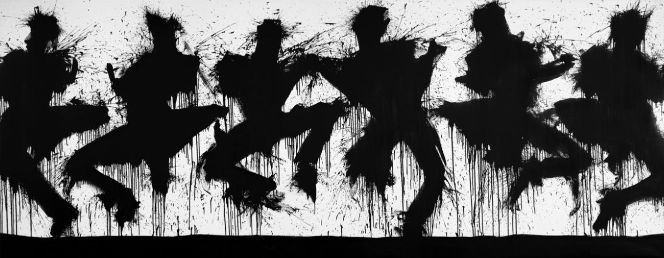
Richard Hambleton

5 ShadowMen

Warhol died. Basquiat died. Haring died. Hambleton fell from the ivory tower. The party was over. New faces filled the magazines. Then dad came home with a crazy story. He was digging a Jazz ensemble in Tompkins Sq Park when a wild man approached on a rickety bicycle and offered to sell him a painting for fifty bucks. 

At first he had been a phantom, then a movie star, but now he was a blood and guts Bohemian, struggling with a bad habit, and just like the cowboy clinging to the reigns of a violently bucking bronco in the painting my father purchased, he was fighting for his very existence. A vulnerable human being, and a fast family friend. Little by little our house filled up with the Shadow Man’s handiwork. He was short on rent, he needed a small loan, the calls came in at odd hours. He’d emerge out of a waiting taxi, leather jacket cinched shut with a jumbo paper clip and a wild look in his eyes, and then in the living room sprung up a figure frozen in the act of leaping into the air like Nijinsky or Michael Jordan, hair standing up straight as though electrocuted. 

Richard Hambleton

Horse and Rider

Pops rented a studio for him in Astoria. Against my will I joined the visit. Richard had reams of canvas stretched across the wall and painted mobs of Shadow Men standing shoulder to shoulder in volatile confrontation, hemorrhaging energy and crazy ideas in gobs of gooey black, horses rearing up, thrashing blindly to throw their rider, at last, into the dirt, dramatic as any Tyson fight, as Richard dashed across the studio, a one-man rodeo, flinging paint-caked brushes, unrolling last night’s work painted with the vivid intensity of a fever dream. Maybe I had feared that he was taking advantage of my Dad, but now I too fell under his spell.

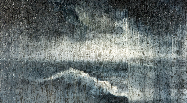
Which of us was not scared of the dark as a child? And how much does it mean to us when some cowboy looks evil in the eye, stands up to a fear of the unknown, that darkness that dwells in all of us we somehow never get around to confronting? It is there looming in Caravaggio’s chiaroscuro, in the moody Venetians, in Rembrandt’s inky umbers, in a tonal late Rothko, heaving like the sea by night, embodying the fears and doubts we all contend with beneath the surface, that the occasional Ahab rises to the helm to reckon with in our place, and for the greater good of humanity. 

Richard Hambleton

Seascape

I found time to visit Richard on my own now. He had been living in some former auto repair garage, slept in a dentist chair, with a television jury rigged to be lowered on a chain by a lever whenever he laid down. One summer night we ventured outside and painted on the streets together with Omni and Lola Schnabel. Things we never photographed, never yearned to be seen, much less sold, but painted for the sheer joy of invention. 

Pops set up an exhibit for him in some gallery uptown off Madison. Maybe the horse and riders would not stand still for a moment, nor the rhapsodic brushwork they were comprised of, but as we installed, now I had occasion to sit with these works for a contemplative moment. My father shared the observation that Pollock had died in a failed effort to return to the figure after spearheading a nonrepresentational revolution, and it was Hambleton who rather carried this aim to its conclusion. In the most carefree way, Richard could articulate a horse’s anatomy as meticulously as George Stubbs, but that blurred streak of a rider was hardly even a human any more, obliterated by the storm-clouds and dust storms of unruly activity.

Continue to Part 3

Conscious Darkness: Richard Hambleton (Part 2) Read More »

Artist Profile, Editorial
Conscious Darkness: Richard Hambleton (Part 1)

“No one can become conscious of the shadow without considerable moral effort. To become conscious of it involves recognizing the dark aspects of the personality as present and real. This act is the essential condition for any kind of self-knowledge.”

-CG Jung

The dark men stood on slum street corners staring menacingly at each passersby. They lurked in the shadows. They had become shadows themselves. Maybe they were ghosts or spirits, and when you approached the pissy, crumbling walls to investigate, you could see that they were made up of some ethereal oozing tar, dripping like spit through soot, splattered like blood on ashes, something like… black house paint.  

Those of us who wrote on walls recognized that, in some ways at least, he was one of us. An anonymous artist who expropriated the corroded civic infrastructure of New York city as a stage for his inspiration. He didn’t sign his name. He left a trail of inspired silhouettes in his footsteps for a signature, and so we called him “Shadow Man”

“ShadowMan”

Photo Courtesy of ©Martha Cooper

Just as a sommelier must speak of wine without failing to consider in depth the soil, the terroir, I would like to discuss Hambleton’s work as a phenomenon that took shape in a hostile landscape lacerated with all manner of criss-crossed written message, in layers of meaning. In so doing there will be no editing out the narrator, as I witnessed up close a broad arc of Hambleton’s poetic development from these first furtive gestures, to the work of a fine artist now considered canon. 

My father was by trade a private art dealer, so our home was a showcase of high-concept sculpture and painting, a little of everything but primarily from Picasso straight through to Warhol, lingering on Abstract Expressionism with some piety. And while the geniuses of western tradition were compelling in their museum or gallery settings, legions of unknown artists took me by surprise from passing trains. Deciphering the names, like Phase 2, Riff 170 and Tracy 168, Stay High 149, Kase 2, Futura and Lee, along with hundreds of others, I developed a dangerous obsession with graffiti from earliest childhood.

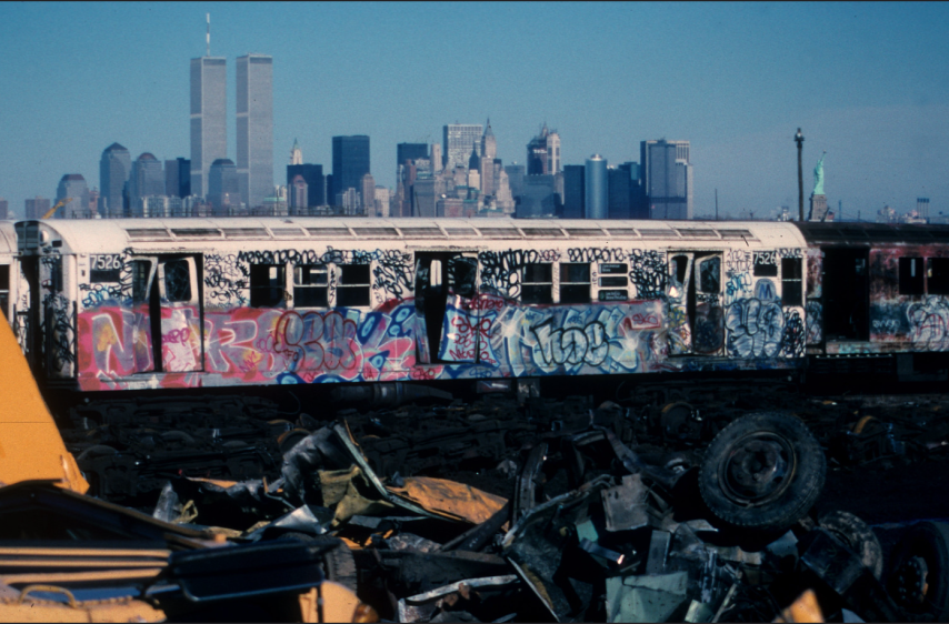
“WTC 50” View of NYC Skyline from a Jersey City scrapyard, late 1980s. Photography by Steven Siegel

Now, no graffiti artist during the subway era referred to their way as graffiti, a media term and a slur, yet it is still the best term to describe the multi-cultured avant-garde movement that began with Taki 183’s straightforward autographs of the late 1960s and ended with Jon One’s wild abstractions in the late 1980s, when the last illegally-painted 1 train was taken out of commission. And all throughout, every scrawled word or scribbled face spoke a code, puzzling my curiosity like ancient hieroglyphs. Indeed it was a strict orthodoxy of form, and yet allowing for a complete freedom of innovation for the proven initiate, as some amorphous council of ascended “kings” maintained ever-evolving standards. 

A procession of fresh masterpieces rumbled past, convoluted multicolored letters twisting back on themselves, taking my breath away like no other form of Beauty. In time I grew to understand their mysteries the way a hungry man understands a sandwich. Here it should be stated as fact that neither Basquiat nor Haring were ever graffiti artists as such, and neither was the Shadow Man, yet no conversation about these artists would be complete without first understanding their complex relationship to this craft. And if so-called graffiti was to my mind the biggest art breakthrough of the age, to say another kind of artist was every bit as relevant is no mean praise.

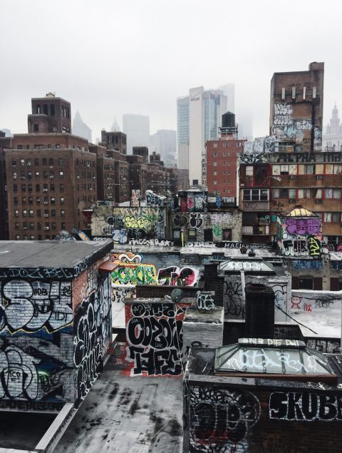
Rooftops in Chinatown Manhattan, 2019

Photograph by Howie Mapson

On this new cultural wave of the early 1980s rode several Art world mavericks, who would storm the citadel of galleries and museums by first laying siege to the war-scarred city streets. We first saw Keith’s chalk drawings on the blank subway posters, the soft curves of a Tex Avery or Disney illustration but in situ, in our hardscrabble subterranean domain of mass transit, these speciously innocent characters took on a subversive attitude. We all regularly appropriated comic book characters as alter egos beside our subway paintings, yet Haring had created an animated iconography of his very own, and was thus first embraced by the graffiti underground as a true original before rising to prominence as an bona fide Art star.

Basquiat was a native New Yorker, a Brooklynite, and he learned to write on walls side by side with actual taggers of repute. He did everything in his own variety of cool, and his inscrutable slogans and unadorned manner of penmanship were at odds with formal graffiti, almost to the point of constituting an anti-graffiti. And yet his modus operandi, even down to his raw anti-aesthetic stance, endeared him to the ranks of graffiti artists from the “beyond” category, restless young turks themselves who sought to break away from the stylistic trends that had already become codified as an -ism. Basquiat was accepted by members of the elite TDS crew and particularly Rammellzee’s Iconoclast Panzerist inner-circle: A1, Arbitrator Koor and Toxic. So Basquiat would ascend to be heralded by the Art establishment despite his early flirtation with illegal Art. So Martin Wong, Kenny Scharf , David Wojnarowicz and a few others found success while simultaneously earning credibility for street authenticity, as did the Shadow Man, Richard Hambleton.

Continue to Part 2

Conscious Darkness: Richard Hambleton (Part 1) Read More »

Artist Profile, Editorial
Style Writing: The Origins and Evolution of a Movement

Tracy 168

To begin to discuss the graffiti movement in New York is to embark on a treacherous journey; you must carefully traverse across seas of misrepresentations and through muddled webs of distortions spun by media. Let the artists themselves be our leaders, the truest definition of explorers wandering uncharted territory. We are Dante, and the artists, our Virgil, their poetry guiding us through urban hell. As someone who is only at the beginning of properly appreciating and excavating the Graffiti movement, I write in caution of adding to an already convoluted history but with extreme wonder and appreciation for a culture that constructed something truly unique. In line with these artists using individual skill to identify with something larger than themselves, attempting to chronicle this movement has been an important reminder that the more you learn, the less you know.

Tracy 168, 1970s

We can trace the origins of graffiti back to the Lascaux Caves, Egyptian hieroglyphs, fresco murals on cathedral walls, or the Roman vandals that defiled the Pasquino statues. The modern style-writing movement in New York used the same forms of satirical poetry to express disbelief in the system, show solidarity, or serve as a proclamation of individual identity within a larger community. But unlike previous centuries of public “vandalism,” the New York writing scene harnessed a unique tool: public transportation. Trains transformed public works of art from solitary moments of reflection into portable messages of rebellion. Their works were no longer bound to physical space or time – their names spread across the city like venom, a constant stream of visual rallying cries that inculcated anyone in their wake. When asked why he thought this movement spread throughout the world, Coco 144 said, “making your mark is a contagious virus with no known vaccination or cure.

“Taki 183 Spawns Pen Pals,” New York Times, July 21, 1971

Spanish Harlem in the sixties was a mecca of vacant plots and abandoned buildings. As factories closed and workshops moved away from the city, it became the perfect playground for artists with an itch to paint – without the cost of stretcher bars, canvas, and a physical space to work. The city became their studio, train cars became mobile canvases presentable to the entirety of New York. Names that originated in the Bronx would end up in downtown Manhattan, an exchange of personal invitations waiting to be answered. Taki 183 (short for Dimitraki, an alternative to his birth name Demetrius, and his address in Washington Heights on 183rd street) was one of the names that began to pop up in the late 60s and early 70s. He used direct, straight lines to construct this simple tag, and in July 1971 it caught the attention of a NY Times reporter. Don Hogan’s “’Taki 183′ Spawns Pen Pals” was one of the earliest pieces of media coverage on the movement, providing a biography on the artist (as much as one can survey someone trying to stay anonymous) and analysis of some of his works. This article inspired artists to have a strategic, citywide approach to their writing.

In the seventies, the term “Wildstyle” was used to describe the evolution of graffiti toward full-fledged artworks and away from more fundamental tags. Angular letters, pointed arrows, and curved lines characterized this style, often making it difficult for the viewer to decipher the distorted image. Phase 2 specifically developed these bubble-style letters rendered three-dimensionally, known as “mechanical letters” or “softies.” Hugo Martinez, who founded the United Graffiti Artists collective, of which Phase 2 was a member, said his lettering constantly changed; you never saw his tag repeat itself. He was constantly trying to destroy himself, destroying his previous style.” Wildstyle became especially popular in New York in the seventies and eighties as its complexity allowed artists to showcase their skill and range.

Although John Lindsay and Ed Koch poured $300 million into the War on Graffiti to keep it off transit systems and out of the streets, this only propelled the evolution of style within the movement. Although works wouldn’t last for more than a day, newly-cleaned trains provided artists with large, blank, portable canvases that moved around every inch of the city. Wildstyle flourished and whole-car specialists added scenery and characters to their pieces, using starbursts, outlines, and shadows to add personality. Others mastered the art of the throw aiming for quick execution and anonymity. Phase 2 enjoyed the thrill of writing on subway cars and called it impact expressionism.” In an interview with Adam Manbasch of Wax Poetics magazine, he recalled writing a poem to a police officer on the vandal squad who had just missed arresting him: If you only knew/the real Phase 2/the super sleuth/who’s still on the loose.”

Phase 2. Photo by Michael Lawrence and Herbert Migdoll

By 1977, the foundations of the culture were fully formed, and artists were now fighting to be recognized by the quality of their works, the amount they were painting, or location of their tags. Artists like Fab 5 Freddy began bombing whole cars with murals. With his connection to Lee Quinones’s Fabulous 5 crew, Freddy became an important link between uptown hip hop and graffiti scenes and downtown punk and art worlds. There were artists like Coco 144, who in 1969 was only a teenager just beginning to paint, after seeing Taki 183 and Julio204 in upper Manhattan. By 1971, he was all-city and up there with Phase 2. He famously called Phase 2 a person from another dimension that came in and deconstructed the letter and reconstructed it again.” With Hugo Martinez, Coco 144 cofounded the United Graffiti Artists in 1972 and was a huge player in moving graffiti from walls to trains. He was also one of the first to introduce stencils into the graffiti movement, allowing for more precision, attention to detail, and for “obvious tactical reasons.

Fab 5 Freddy, Soup Cans, 1980

The first major introduction of graffiti into the fine art world was driven by the LES galleries and European art market (primarily Denmark, France, and the Netherlands). It all happened pretty quickly; both Phase 2 and Coco 144 were in the first gallery show that featured graffiti, a United Graffiti Artists presentation at the Razor Gallery in SoHo in September 1973. By the beginning of 1975, Phase 2 had largely given up subway graffiti, moving his work onto paper and canvas or into sculpture. In 1979, Galerie le Medusa invited Fab 5 Freddy and Lee Quinones to exhibit in Italy, the first time graffiti was exhibited overseas. And by 1980, Lee had his first New York show at White Columns, officially signifying aerosol paint’s transition from moving objects back to stationary works (this time inside galleries instead of the outside of buildings). The Times Square show in 1980 incorporated Basquiat and Keith Haring, widening “street art” to include graffiti, fine art, and the integration of the two. In early 1981, Fab 5 Freddy, together with Futura, curated the Mudd Club show Beyond Words, an important early exhibition that brought together graffiti-based artists and downtown fine artists. Over two dozen canvases, along with early photos from Martha Cooper and Henry Chalfant were shown as part of an exhibition on graffiti at UCSC in 1982.

Keith Haring In New York City subway, 1984

In the same year, back in New York, 51X Gallery opened just 2 blocks away from Fun Gallery, expanding access to and the content of Graffiti art. Dondi’s show at 51X, The Ugly Man, expanded his visual repertoire toward more abstract and “atmospheric” pieces. But museum acceptance in Europe was one of the key factors of Graffiti’s early canonization. Graffiti at the Boijmans-Van Beuningen in Rotterdam in 1983 featured the second-generation stars – Seen, Futura, Crash, Quik, etc. – and the same show spread the formal appreciation of Graffiti first to the Groninger Museum, then to the Stedelijk in Amsterdam, and across Denmark’s Loudian Museum in 1984.

It’s important to note the term “graffiti” is largely contested within the movement itself. Coco 144 explained that what the media would call the Graffiti movement, he would call the Writing Movement in New York. As the movement shifted from a “social scream of the inner city to a large-format, graphic design-like urban beautification movement,” “graffiti” was repackaged into an art market-friendly term to easily categorize and sell the work.

For artists developing the movement, writing wasa reflection of the times… a combination of the spirit of the anti-war movement, frustration with economic and social inequality, and racial and political tensions.” Phase 2 crucially rejected the word “graffiti,” or “the G-word” as he called it, and preferred a term like “style-writing.” But what word could ever adequately encapsulate the original intentions of the movement, and track its evolution not just stylistically, but socially, over time? “It’s like calling a meteor a pebble,” Phase 2 said in an interview with Raw Vision magazine in 1997. He would describe his artistic development as “absorbing and devouring language in its coexisting state and creating something else with it.” Now how do we find an appropriate word for that?

Style Writing: The Origins and Evolution of a Movement Read More »

Editorial