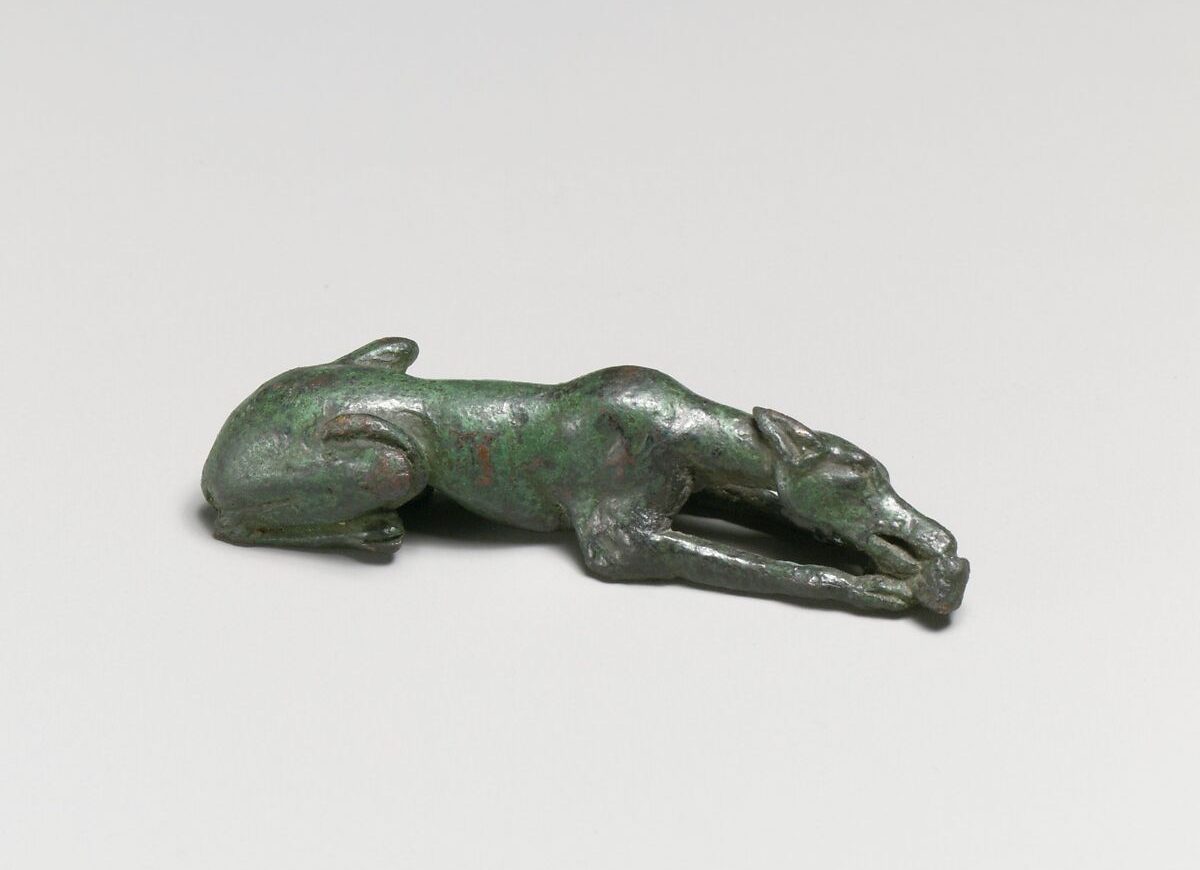
Bronze statuette of a hound gnawing a bone, Greek, 3rd–2nd century BCE, via The Met
In part 3 of the "How To Look At Art" series, Alexandra Kosloski uses formal elements to bring together the units of visual language.
Continued from Part 2
Design principles are terms to communicate how the formal elements are used, and what kind of effect that has on the work and the viewer: balance, rhythm, proportion and scale, emphasis, unity and variety.
Balance
Balance results from the manipulation of visual weight within a composition. A part of an artwork that is large, more detailed, or more intense in color has more weight. If a piece of art has symmetrical balance, that means weight is distributed evenly, as opposed to uneven elements which are asymmetrical, or when elements radiate out of a central point which is radial balance. Symmetry will often seem harmonious, asymmetry may seem more dynamic, and radial symmetry may even seem mystic.
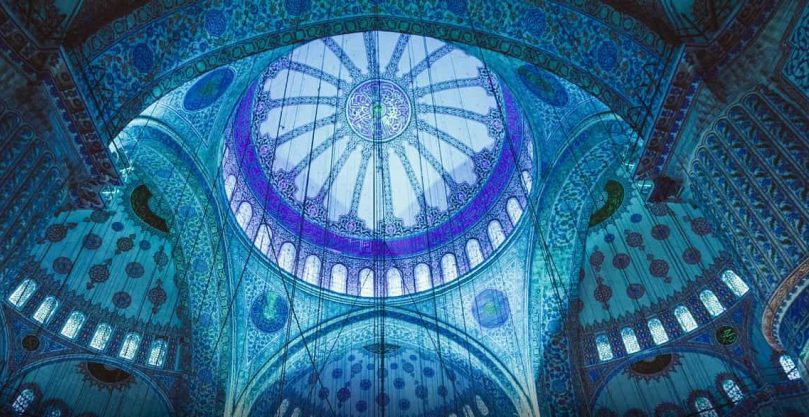
Sedefkâr Mehmed Ağa, Dome, Blue Mosque (Sultan Ahmed Mosque), completed 1617, Istanbul via iStockPhoto
Rhythm
Patterns can be used to communicate rhythm through repetition, or by leading our eyes through a composition. Visual rhythm can be regular, alternating or eccentric, and a work may have different combinations of the three to express the right pace and movement in the work.
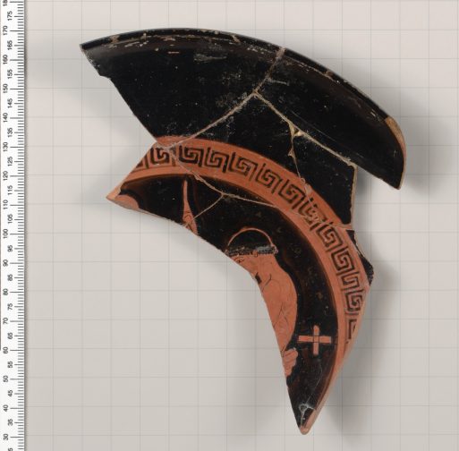
Terracotta fragment of a kylix (drinking cup), Greek, 500-490 BCE, via The Met
Proportion and Scale
Proportion is the relative size of part of a composition. Artists may study proportions so they can create life-like drawings or they may subvert proportion to try to express a new perspective. Scale is when the artist plays with the size of something and our expectations of it, a device that often occurs in sculpture, but can appear anywhere. A large painting with large subject matter will approach the viewer and feel quite intimate, as opposed to a very small painting, which won't have as much room for detail.
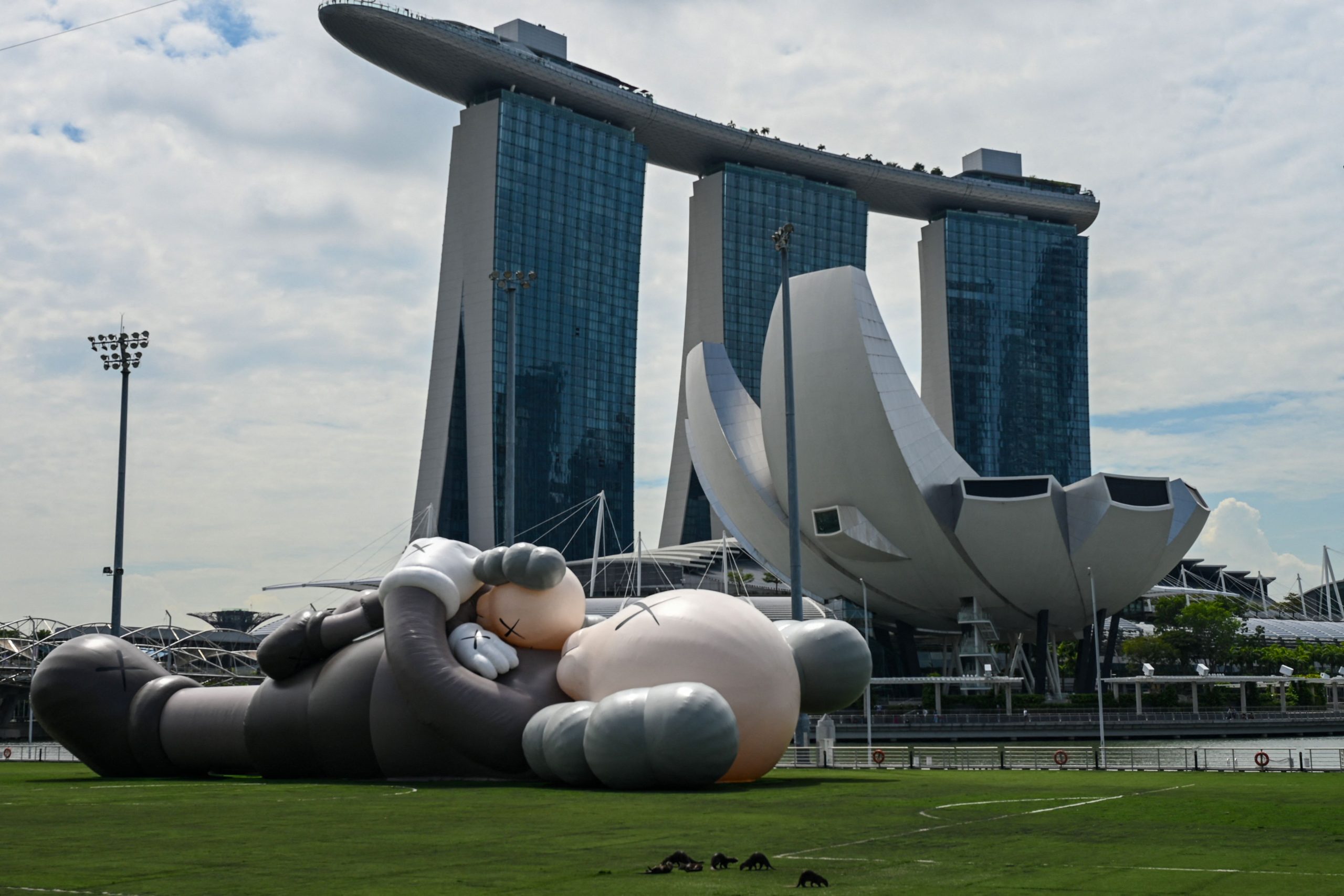
42-meter inflatable sculpture by KAWS, 2021, Marina Bay in Singapore, Photo by Roslan Rahman/AFP/Getty Images
Emphasis
The part of the work viewers are meant to focus on will be most emphasized. The artist can make the focal point stand out in many ways by employing the elements of art, like adding a bright accent of color to an otherwise dull photograph.
Hierarchy is a useful tool, related to both proportion and emphasis. When looking at religious art, the figure most high or with the most emphasis is the holiest. When looking at advertisements, the most important object or message will have the most emphasis.
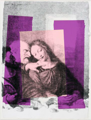
Andy Warhol, Detail of The Last Supper, 1986, Andy Warhol Foundation for the Visual Arts, Inc./Licensed by Artists Rights Society (ARS), NY
Unity and Variety
Unity and Variety are counterparts, and the balance of the two is what makes art interesting to look at. Unity is achieved when elements, like color, are all of the same nature. Variety adds contrast and spontaneity.
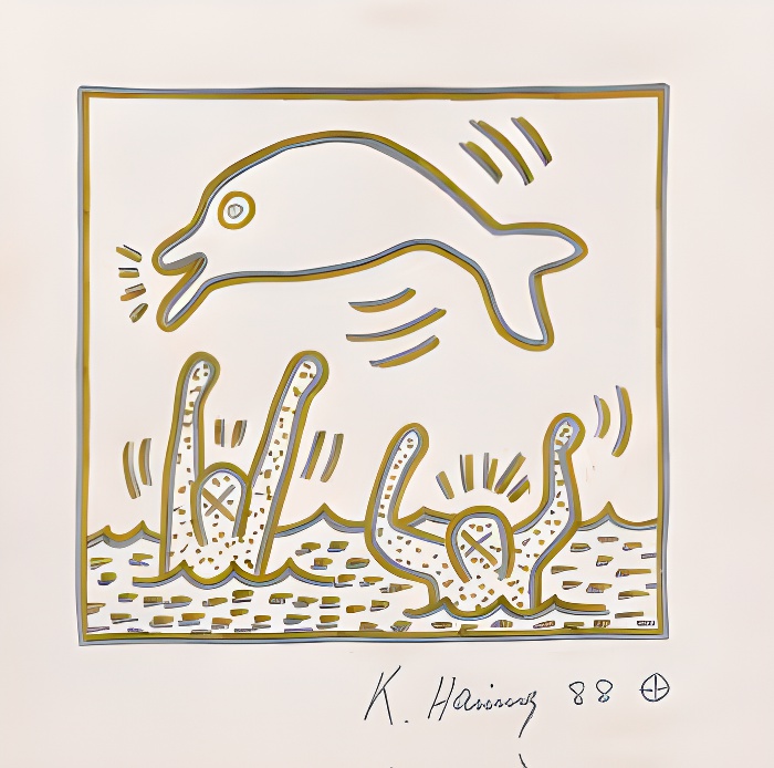
Keith Haring, Save Dauphine, 1988, via ArtBanx
The purpose of all of this is communication. Artwork can express something very specific, like a well known myth, or something intangible, like ecstasy. By familiarizing ourselves with the ways artists communicate, we can have better visual literacy, which adds depth to the world around us. When we understand art, we can better understand architecture, advertisements, movies, and all of the visual elements of our everyday lives, as well as having true appreciation for the previously unattainable fine art.


")


")

