Author name: Alexandra Kosloski

Alexandra Kosloski is a UX designer and assistant gallerist at The Trops.

February Cinema Circle

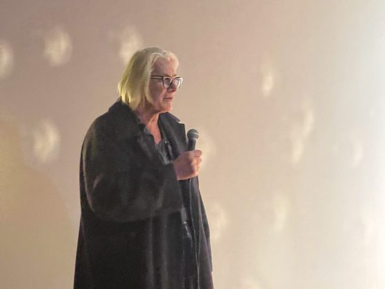
Filmmaker, artist, and “high priestess” Judith Dimitria Fleishman shares a 1984 short film created in her early career as an artist in NYC.

At the Trops’ Cinema Circle at ArtxNYC on February 14th.

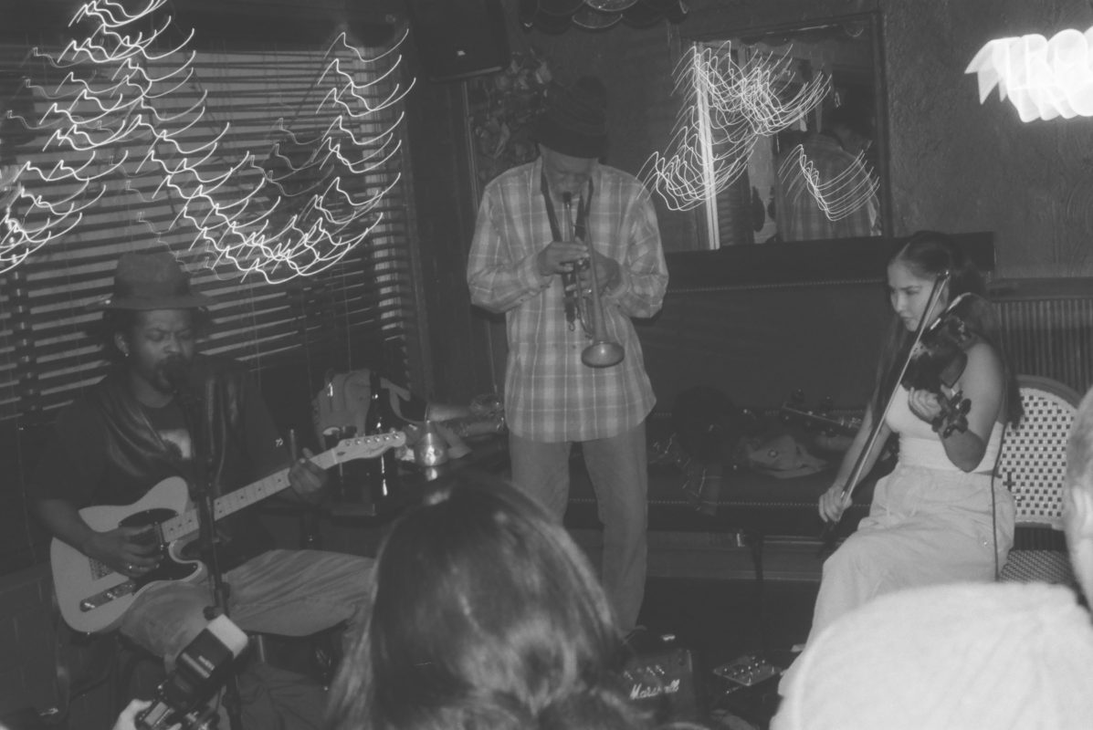
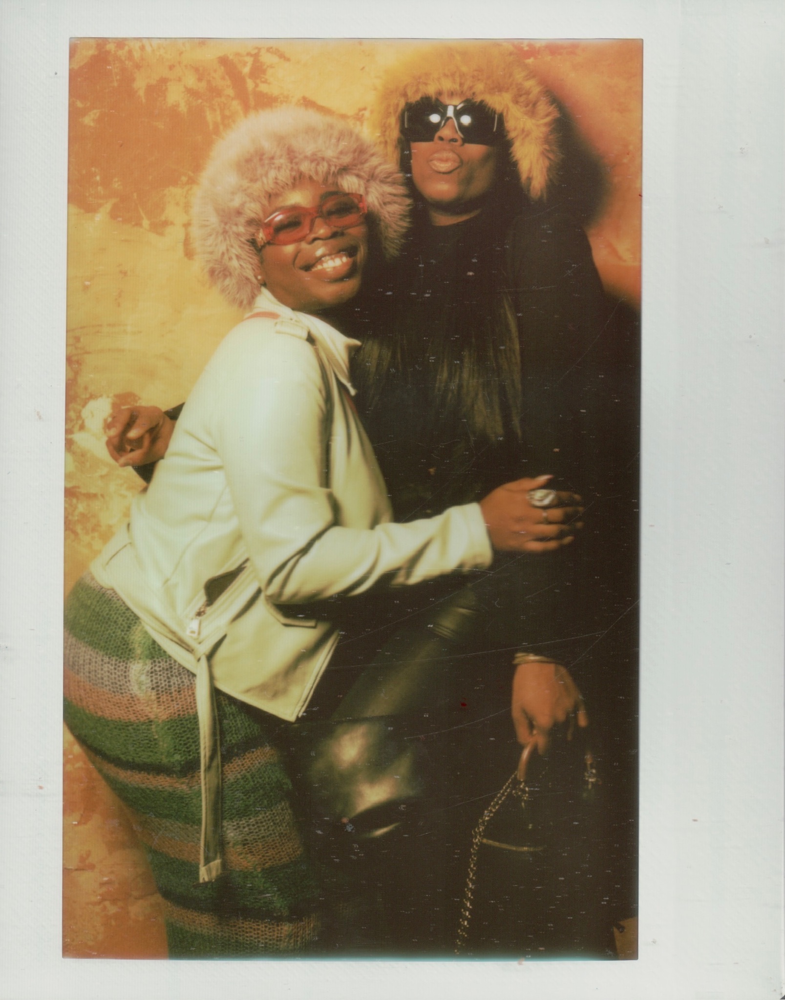
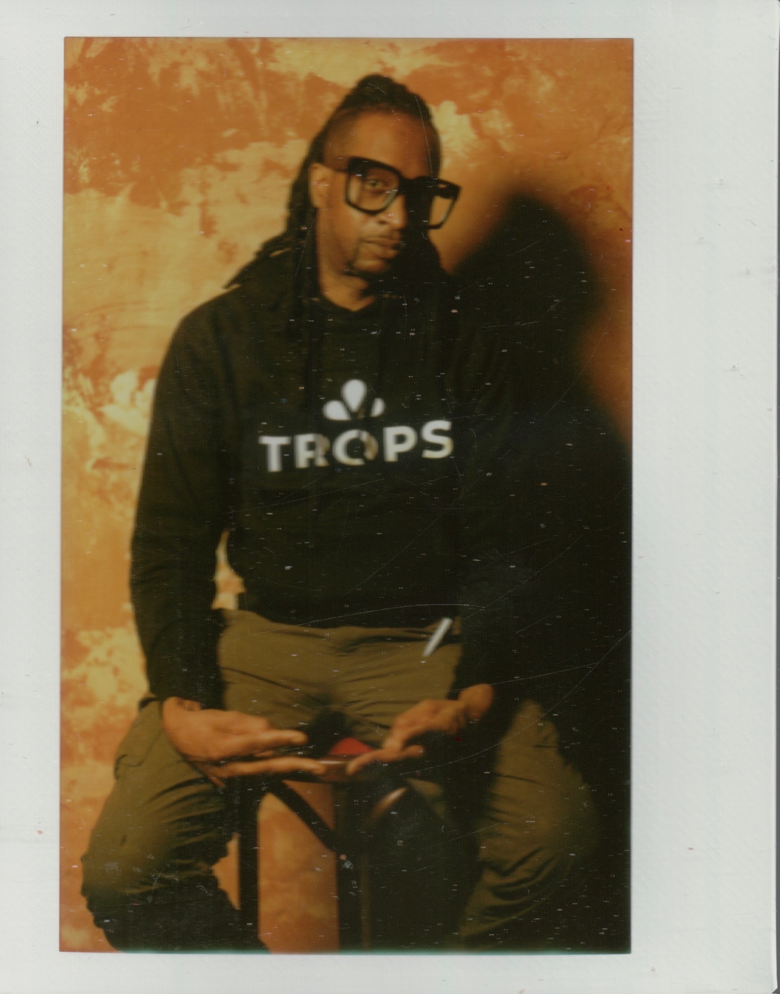
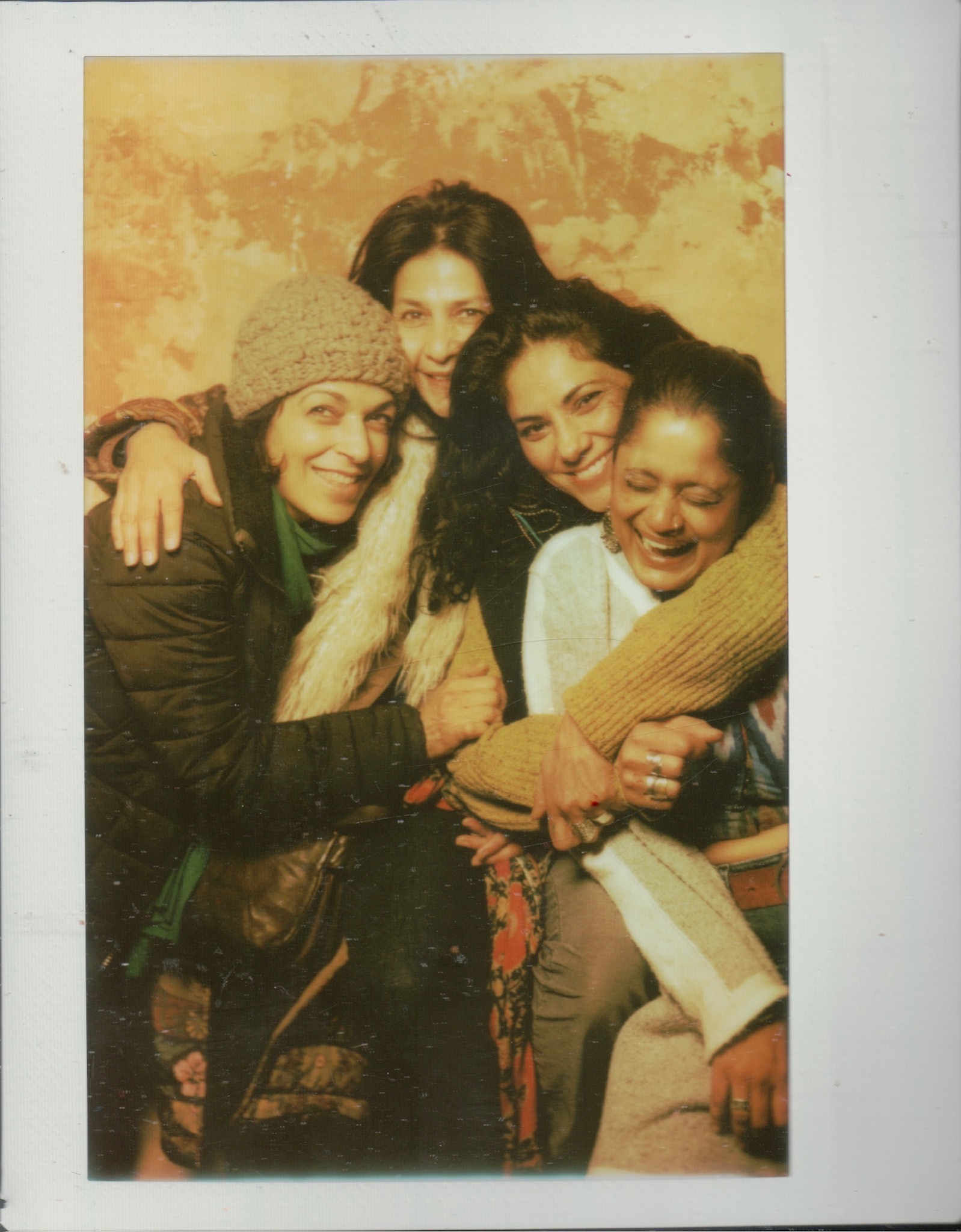
On this Bohemian Wednesday, taking place on the evening of Valentine’s Day, the Trops screened a series of short films at Cinema Circle in collaboration with ArtxNYC.

The screening included short films by Seth Cameron, James Top, Ethan Minsker, Amos Poe, Luigi Cazzaniga, Nemo Librizzi, Nick Farhi, Judith Dimitria Fleishman, Lola Daehler, Isaiah Barr, Rachel Amodeo and Jamie Nares. The evening opened with a musical performance by Adjua Ajamu.

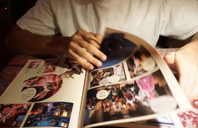
Top left: “OF” by Luigi Cazzaniga

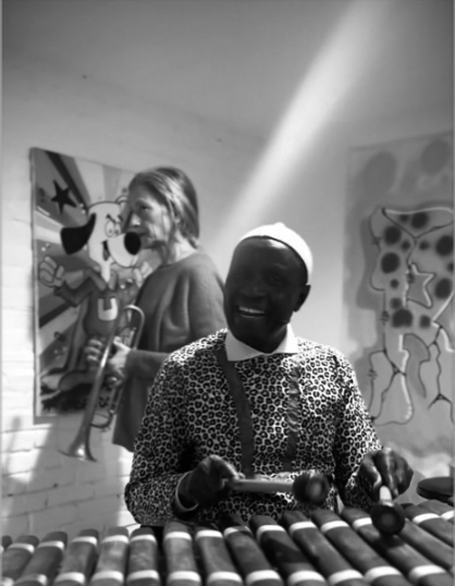
Top right: Performace by Adjua Ajamu

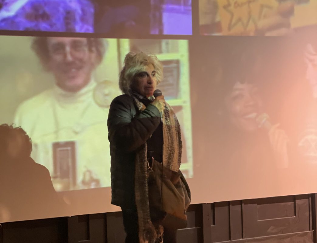
Bottom left: Post-screening Q&A with Jamie Nares

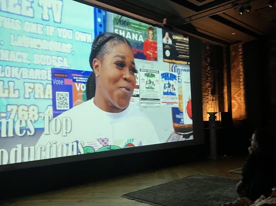
Bottom right: “Big L Street Renaming” by James Top

Thank you to our local vendors ArtxNYC, Monda, So Lah Tea, and Fruhling for their participation, providing products and refreshments for Cinema Circle viewers to enjoy.

February Cinema Circle Read More »

Event

An Interview with Nemo Librizzi

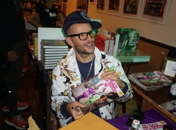
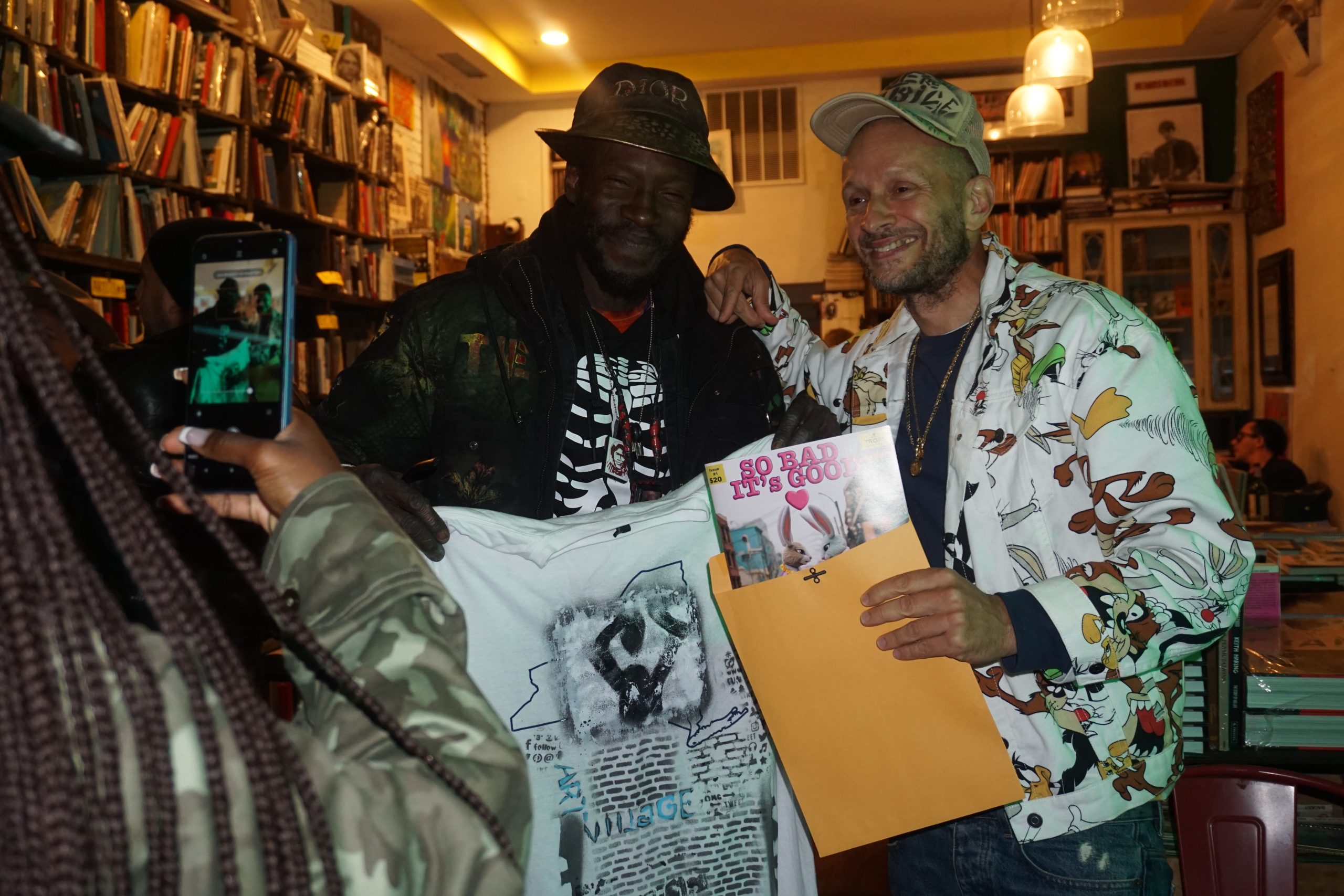
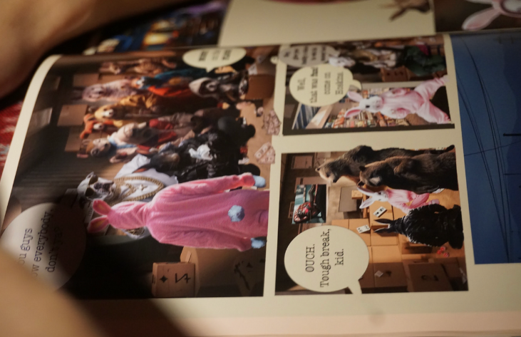
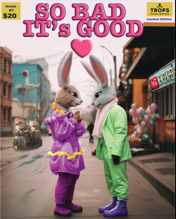
Nory Aronfeld and “So Bad It’s Good” by Nemo Librizzi, photo by Bebe Uddin

In his interview with Alexandra Kosloski, Nemo Librizzi shares the essence of bohemianism, emphasizing the intrinsic drive to create art regardless of external validation. From his graffiti roots in New York to using AI in illustrating his graphic novel “So Bad, It’s Good,” Librizzi discusses his artistic evolution and ongoing projects.

Alexandra Kosloski: What does it mean to you to be bohemian?

Nemo Librizzi: Well, sometimes the arts equate a livelihood. Art can make some people very wealthy, and some people it even makes famous. But for anybody who has ever made something– before there was ever any question of an audience, you’re making it for yourself responding to some unsettled feeling or raw urge to create. 

Some people make beautiful things because they came up in an environment of beauty and elegance, and others come from a very dysfunctional place, and have a vision of a more beautiful world. There are people from all walks of life that find themselves in a position to create something. To make something becomes more important than practical realities. People who make art even though they’re not understood or can’t make ends meet by this pursuit, and they do it anyway, we call that a bohemian.

“I think that each of us has an inclination or sensibility to create based on a dream or a feeling.”

I think that each of us has an inclination or sensibility to create based on a dream or a feeling. Not everybody tries it, and out of the people who act on this fantasy, not everybody strikes a chord to be readily understood by others. In which case, the realization is still useful to oneself. Art for art’s sake. And in our society, there are these cultural specializations: you’re a lawyer, you’re a doctor, you’re a statesman or something, or you’re an artist. In other cultures, perhaps it’s more acceptable to be a Renaissance person. You make something, but you also have a regular job, and it’s not necessarily merely a hobby either. It’s part of who you are- a more nuanced part of your identity.

Alexandra Kosloski: I would say that you’re a pretty good example of a Renaissance person. You seem to be an artistic shapeshifter. Can you share a little about your journey from graffiti art to filmmaking and beyond? How did your experiences influence this artistic evolution?

Nemo Librizzi at the launch of “So Bad It’s Good (Part One)” at Village Works

My dad was a painter his whole life, and a poet, although he was an art dealer by day. Just being with my dad as an art dealer, we used to go to Warhol’s Factory, or Tom Wesselmann’s studio, or different artists ranging from the abstract to photorealist. There were no hard and fast rules for my father about what constitutes art other than it’s a movement of the soul. 

So when graffiti came around, I remember seeing it on the subway and asking my dad what it was, and he said, “The kids go in the tunnels at night and do it.” I must have been 5 or 6 years old. I told my dad, “I want to do that”. He said, “You have to practice and when you get bigger you can go do it.” And I did.

I focused on it for many years until I went and painted on the subway. The first time I did it was ’82, maybe ’83, and I wrote all the way up until they phased out the graffiti trains in around ’88 or ’89. It was a starting point for me because at that moment when I was initiated as a graffiti artist, it came in vogue in creative circles that people from other disciplines were paying attention to what was happening on the streets in New York. So I found myself, as a graffiti artist, part of this inner circle of people like Jean-Michel Basquiat or Keith Haring or Martin Wong, because all these people were interfacing with that street avantgarde. And I never saw a clear delineation between the different arts. I felt they were all equally relevant. 

Sometimes I get an idea that might be musical in nature, and I have to try to figure out a way to make a sound that echoes the sound I’m hearing in my head. I used to make radio shows because I’ve never learned how to play an instrument. That’s just one facet of self-expression. But I also write books and make little films. I think you are inspired by a spark of an idea first, and then that idea knows what it wants to be. Maybe you need to learn some formal things, to bring it into fruition, but technique is not art. The technique is a means by which we express the idea that we have.

Alexandra Kosloski: I’ve experienced this. It feels like the idea is the one driving the car and you just have to be in the passenger seat.

Nemo Librizzi: Absolutely. You have to help it get where it’s going.

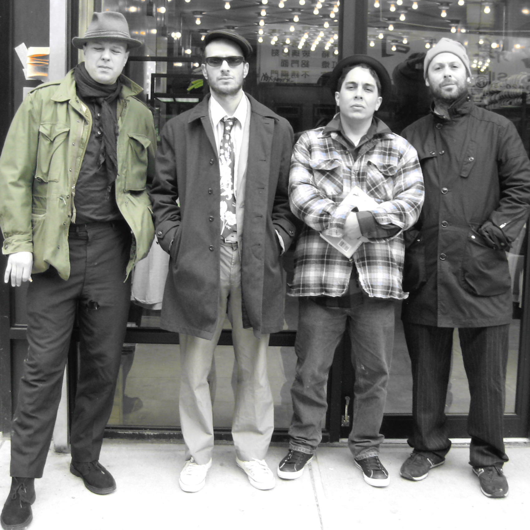
“With some Bohemian comrades-in-arms in 2009”

L to R: Ben Ruhe, Nemo Librizzi, Lance de Los Reyes, Kiernen Costello

Alexandra Kosloski: Do you have a favorite memory of when you were Style Writing?

Nemo Librizzi: I had that dream when I was young, but it’s not as simple as painting in a studio. It’s a fearsome thing when you’re nine or ten years old to actually get to a place where you can write on a train. The trains themselves are dangerous. You’re trespassing into subway property, where the people that work on the trains get killed while working there. So us as kids, you were taking your life in your hands. And on top of that, if you didn’t get arrested or hit by a train, the place was full of gangs that would try to steal your spray paint and beat you up. And if you had any kind of name, a sucker reputation could follow you around and ruin your chances of getting your name up.

There was a lot to contend with, especially being a white kid and the son of an art dealer. I wasn’t as tough as a lot of my counterparts. When I could finally paint the side of a train– objectively, my first efforts were horrible, looking back– but I was proudest of that moment where I first achieved it at last, because nobody handed me that victory. I went out and I made it happen just by my own backbone. Even though it wasn’t any great glory in anybody else’s eyes, I proved something to myself that day.

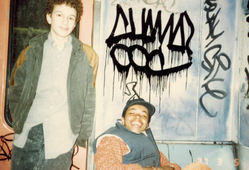
Young Nemo Librizzi in NYC

Alexandra Kosloski: Can you think of a time that another artist surprised you?

Nemo Librizzi: Oh, God. Artists always surprise me, so they never surprise me. I can give you three occasions. One was VFR, who’s a graffiti artist, and his specialty was “tagging”. His signatures were all over the city. VFR made a campaign to go all city [known for graffiti throughout all 5 boroughs of NYC] one of the highest ideals that a graffiti artist can realize, if you’re not going to concentrate on doing what we call “burners” [large, elaborate wall pieces]. When we first met, we were all selling fireworks down on Canal Street. My partner CHAMA saw talent in VFR that honestly, at that moment I felt was too raw. He was too young. But, at some point VFR matured. I don’t know what it was, but one day a light went on in his head. Suddenly he had one of the best signatures in the city and of all time. It shocked me to think the kid ended up being great.

I felt the same thing with the photographer, Khalik Allah. His videos for Wu Tang Clan seemed very straightforward, but he wasn’t coming from any poetic background that I recognized, he was pretty much self-taught. Somewhere along the line, he discovered these people on 125th and Lexington, who were smoking K2. K2 is supposed to be synthetic weed, but it takes people to a much more psychotic break with reality than marijuana takes somebody. Khalik Allah took it upon himself to document these outcasts, and it was like his soul was reaching out to theirs. These weren’t stars, or even conventionally “cool” people. Yet, there developed a very vital connection between the viewer and the subject. I think the resulting works are of great importance on the landscape of our city’s history.

The third example is Martin Wong, because Martin Wong used to hang around all the graffiti scenes, and he was a very self-effacing, humble guy. Although he dressed pretty outlandish and had a big, larger than life personality, he was very earnest. I never knew him to be an artist, I just knew him to be part of the underground. He was an enigmatic character.

And one day, I was brought to see his paintings. It was his Chinatown series, and I had my mind properly blown. Martin Wong was probably the biggest Trojan horse for me in that he had always been there. I was friends with him. I’d hang out and eat dinner with him and I never knew how great of an artist he was until very late in his life.
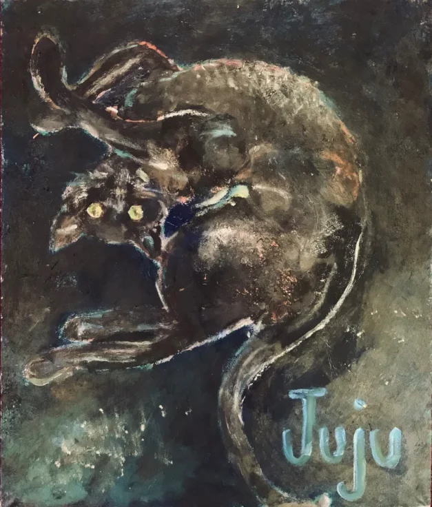
Nemo Librizzi, Juju, oil on canvas

Alexandra Kosloski: Who are your biggest influences?

Nemo Librizzi: I probably have a thousand biggest influences. I think that if I had to make a shortlist, though, they would probably be all of the outlaws, like John Genet and Caravaggio. Jack Black, obviously not the comedian, but the stickup guy who became a writer in the 1920s. Or Petronius Arbiter, who wrote the Satyricon. Or Eugène Sue. Rimbaud. Anybody that had an aptitude for culture and intellectual rigor, but was also there on the street corners where things actually happened. Henry Miller is one of them. Bukowski. We see this “terribilita” even in the Abstract Expressionists. We find it in Reggae and Dancehall and Rap music. Art that has blossomed right out of the mud of everyday human life has appealed to me most.

Alexandra Kosloski: The counterculture.

Nemo Librizzi: Yeah.

Alexandra Kosloski: I wanted to talk about “So Bad, It’s Good.” It brings a really unique approach to storytelling since it’s AI illustrated. What led you to this style?

Nemo Librizzi: I had written the play about 15 years ago, and it was my intention to have it acted on stage in costumes. I got kind of far along in the process where I was actually meeting with theater people, but it fell between the cracks. I didn’t know quite what to do with it, and I moved on to other endeavors. And then when I saw a friend playing around with AI, I was like, bingo! I can mine that source with this idea. I have chops as an illustrator, but I can’t compete with what AI can do on this level. I can fill up the pages with endless details. I think the AI has untold potential, though it’s unwieldy at times. It’s like trying to make a fine sculpture with a chainsaw, really, because it’s such a powerful tool. It can lead you by the nose if you’re not careful.

Alexandra Kosloski: What inspired the world of Norbert and the hijinx of Petropolis?

Nemo Librizzi and Ibrahim Kandji at the Trops launch of So Bad It’s Good (Part One) at Village Works in NYC

Nemo Librizzi: For many years I’d been a starving artist, I was happy to live wherever I could hang my hat, until I became a father for the first time. In a way, Norbert’s struggle is autobiographical– he has 14 or 18 kids, I have one to worry about– but suddenly I had somebody other than myself to worry about. When I started to face the problem of making a living, I realized, everybody faces those problems. I had to laugh at myself. Struggling to make a living is not really an epic human battle, it’s just normal. “The daily grind” most people call it. So it wouldn’t have been that funny if I wrote a play about my own mundane struggles, but now putting bunnies in there, trying to hustle their way out of an animal ghetto- that becomes funny. 

We all grew up with some kind of fairy tales, and most of them were about little bunnies and puppies, with very little resemblance to our own world. They’re usually acting out some sort of moral maxim or ethical lessons to children. I tried to replicate the everyday realities that people are up against in the inner city, except enmeshed with a fairy tale or cartoon world. I just thought it was a funny juxtaposition that I’m sure other people have done, but that’s my own take on it.

“So Bad It’s Good” by Nemo Librizzi, photo by Bebe Uddin

I find it entertaining to immerse myself in the process of making it. It’s almost like playing with a dollhouse. It’s an escape. We got the second chapter at the printer now, I’m in the process of making the third one in the trilogy now. And my friends down here in Miami, tonight they’ll all be going to a party or something, but I’ll rush home to get working on this. It’s more exciting than being at a party. You never know who you’re even going to meet on AI. Once you type in the prompt, you see all these strange faces emerge out of the mist, and it’s just a fascinating process.

Alexandra Kosloski: Yeah, it brings some levity to the story. Besides part two and three of “So Bad It’s Good”, what are some other current projects that you’re excited about?

Nemo Librizzi: I started writing a novelization of Dirty Dancing. I was really excited about it at the beginning, and it wrote itself, but at some point I started struggling with it. I needed it to be a little bit more than a simple rehashing of the story. A filmmaker friend thought it could be cool for it to become a movie, then it could be Dirty Dancing- the movie based on a book, based on the film. It starts to become a hall of mirrors in that way. Other than that, I’ve been making some more little films for YouTube. 

Available Now

Discover “So Bad It’s Good” and other art books by Trops Publishing

An Interview with Nemo Librizzi Read More »

Interview

Workshop with Ibrahim Kandji

Ibrahim Kandji and friends at the Trops Workshop.

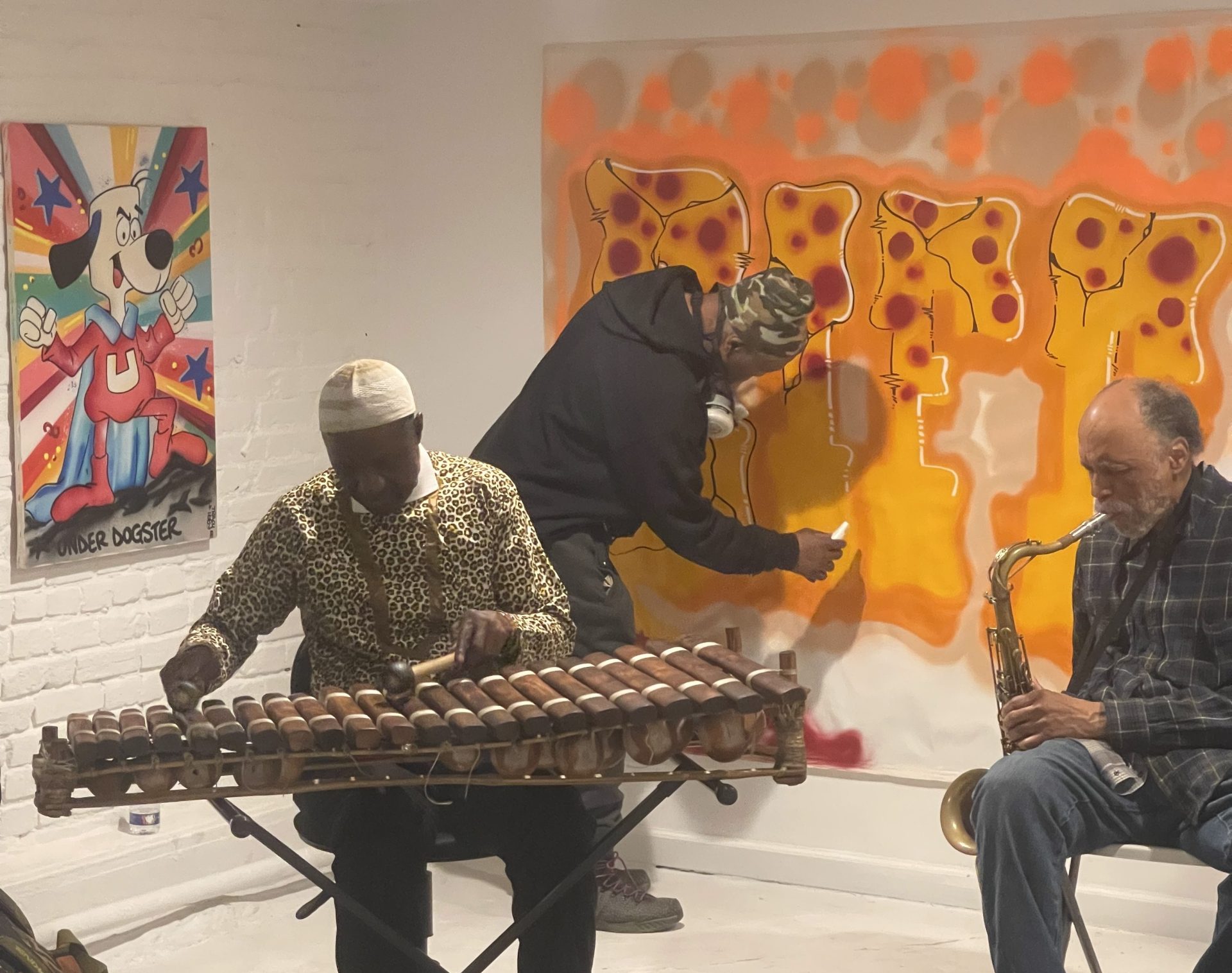
The Trops is proud to present the works of Ibrahim Kandji “Uneek”. This Senegalese artist is based in New York City and creates contemporary street art at his unique studio in TriBeCa.

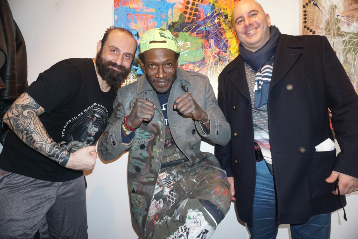
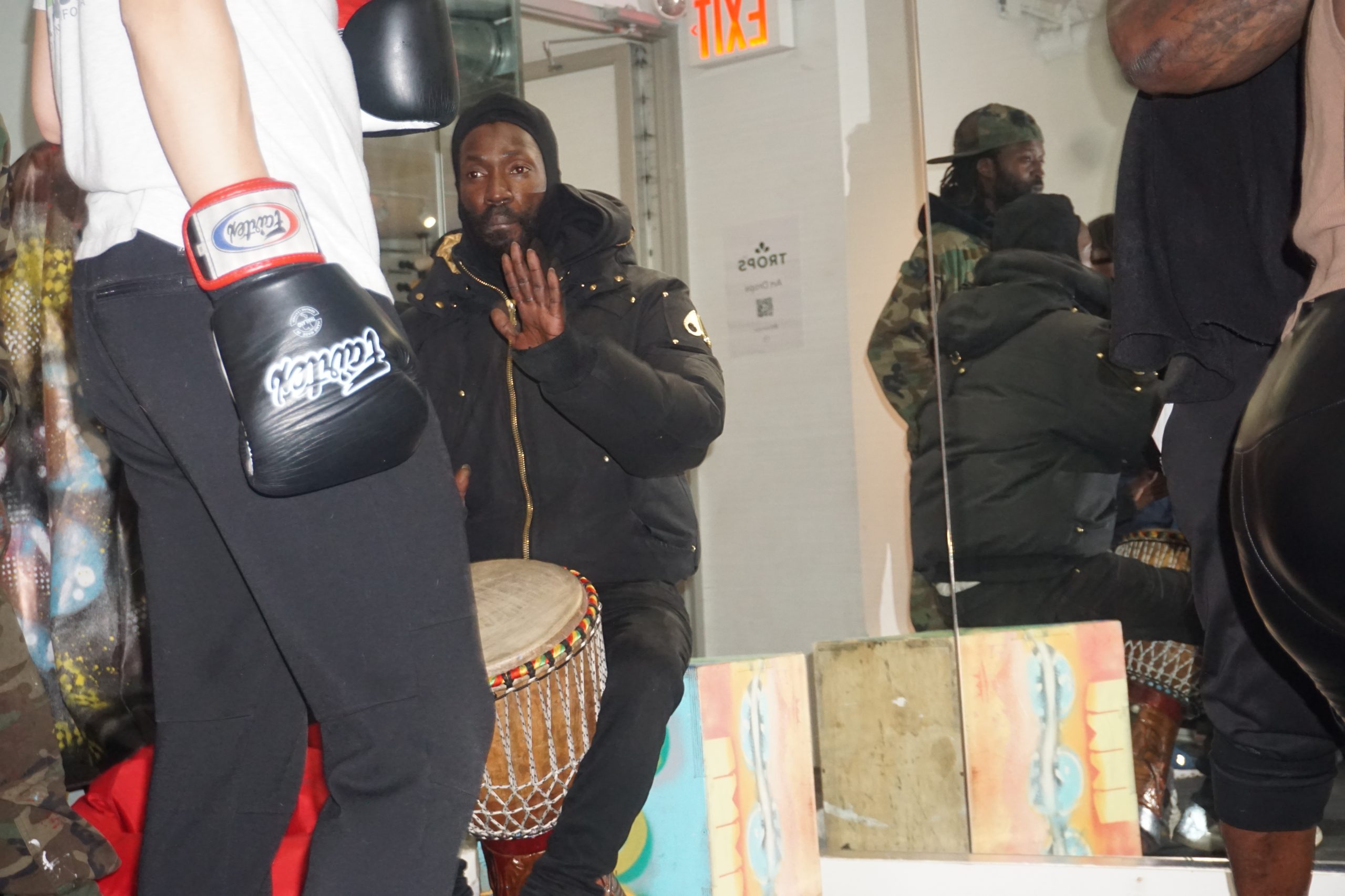
On January 3rd, 2024, the Trops hosted a Workshop at 333 Church St. in NYC. The night featured live music by Adjua Ajamu, boxing by Hudson Boxing, poetry readings and an artist talk with Uneek and Amelia A.

Workshop with Ibrahim Kandji Read More »

Event

Yalda 2023

Photo by Adrian Crispin @adrian_crispin (IG)

On December 21st, The Trops celebrated Yalda. The event took place at Manero’s of Mulberry, in Little Italy, NYC.

Yalda is an ancient Persian tradition to celebrate the winter solstice. As the longest night of the year, people stay up late with their community, gathering and sharing music, art, and poetry to welcome back the sun.

Photos by Bob Greco

Live performances, poetry and music by:

Adjua Ajamu, Amelia A, Ayna Ivanova, Bako, Daniel Carter, DJ Sadra, Galen Passen, Ilka Scobie, Indya Moore, Martin Shamoonpour, Mehrnam Rastegari and Mehdi Darvishi, Mir Naqibul Islam

Yalda 2023 Read More »

Event

How To Look At Art: Formal Elements

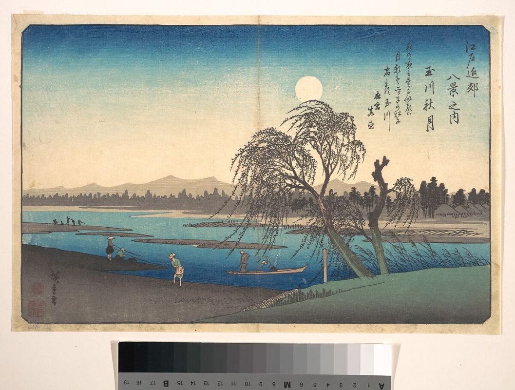
Utagawa Hiroshige, Autumn Moon on the Tama River, Japanese, ca. 1838, via The Met

Diving deeper into the art, Alexandra Kosloski uses design principles to unpack the language within visual compositions in the “How to Look at Art” series.

Continued from Part 1

Moving past the basics of visual analysis, we can look into the work for the formal elements and the principles of design. The formal elements of art are basic terms we use to communicate visually; line, light, color, shape, pattern, space, and time.

Line

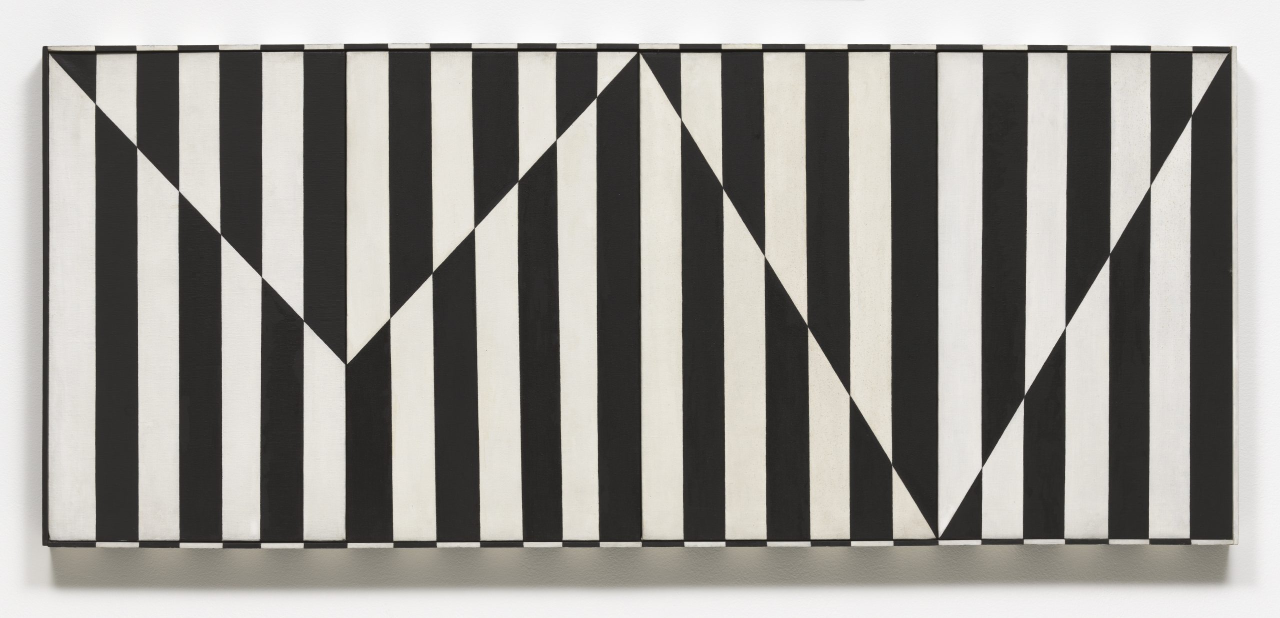
Linear marks made by artistic mediums like paint or pencil are actual lines. Implied lines are not made physically but still can make up the composition– dotted lines that don’t connect, the horizon in a landscape, the pointed hand on the outstretched arm of a figure.

Carmen Herrera, Untitled Estructura (Black), 1966/2016 © Carmen Herrera; Courtesy Lisson Gallery

Notice the vertical actual lines and jagged, horizontal implied line in Herrera’s work.

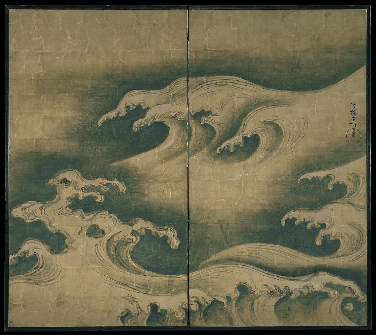
The direction of lines can indicate meaning. Viewers can draw from their own real world experience. Horizontal lines, like a sleeping body, could indicate rest, peace, or inactivity. Vertical lines may suggest aspirational reaching or standing at attention. Diagonal lines would suggest action, like all the diagonal lines of a runner. Curving lines may suggest movement, or the organic lines of nature. Line quality– if a line is thick or thin, or sketchy or bold– can also convey meaning.

Ogata Korin, Rough Waves, ca. 1704-9, Courtesy Met Museum

“Rough Waves” strives to capture the amorphous tide in ink.

Light and Value

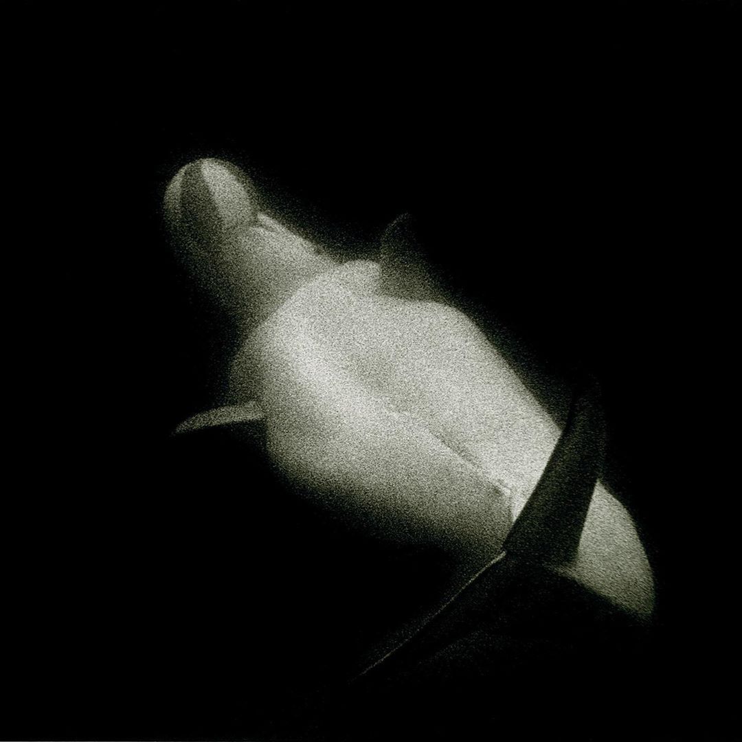
Art may utilize natural and artificial light, like in sculpture or architecture. In 2D art, artists use value to represent shades of light and dark. Artists manipulate light to create form by mimicking shadows and plasticity in 3D objects. Value can also portray emotion. For example, high contrast visuals look dramatic.

Sante D’Orazio, White Beluga Whale at Coney Island Aquarium, 1975

The harsh contrast between light and dark brings intensity to the mood of the photo.

Color

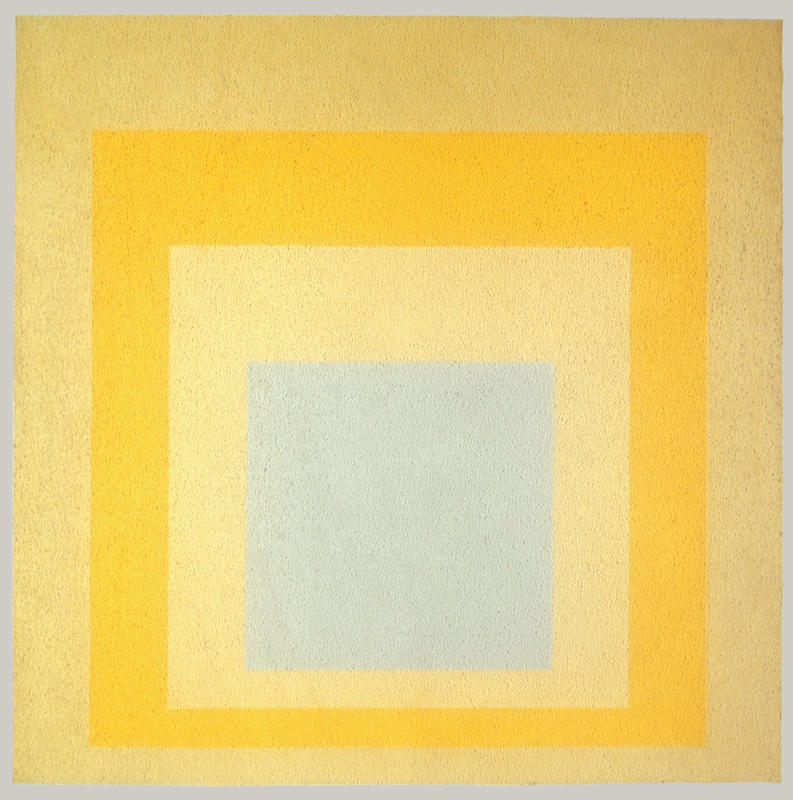
Color consists of three properties. Hue– the state of a color, like red or blue; value– lightness or darkness within a hue; and intensity– the dullness or saturation of a hue. Color can be warm or cool, which affects the viewer’s experience. There is a lot to learn about color theory because color is so subjective. It interacts with its environment and the colors around it, and can be very complex. Color is also largely symbolic, like the colors of a nation’s flag, or red being the color of passion.

Josef Albers, Homage to the Square: With Rays, 1959, © 2016 Artists Rights Society (ARS), New York

The interaction between the colors causes our eye to see them differently.

Texture and Pattern

Texture can be tactile or visual. A marble sculpture of a figure would be physically smooth to the touch, but visually, the artist might represent soft flesh or sinuous muscle. Texture and pattern are related, as pattern may be perceived as texture and vice versa. Pattern is an arrangement of repeated form, and they can be natural, like in leaves and flowers, or geometric, with mathematical shapes and lines.

Egyptian, Leaf Pendant, ca. 1390–1352 B.C., Courtesy Met Museum

The pattern is meant to mimic the appearance of a natural leaf and add texture.

Shapes

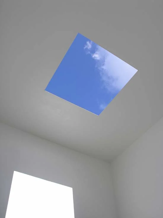
Regular shapes are often geometric and identifiable like triangles and squares. Irregular shapes are organic and spontaneous, like a patch of light or a mark made by a paintbrush.

James Turrell, Meeting, 1980-86/2016, at MoMA PS1, Copyright Hugh Pearman

The shapes create the space of the architecture around the viewer.

Space

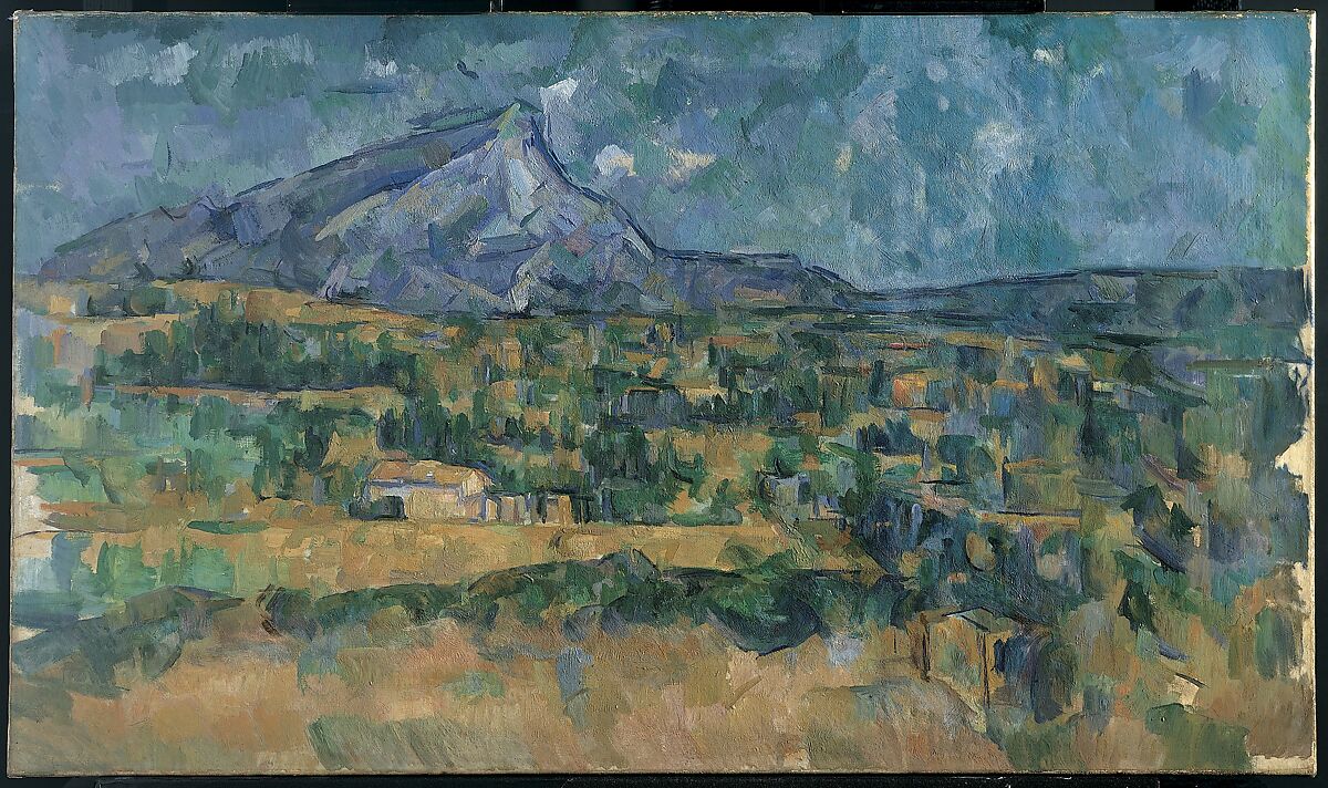
Artists can portray space in 2D art by employing one of many illusory techniques, like by manipulating vale or scale. A complex technique is by taking advantage of perspective. There are a few methods of perspective, but generally, the artist considers the natural experience of a viewpoint and tries to mimic it– or, as popularized by the cubist movement– defy it. 

Paul Cezanne, Mont Sainte-Victoire, 1902-6, Courtesy Met Museum

The blue mountain seems far away, past the houses.

Time and Motion

Time and motion functions differently across mediums. As we view sculpture, we observe several viewpoints as we move through or around it. Painting and drawing can have an illusion of motion through mark making. Film, dance, and other performance depend on time and motion.

Gian Lorenzo Bernini, Apollo and Daphne, 1622-1625, Photo by Daniel Kelly

“Apollo and Daphne” seems to have a sequence of motion as the viewer moves around the sculpture.

Next, we activate the formal elements by understanding how they make up design principles.

Continue to Part 3

How To Look At Art: Formal Elements Read More »

Editorial

Keeping The Faith, November 2023

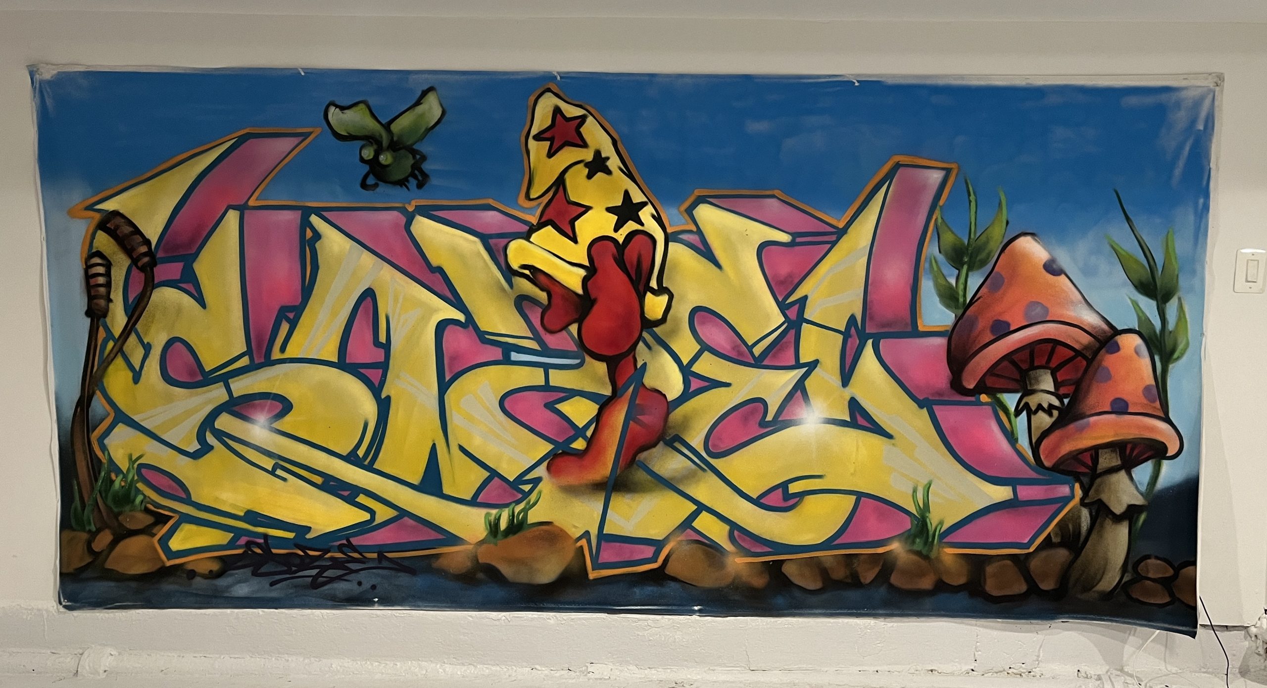
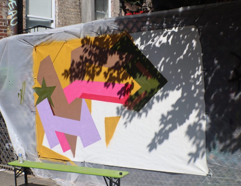
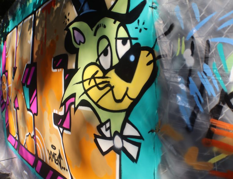
Style Writing by Jona Cerwinske at Keeping the Faith

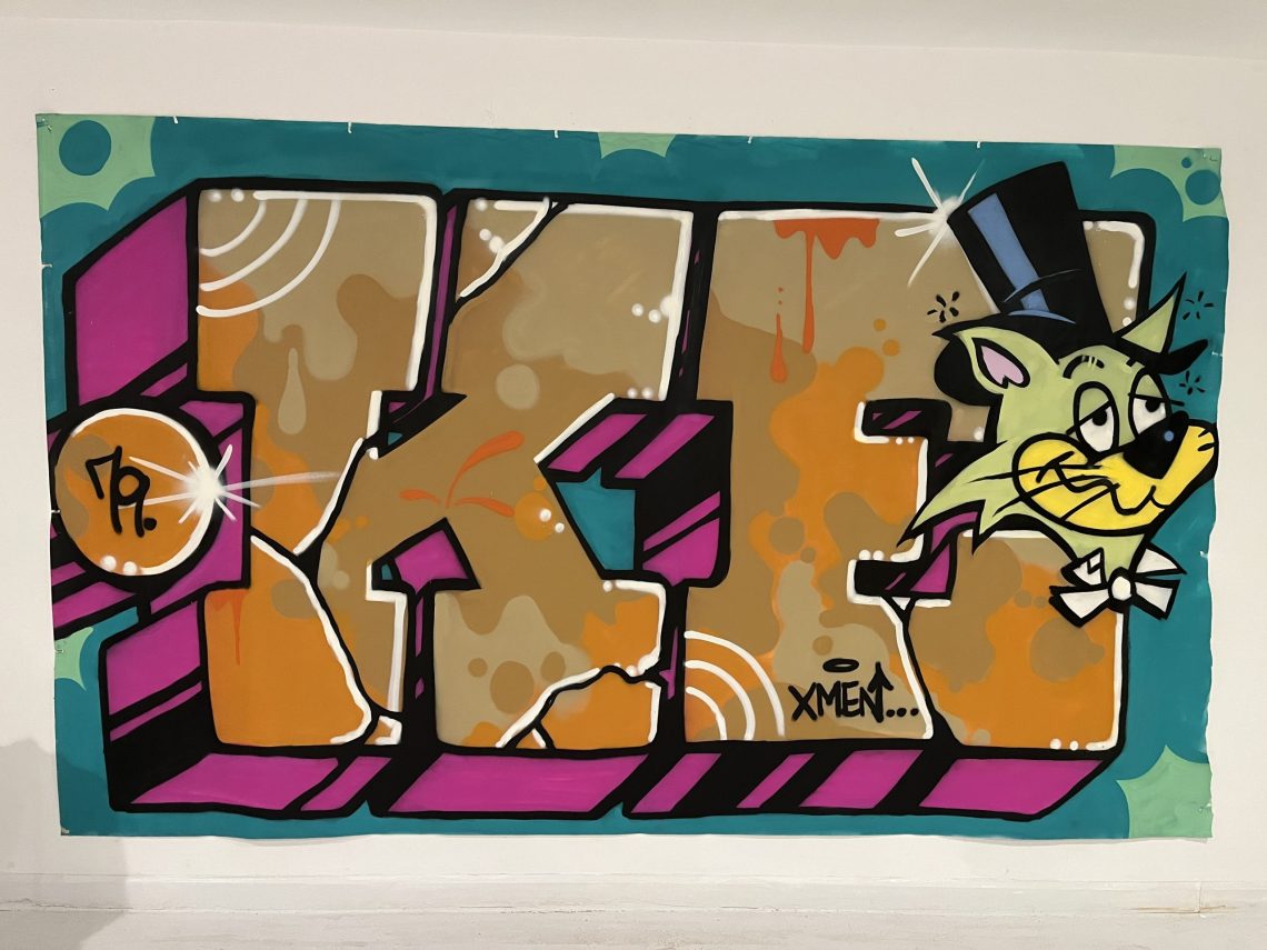
The Trops presents community paintings created live in NYC’s public spaces, representative of the sort of pieces that were done on the walls, streets, and trains that manifested into a global movement. Mark making attached a figurative significance to the individual spirit that guides self-expression in these exhibitive spaces; however, in their original contexts, the art of writing was not necessarily intended as a painting in the western sense of the word. These works, painted by legendary living writers, are contemporary developments of the Style Writing tradition that bring the vitality of the culture into canvas. 

Featuring:

KEO VFR JONA

SOZE RIFF

Keeping The Faith, Video by Avery Walker

The opening reception for Keeping The Faith presented musical performance by Daniel Carter and Ebrima Jassey, as well as a screening by Producer Plug, featuring Big Boo and The 45 King.

Train Writers

Shop our “Train Writers” collection, featuring Style Writers from Keeping The Faith.

Ebrima Jassey (left) and Big Boo (right) at Keeping The Faith, Photos by Adel Saad Abouelalav

Style Writing

Learn more about the Style Writing tradition by visiting our page for the culture.

Style Writing by Soze at Keeping the Faith

Style Writing by KEO at Keeping the Faith

Performance by Daniel Carter and Ebrime Jassey at Keeping the Faith, Style Writing by RIFF

Keeping The Faith, November 2023 Read More »

Exhibition

How To Look At Art: Visual Analysis

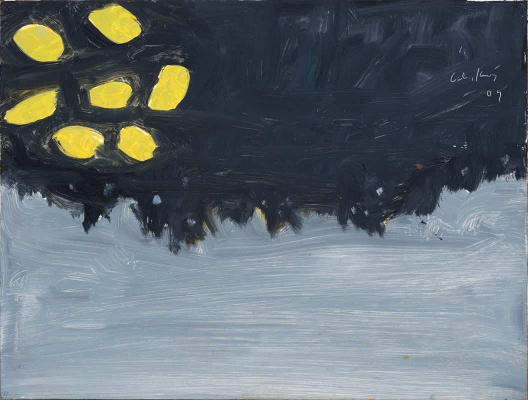
Alex Katz, Homage to Monet, 2009, via Andrea Rossetti, 2016

In the “How To Look At Art” series, Alexandra Kosloski guides readers through the multifaceted journey of art appreciation, fostering a deeper understanding of the emotions and stories woven within the work.

“Fundamentals are the building blocks of fun”

Mikhail Baryshnikov

To begin to understand a work of art, it helps to know any context you can, including the artist’s name, the title of the artwork and the year it was created. This information is often provided, which is useful in considering the historical context, like why the artwork was created, who it was created for, and what movement it was a part of. These details can lay the groundwork for how to look at art. For example, the identity of the artist, or the era they are from may have a large impact on the meaning of their work. Sometimes I look for this information first, and sometimes I look for it last so I can look at the artwork without any preconceived notions. The more artwork you look at, the more you’ll begin to recognize automatically, like the style of a specific movement.

Look at the work and think about what you see. Also, think about what you don’t see. Try to look at art without immediately projecting your feelings or interpretation onto it. It may not be what it first looks like. Meaning can come to you very softly and slowly, you don’t have to rush to that point. First, observe the content–  who or what is on the canvas and how is it presented? Notice all of its parts. Then consider how the artist manipulated the content and what they might be trying to communicate through it.

Keep an open mind. You should always assume that the artist meant to make the work look that way. If the painting looks weird, the artist wanted it to look weird. It’s not every artist’s goal to make a painting look representational or naturalistic.

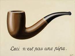
Rene Magritte, The Treachery of Images, 1929, via MoMA

It’s a matter of style. Style can be dependent on the individual or the culture. Sometimes art is idealized, meaning it looks somehow more perfect than reality. Sometimes, art is expressionist, which usually looks a little chaotic and wild, and is meant to communicate emotion. Sometimes art is entirely abstract and is only expressive marks or random pieces. Don’t assume the artist didn’t have the skill to make art lifelike, beautiful, or the way you think it should look. That’s irrelevant. If you’re focused on what you think it should be, you’ll miss out on what is actually there.

Jamie Nares, Back Then, 2021

Then, try to use your observation to piece together what is being depicted. Consider the figures and what they represent, and if there is a narrative or theme being portrayed. Make connections to what you already know. If the work is abstract, observe the marks made by the artist. What is the overall mood of the artwork? How does it make you feel?

In Part 2, we continue into a more detailed analysis of art.

Continue to Part 2

How To Look At Art: Visual Analysis Read More »

Editorial

On Message Off Grid (March 2022)

Performance at On Message Off Grid

March 2022

On Message Off Grid was a 2022 installation by Jona Cerwinske in collaboration with the Trops in New York City. Presenting works created in situ, On Message Off Grid showcased the gallery format as the ultimate studio visit as the artist created additional works across the streetscapes of NYC. 

Plato’s allegory of the cave was intended to show  “the effect of education and the lack of it on our nature.”

The allegory consists of a family who has lived their whole lives in a cave with no natural light. The only things they see are shadows cast on the wall by a fire. They see these shadows as real figures and learn from them as if they were aspects of real life. One day, someone finds a way out of the cave. They first are overwhelmed by the light, and soon realize that what they were looking at were the actual forms of the shadows they had been seeing their whole life in the cave. 
When the person goes back into the cave and tells the other about his discovery, they become angry and do not want to see his reasoning, plotting to kill him. The purpose of the allegory of the cave is to show that the reality of life often contrasts with the version of it that we interpret.

“I create in a marriage of two art forms that rebel against each other. I come from a generation when galleries did not accept anything from the street. And, vice versa, the street wanted nothing to do with the galleries. I had to experiment with what that looked like, combined.”

Jona Cerwinske

On Message Off Grid (March 2022) Read More »

Exhibition

NYC Parks: FSG Park (Part 4)

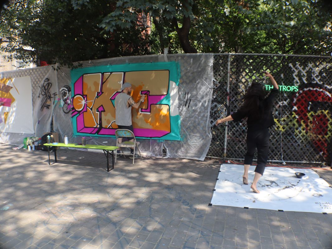
Keo and Kanami Kusajima at FSG Park, July 2023

First Street Green Park opened in 2008, sits between Houston and E 1st street, and had formerly been an empty lot between two buildings. Today, it is a site that highlights the best street art of the moment, and brings visitors together with murals, music, community and cultural events.

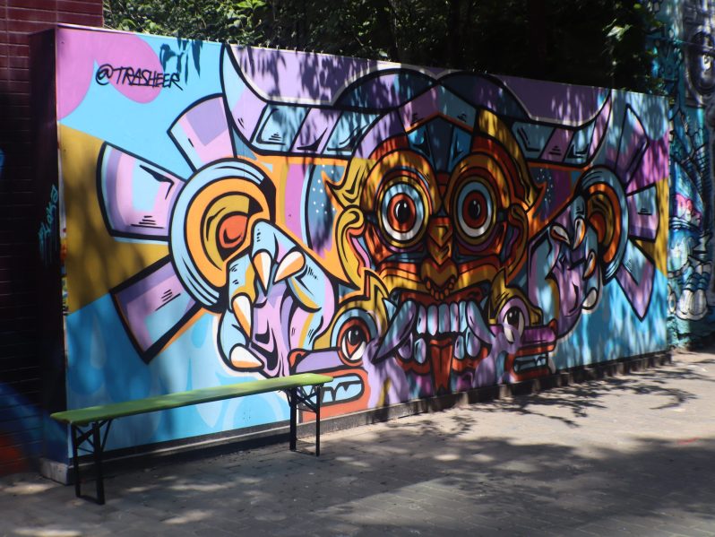
Art by Trasheer at FSG Park, July 2023

Like a gallery, the art changes regularly, and FSG Park has democratic approach. It holds open calls for art, but also features some of the most notable muralists, and is proud to include artists from all over the world. The Trops has collaborated with FSG Park at Keeping The Faith and Above Fresh Air, sharing a goal of community participation through the arts.

Work in Progress at FSG Park, July 2023

The appeal of FSG Park is in its ephemeral nature but unchanging mission. Visitors can always depend on being impressed by new graffiti, live music, performance, and good energy. FSG is for everyone. In this way, it’s a true manifestation of New York City street arts and culture. It brings out all of the best parts of the city– art, culture, style, diversity, charisma, collaboration– and shares them on one lot in The Lower East Side.

Art by KEO at FSG Park, July 2023

The Trops spoke with Anthony Bowman, Park Administrator, who shared some history of the park.

Video by Avery Walker

Shop our “Train Writers” collection, featuring artwork from FSG Park.

NYC Parks: FSG Park (Part 4) Read More »

Public Art

NYC Parks: Central Park (Part 3)

Lithograph by Julius Bien, Central Park (Summer), 1865, via the Met Museum

Central Park, and all of its features and amenities, demonstrate the intent that designers Olmsted and Vaux had in 1858– to create a social space where New Yorkers could come together to connect with nature and enjoy arts and culture. The vast park contains listless hidden gems and art drops, but below are a few highlights. 

The Literary Walk

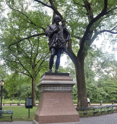
The Mall and Literary Walk is the wide walking path lined with trees and benches, located mid-park at 66th St. The path is renowned– it was part of Olmsted and Vaux’s original design of the park. Today, it is populated with vendors, musicians, and artists, it has been featured in many of the famous movies filmed in Central Park, and the path leads the way to many favorite spaces in the park. It is named the “Literary Walk” because of the sculptures of notable writers that it features, including William Shakespeare, an art drop that can be found using the Trops Mobile app.

William Shakespeare, Photo by Avery Walker

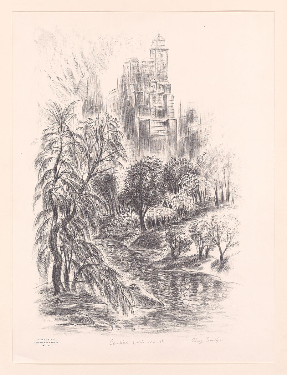
Chuzo Tamotzu, Central Park South, 1935, via the Met Museum

The Metropolitan Museum of Art

Located on the edge of Central Park facing 5th Avenue, The Metropolitan Museum of Art is a significant and beloved institution of art history in New York City. The museum has one of the largest collections in the world, with a diverse and endlessly fascinating breadth of art works. Between the Met and Central Park’s Great Lawn sits the obelisk known as “Cleopatra’s Needle”.

“The Indian Hunter”

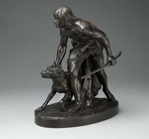
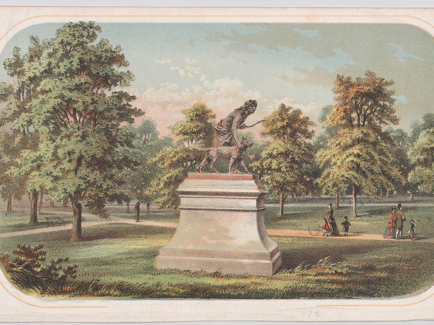
“The Indian Hunter” by John Quincy Adams Ward, was first built on a smaller scale before it became the life size bronze monument that we see in Central Park today. The Met Museum describes some of the history surrounding the statue:

With his statuette of a Native American youth and his dog, Ward answered the call for sculpture modeled by home-based, rather than expatriate, artists in a realist style. He imagined an Arcadian hunting scene, a stark contrast to the reservation system by then established to confine Indigenous peoples to U.S. government-specified tracts of land.”

John Quincy Adams Ward, The Indian Hunter, 1860, via the Met Museum

Anonymous, Central Park, Statue of The Indian Hunter, 1860, via the Met Museum

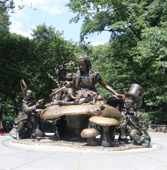
José de Creeft, Alice in Wonderland, 1959, Photo by Avery Walker

Conservatory Water 

Many water features can be found in Central Park, and the Model Boat Pond at Conservatory Water is a popular favorite. Visitors can watch the races of miniature boats and yachts on the pond, and it is an ideal place for relaxing. The scenery also draws guests towards one of the most adored statues in Central Park, Alice in Wonderland. 

The sculpture was donated by philanthopist and publisher George Delacorte, as a gift to the children of the city and in honor of his late wife, who loved literature and would read “Alice’s Adventures in Wonderland” to their children.

Find “Cleopatra’s Needle”, “The Indian Hunter”, “Alice in Wonderland” and many more art drops and hidden gems on the Trops mobile app, available in the app and google play store.

Video by Avery Walker

NYC Parks: Central Park (Part 3) Read More »

Public Art

NYC Parks: Prospect Park (Part 2)

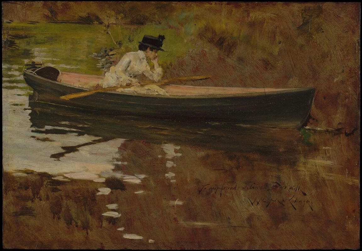
William Merritt Chase, Alice Gerson in Prospect Park, 1886, via the Met Museum

Prospect Park, the crown jewel of Brooklyn, NY, is admired by tourists and adored by locals. The green space, spanning 585 acres, is nestled in the middle of several charming Brooklyn neighborhoods. Since its opening in 1867, the park has been a place of leisure for New Yorkers in the busy city. Below is a guide to some of Prospect Park’s art drops. 

Grand Army Plaza

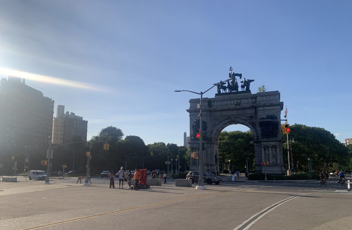
Reminiscent of Paris’s Arc de Triomphe, Grand Army Plaza features an arch in honor of Union Civil War soldiers. The space holds the Grand Army Plaza Greenmarket, open on Saturdays year round. Grand Army Plaza serves as a striking transition from the city to the verdant park.

Grand Army Plaza, Photo by Avery Walker

Lookout Hill

Lookout Hill is the highest point in the park, and offers a beautiful panorama view of Manhattan and Brooklyn. A great time to visit is in the late fall, after most leaves have fallen, and the hill has the best visibility. There, you can also find the Maryland Monument. This art drop is a tall Corinthian column that commemorates the Maryland 400, the group of Maryland soldiers who fought at Lookout Hill almost a hundred years before the park opened.

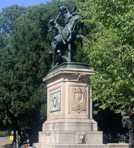
The Horse Tamers, Machate Circle, Photo by Avery Walker

Machate Circle

Machate Circle is the grand south entrance of Prospect Park. Like Grand Army Plaza, designers Olmsted and Vaux envisioned the space to be a palatial transition from busy city to peaceful park. Here, you can find “the Horse Tamers”, using the Trops mobile app. This entrance leads right to the Prospect Park Lake, a popular place for fishing and leisure.

Hiking Trails

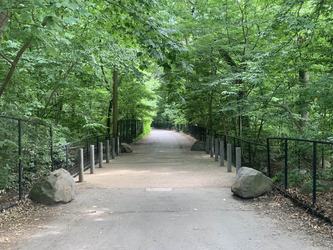
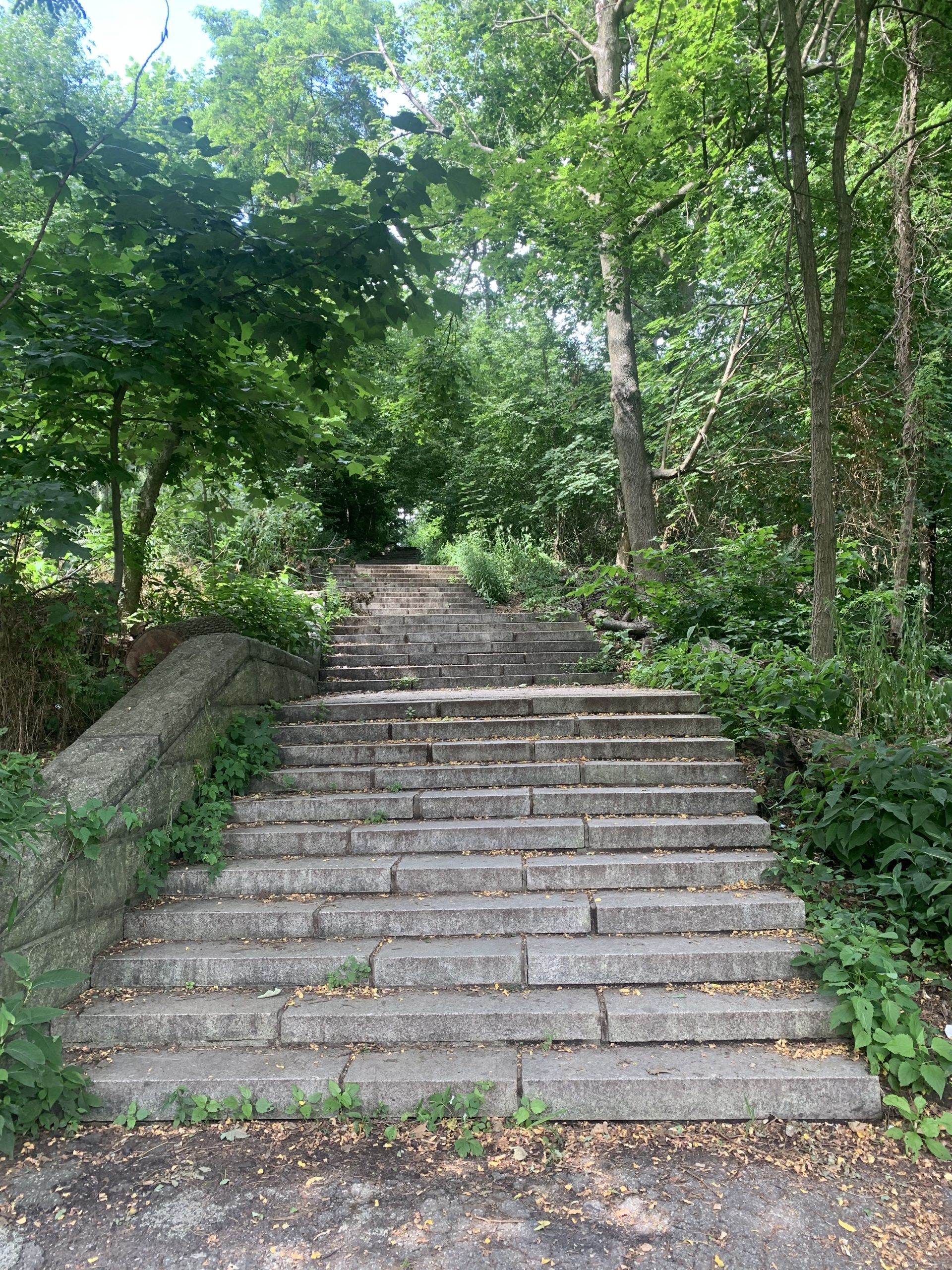
Prospect Park features several hiking trails. As the weather cools, fall is the perfect season for hiking and spending long hours out in the beauty of nature. See the leaves change in Brooklyn’s oldest forest.

Find “The Horse Tamers”, “The Maryland Memorial”, Grand Army Plaza and more art drops and hidden gems on the Trops mobile app, available in the app and google play store.

NYC Parks: Prospect Park (Part 2) Read More »

Public Art

NYC Parks: Olmsted Parks (Part 1)

Prospect Park, Photo by Avery Walker, 2023

Frederick Law Olmsted is widely recognized as one of the most influential landscape architects in history. Together with his partner Calvert Vaux, Olmsted created iconic designs for New York City’s Central Park and Prospect Park, leaving an indelible mark on urban landscapes.

In 1858, Olmsted and Vaux’s design for Central Park was selected through a competition, chosen over 32 other entries. Their vision was a departure from the prevailing Victorian-era park designs characterized by geometric patterns and ornate features. Instead, Olmsted aimed to create a practical park that embraced the natural landscape, incorporating native plants and offering an escape from the bustling city. The design prioritized harmony with nature rather than asserting human dominance over it. The result was a revolutionary concept that introduced an idealized version of nature within an urban setting. Central Park’s winding paths, tranquil ponds, and wide green spaces provide respite for residents and visitors alike.

Olmsted’s influence extended beyond Central Park. Prospect Park in Brooklyn, also designed by Olmsted, was similarly intended to serve as a sanctuary for city-dwellers seeking solace in nature. Constructed in one of the most densely populated areas of the country, Prospect Park provided a much-needed escape and a source of inspiration for the local community. 

Beyond the immediate impact on New York City’s landscape, Olmsted’s work elevated the profession of landscape architecture itself. He brought a visionary and artistic approach to his designs, recognizing the importance of creating spaces that not only served practical purposes but also resonated with people on a deeper level. 

Frederick Law Olmsted’s legacy lives on in the enduring beauty of Central Park and Prospect Park, as well as in the countless parks and landscapes that have been inspired by his innovative designs. His commitment to blending nature with urban environments continues to shape the way we perceive and interact with public spaces, reminding us of the profound impact that thoughtful design can have on our quality of life.
Prospect Park, Photo by Avery Walker, 2023

Embrace the spirit of adventure with the Trops mobile app and unlock the hidden gems of your community, like the enchanting parks of New York City. The Trops mobile app is a guide to new art drops experiences. This fall, step outside, breathe in the fresh air, and let Trops be your ultimate companion. Download the app now and let the adventures begin.
NYC Parks: Olmsted Parks (Part 1) Read More »

Public Art